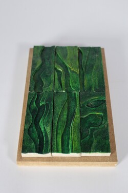
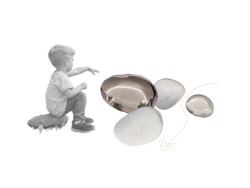
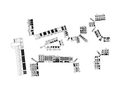
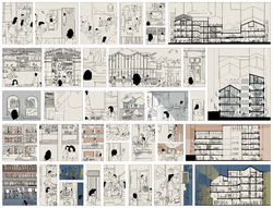
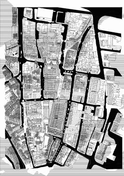
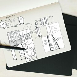
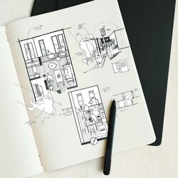
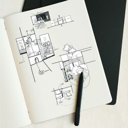
A 1:5 detail model of tiles. The detail chosen is wall tiles which have a few layers to them. I did six iterations at a scale of 1:5 and a final cast at 1:1. Through these iterations, I explored the texture and colors that this model could achieve. The 1:5 iterations are placed on a wooden base to better showcase them individually and as a potential more dense layout.
Posted 14 May 2022 21:43
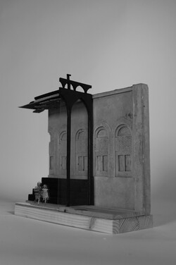
Collaged photo of the final 1:50 physical model. Most of the aspects of the model were made at home and the listed facade was cast in the workshop. The slight editing helps to further visualize the design.
Posted 14 May 2022 21:39
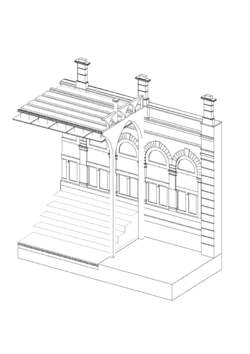
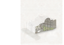
To better understand the 1:50 physical model that I needed to produce, I made a quick digital version, which although not complete really helped with tackling the overall task.
Posted 14 May 2022 21:37
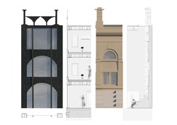
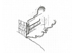
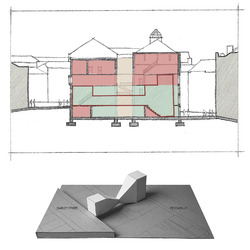
Concluding a more detailed development of the design. The image brings together the visual of where section and elevation are and draws their relation.
Posted 14 May 2022 21:34
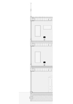
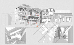
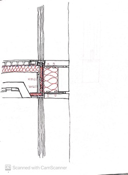
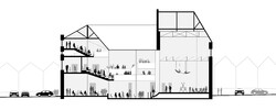
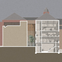
Continuing detail development by drawing up sections and plans more precisely. The cut is taken from where the project maintains part of an already existing structure - its steel structure and concrete floors - and builds on that - changing the facade and roof.
Posted 14 May 2022 21:28
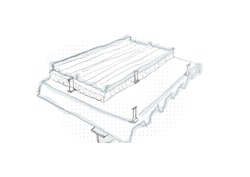
Investigating another aspect of the technological design and exploring some ideas of material use as well as wall, floor, and roof build-ups through sketching.
Posted 14 May 2022 21:24
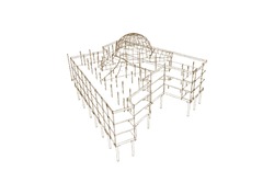
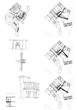
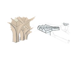
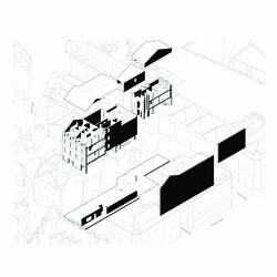
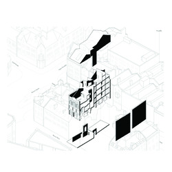
Looking into the structural strategies by using sketch diagrams and exploding them. This really helps with having clarity of the structural understanding and helps to see weak spots or gaps in the development.
Posted 14 May 2022 21:21
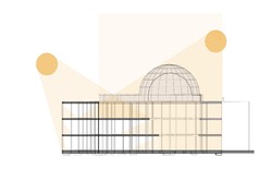
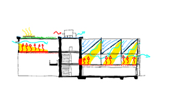
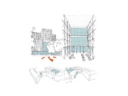
This diagram is the beginning of the more technological and environmental strategies. With a simple daylighting diagram further understanding of the implications and opportunities of the glass roof begins.
Posted 14 May 2022 21:18
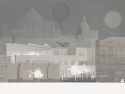
Finalizing 'The Big Pebble' by using soft tones and textures to place the emphasis on the atrium space. The rest of the building is left only as a mark and the pavement outside serves as an indicator for a starting point.
Posted 14 May 2022 21:14
Iterating drawing concepts through sketches to find the most suitable imagery for 'The Big Pebble', an image encapsulating the path of people from the public space outside to the main destination inside. In my design, this main space creating the fluidity between outside and inside is the large atrium space, covered by a glass dome.
Posted 14 May 2022 21:11
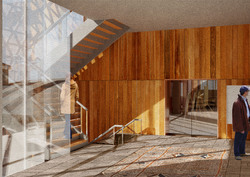
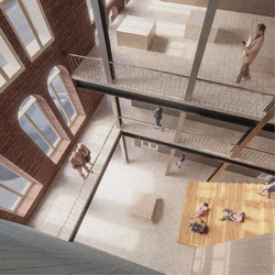
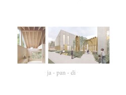
Interior view showing dramatic lighting and public area towards and artist and textiles studio, which can be visited a select times. There is supposed to be a permeability between spaces and an overlap between different forms of work, public and private.
Posted 11 May 2022 09:27
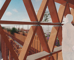
Brick/ceramic lattice detail to scale, with background features. This view from a stairwell to the inhabited rooftop shows the planting of native flowers and the rich material qualities of ceramics.
Posted 11 May 2022 09:25
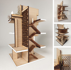
Modelmaking at 1:50 scale, isolating a stairwell section and partial façade, materiality and lighting. The rooftop planting is also included.
Posted 11 May 2022 09:22
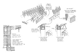
Structural strategy- suggestions for an extension to an existing steel framed structure, with a separate structure of solid concrete arches. Initial thoughts on envelope makeup is documented here too.
Posted 11 May 2022 09:19
"The Big Pebble"- a space where people congregate and is of particular focus- here an outdoor rooftop seating space is shown. The movement of people through the site is important, as is depicting the space in perspective.
Posted 11 May 2022 09:17
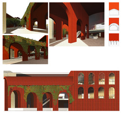
Materiality of largely brickwork with extensive foliage in an attempt at urban greening, with a roof/wall interface that contains planting and irrigation - detail to be finalised later. At this point, the amount of brick will be reduced and more timber and smooth concrete will be used.
Posted 11 May 2022 09:15
Typical analysis of an early design, critiquing obvious flaws and stimulating further changes.
Posted 11 May 2022 09:11
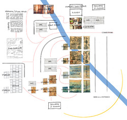
Adjacency diagrams showing proximity of different programmes, while indicating sun path and showing an underground river through the site, which the brewery on the site will use for water collection.
Posted 11 May 2022 09:09
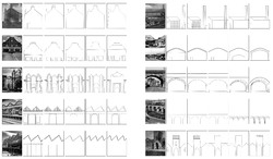
Identifying various landmarks and typical buildings in Accrington, then abstracting these often industrial forms down to the basic shapes, then iterating upon them to create new forms that references the originals. These will be influential in the form (elevation) of the new building.
Posted 11 May 2022 09:05
Collection of basic sketches, a series of simple proposals for new buildings from simple shapes, with the final choice being an almost parasitic re-use and subsuming of the town hall extension, that also has a clear route through the site.
Posted 11 May 2022 09:03
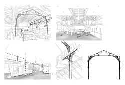
Internal sketches and details of the Market Hall, with a focus on the permeable floor space and seemingly temporary shops that can be reconfigured as necessary and have slightly loose borders. This is inspirational towards a flexible approach to spatial layouts and allowing adaptable re-use of the new build.
Posted 11 May 2022 09:00
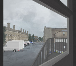
Digital Painting - a "view from a window" - depicting what may be an average day in Accrington, showing the contrast between the distinctly 'back of house' side of the Town Hall and the more ornate side of the Market Hall. Currently this space is used for parking and waste disposal.
Posted 11 May 2022 08:57
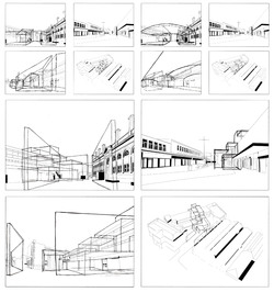
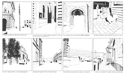
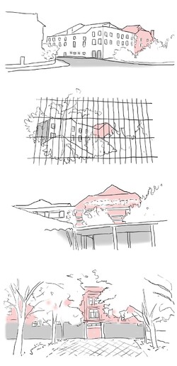
Cullen-style serial vision drawings, identifying landmarks and showing a narrative route to the site. The solid material permanence of the Town Hall and Market Hall is representing with bold shadows, while the town hall extension, with a steel frame, is seen as more permeable and could be infilled, with the historic buildings acting as hard borders and context to any future build.
Posted 11 May 2022 08:54
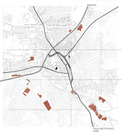
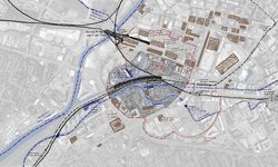
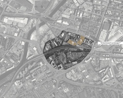
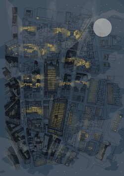
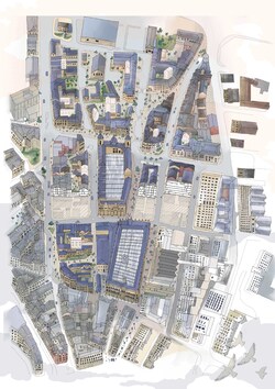
In the initial stages of the project, a broad understanding of the features of the site and town was needed. Here, a map of the whole town identifies transport links and routes to the town centre, location of historic warehouses and industrial buildings in decline, and the location of the site itself.
Posted 11 May 2022 08:52
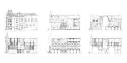
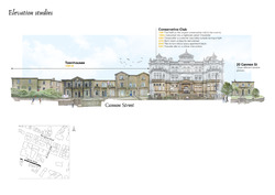
Elevation exercise for a contentious piece of heritage building.
In these quick sketches, we explore and ask how the Conservative Club would be dressed if it was hypothetically designed by Flores & Prats, Lacaton & Vassal, Palladio, Rafael Moneo, the original architect, and the mixture of them, clashing classical approaches with contemporary ones.
In these quick sketches, we explore and ask how the Conservative Club would be dressed if it was hypothetically designed by Flores & Prats, Lacaton & Vassal, Palladio, Rafael Moneo, the original architect, and the mixture of them, clashing classical approaches with contemporary ones.
Posted 18 Mar 2022 07:09
Further analysis of the materiality and possible wall build up of my design. Exploring the idea of having a geometric grid pattern with stone cladding being the facing of the grid and the set back panels be glazing. The sketch iteration also allowed me to explore the floor build up and how the services will be ran below floor level.
Posted 11 Feb 2022 16:18
An investigation into the environmental strategy of my scheme, exploring daylighting, passive solar gain, water collection, green roofing, and air source heat pumps.
Posted 10 Feb 2022 09:25
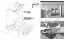
I explore the structural elements in my scheme that need to be developed further in understanding. With the lens of my project focusing on the connection between the Broadway, market hall, and the main square, as well as the pathway through the existing building, the cantilever, and the doors which open the workshop into the public realm.
Posted 1 Feb 2022 14:05
Diagrams of Roman Chester, Walton-le-Dale, Manchester and York
The research about typology of Roman town planning has been carried out by investigating four specific sites. Based on the historic maps and articles, the relation between Roman town, roads and waterways was described in these diagrams.
The research about typology of Roman town planning has been carried out by investigating four specific sites. Based on the historic maps and articles, the relation between Roman town, roads and waterways was described in these diagrams.
Posted 24 Oct 2021 22:43
Sketched map showing various layers in Castlefield
To further understand about the context, we started our research from the existed layers in Castlefield, including waterways, railways and listed buildings. Through the context research, the situation of redevelopment or renovation within Castlefield have been clarified. Because of the "unreliable" reconstruction, the embarrassed position of the Roman heritage has become more and more obvious.
To further understand about the context, we started our research from the existed layers in Castlefield, including waterways, railways and listed buildings. Through the context research, the situation of redevelopment or renovation within Castlefield have been clarified. Because of the "unreliable" reconstruction, the embarrassed position of the Roman heritage has become more and more obvious.
Posted 24 Oct 2021 22:42
The map with highlights showing the initial interest
When wandering around Castlefield this summer, both of us took particular attention to the Roman Fort reconstruction in this area. As one of the most important heritages, this Roman heritage, to some extent, was under an "embarrassed" position. People just pass by, go jogging or take the dog for a walk. Few people truly stop to visit and understand about the Roman heritage. Due to the historic value, it keeps as ever. It is, to some extent, lying vacant and a little bit desolated. We believe it could contribute more and engage more in Castlefield, the surrounding context. So we would regard it as a starting point for our further exploration.
When wandering around Castlefield this summer, both of us took particular attention to the Roman Fort reconstruction in this area. As one of the most important heritages, this Roman heritage, to some extent, was under an "embarrassed" position. People just pass by, go jogging or take the dog for a walk. Few people truly stop to visit and understand about the Roman heritage. Due to the historic value, it keeps as ever. It is, to some extent, lying vacant and a little bit desolated. We believe it could contribute more and engage more in Castlefield, the surrounding context. So we would regard it as a starting point for our further exploration.
Posted 24 Oct 2021 22:40
Study of levels within the Hulme Hippodrome through section to capture important platforms of interaction and the scale of distances between audiences and performers as well as the opportunity to view the rococo plasterworks within the theatre.
Posted 24 Oct 2021 01:01
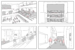
Various views towards the Hulme Hippodrome were captured to identify its identity within the neighbourhood and discover its strengths and weaknesses in creating a visual impact or attraction to the local community.
Posted 24 Oct 2021 00:53
Visualizing the past through sketches to understand the environment and usage of spaces through various angles of users such as the theatre audiences, performers and pub goers. Volume of spaces were also studied to build understanding on the experience throughout important spaces of Hulme Hippodrome.
Posted 24 Oct 2021 00:49
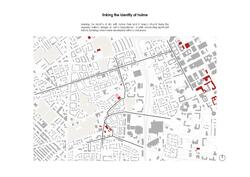
Understanding site context and morphology studies helped to identify significant listed buildings around the Hulme area, which leads to the discovery of the historical path which remained throughout the redevelopment of Hulme.
Posted 24 Oct 2021 00:42
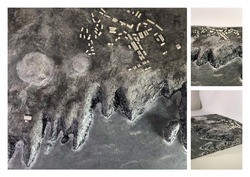
The photos show the site model of Penhale. This was created using foam, tinfoil, polyfiller and paints. The small military buildings are created from white and sprayed in an off white.
The model communicates the "uncanny" (Vidler, 1992) nature of the site successfully. The model also aims to display the juxtaposition between the mass of the headland versus the light weight militant structures which occupy the cliff.
The model communicates the "uncanny" (Vidler, 1992) nature of the site successfully. The model also aims to display the juxtaposition between the mass of the headland versus the light weight militant structures which occupy the cliff.
Posted 20 Oct 2021 14:46
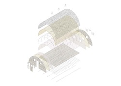
This exploded Isometric explains the efficient tectonic and light weight structure of the Nissan Hut. These durable and functional buildings have stood the test of time at Penhale. They have been affected by prevailing winds travelling off the sea and heavy storms around the coast now for over 80 years. The structures despite some smashed windows are still in good condition, boasting their robust design.
Posted 20 Oct 2021 14:42
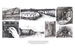
Primary research has been carried out by interviewing former Soldiers who stayed and trained at Penhale Military camp. Many stories were told bringing the memory of the site to life.
Many moving memories were kindly shared:
"Stanley chose to stay in the hut and that is where a lone German bomber managed to get a direct hit with a high explosive bomb. Stanley lost his life that day and was buried in the local churchyard along with eighteen other men in a single grave...’’
Many moving memories were kindly shared:
"Stanley chose to stay in the hut and that is where a lone German bomber managed to get a direct hit with a high explosive bomb. Stanley lost his life that day and was buried in the local churchyard along with eighteen other men in a single grave...’’
Posted 20 Oct 2021 14:37
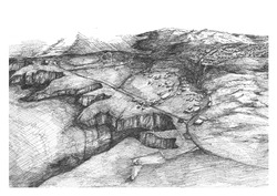
Our chosen site is Penhale Military camp, located on the coast of North Devon. The project started by researching abandoned military camps and their contentious and unwelcoming natures. Redeveloping these sites can be problematic and therefore many are left unused. We have chosen this large eerie site on top of the cliffs and have started to peel back the many layers of history which this site possesses. The military camp was created in 1939 and has been operation up until 11 years ago. A developer has purchased the site and proposed a residential project which many locals are objecting to.
Posted 20 Oct 2021 14:30
Reimagine
Farah and Syahirah
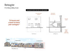
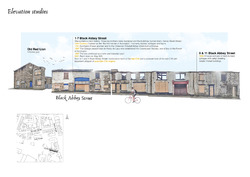
Do you know that before terraced housing, back-to-back type were very popular due to its cheaper cost. However, in the late 19th century, it was banned due to health and sanitary concern and since then many of those houses are demolished throughout the UK, although there are still some survived. The 9-11 Black Abbey Street building is one of the surviving examples of a house and back-to-back cottages.
Posted 16 Oct 2021 00:48
Reimagine
Farah and Syahirah
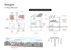
Based on descriptions provided, we try to recreate the 18th century interior of the 1-7 Black Abbey Street building. The function of the building has changed so much from a grange to cowhouses to barn and stables, and recently just before the fire, as retail stores.
Farah and Syahirah
Based on descriptions provided, we try to recreate the 18th century interior of the 1-7 Black Abbey Street building. The function of the building has changed so much from a grange to cowhouses to barn and stables, and recently just before the fire, as retail stores.
Posted 16 Oct 2021 00:42
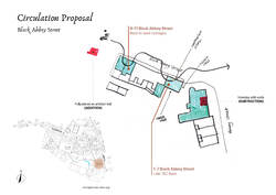
Circulation Proposal
Farah and Syahirah
Developing our facade intervention idea from previous week, instead of a mere exhibition, we proposed for the possibility of interaction between visitors and urban artefacts that will be installed in the Black Abbey Street.
Farah and Syahirah
Developing our facade intervention idea from previous week, instead of a mere exhibition, we proposed for the possibility of interaction between visitors and urban artefacts that will be installed in the Black Abbey Street.
Posted 16 Oct 2021 00:33
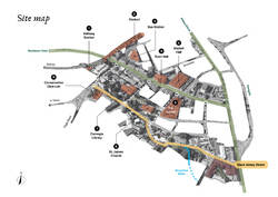
Site Mapping
Farah and Syahirah
Mapping our chosen site for intervention, Black Abbey Street, within the town of Accrington. Our intention is to revive the true value of the Black Abbey Street, locally dubbed as the 'first hamlet of Accrington', as a gateway and destination. Our intervention will then re-activate the high streets including the Blackburn Road and Abbey Street, as well as other points of interests identified.
Posted 16 Oct 2021 00:28
Another street of interest looks into a ruin of the former Conservative Club in Cannon Street. Like Black Abbey Street, this building also suffered a burn (by arson) in 2016.
Posted 15 Oct 2021 15:05
The first entry starts with the image of what believed as "the first hamlet of Accrington" in Black Abbey Street.
Posted 15 Oct 2021 14:59
Final perspectives // the performance space
Yifan He, Yuxin Jiang and Juliet Tremble
This image demonstrates how the final performance space and gallery will look and feel. Visitors can sit on the stair seats or peer down from the gallery overlooking the performance area. The steel columns are distinctly modern and respect the wishes of the client, who wanted a contemporary, industrial feel to the building.
Posted 15 Jun 2021 16:54
Design development // interior design of the performance space
Yifan He, Yuxin Jiang and Juliet Tremble
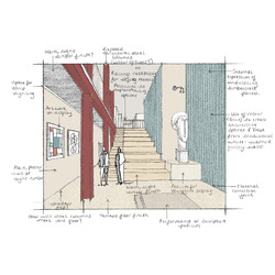
This sketch explores options for the materiality and atmosphere of the new performance space on the lower ground floor of the building. This space terminates the visitor’s journey through the building from Darley Street. The blue timbercrete wall was used as a continuation of the façade of the new extension. Complementary red steel columns have been shown, although these were left plain silver in the final images of the interior spaces.
Posted 15 Jun 2021 16:53
Final perspectives // to the studio
Yifan He, Yuxin Jiang and Juliet Tremble
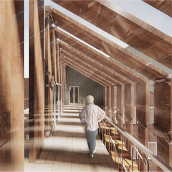
This perspective shows the space at the top of the circulation link, which is enwrapped with the vertical timber slats. This is the journey from the top floor residency accommodation to the studio spaces, which is made exciting by the play of light that the shading device creates.
Posted 15 Jun 2021 16:51
Final perspectives // in transition
Yifan He, Yuxin Jiang and Juliet Tremble
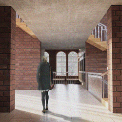
This image shows the single height space which leads to the quadruple height area at the back of the building. Light can be seen entering through the glazed circulation link.
Yifan He, Yuxin Jiang and Juliet Tremble
This image shows the single height space which leads to the quadruple height area at the back of the building. Light can be seen entering through the glazed circulation link.
Posted 15 Jun 2021 16:48
The circulation link // section
Yifan He, Yuxin Jiang and Juliet Tremble
This building section shows how the final shading device for the new glass link would sit in context between the two street-facing sides of the building. The glazed nature of the link ensures that plenty of natural daylight enters the core of the building while creating an interesting play of light internally.
Posted 15 Jun 2021 16:44
The circulation link // model-making
Yifan He, Yuxin Jiang and Juliet Tremble
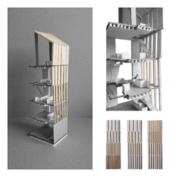
We experimented with various arrangement options of the vertical timber slat shading device for the new glazed link. We then made a grey board and balsawood model which depicts the final design idea. Physically making the model also helped us to think about how the shading device would work technically.
Posted 15 Jun 2021 16:43
Design development // model-making
Yifan He, Yuxin Jiang and Juliet Tremble
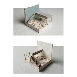
These experimental models were created to explore different options for the final interior finish of the building. The model depicts the new double-height entrance space and the final material options were a timber terrazzo floor finish, blue timbercrete walls and plain white plaster walls.
Posted 15 Jun 2021 16:40
Design development // the entrance hall
Yifan He, Yuxin Jiang and Juliet Tremble
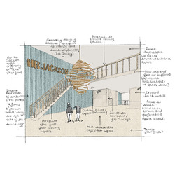
This sketch demonstrates ideas for how the entrance area will look and feel. The HR Jackson sign, which sat above the entrance of the building, when it was a fine china shop, has been used as a wall piece. A complimentary abstract sculpture hangs within the double-height void. Bar furniture has been removed to draw focus to the architectural quality of the space.
Posted 15 Jun 2021 16:39
Concept // summarising the key design idea
Yifan He, Yuxin Jiang and Juliet Tremble
The key concept behind the project, to design an art space for FUSE, was the visitor’s journey from the entrance to the performance area at the Piccadilly facing side of the building. Visitors are led through a double, single and then quadruple height space. This creates and releases tension which creates excitement for the visitor exploring the building for the first time.
Posted 15 Jun 2021 16:28
Site Analysis // sketching the local area
Yifan He, Yuxin Jiang and Juliet Tremble
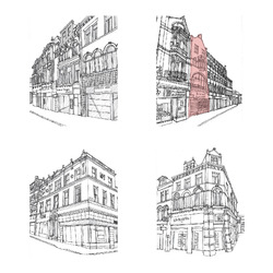
We made quick sketches using photographs of the site and the buildings immediately surrounding it. This helped us to identify small details within the façade designs and patterns which could come to inform our own design.
Yifan He, Yuxin Jiang and Juliet Tremble
We made quick sketches using photographs of the site and the buildings immediately surrounding it. This helped us to identify small details within the façade designs and patterns which could come to inform our own design.
Posted 15 Jun 2021 16:26
Site Analysis // exploring the local area
Yifan He, Yuxin Jiang and Juliet Tremble
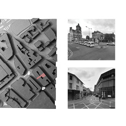
As a form of site analysis, we made a card site model. This helped to decipher the urban grain of the area in which our building, 46 Darley Street, was located (as indicated). We visited the site and analysed the architecture in the local vicinity, through photography, to find inspiration for our proposed reuse project design.
Posted 15 Jun 2021 16:24
// Final touch :: Envelope //
SE elevation showing the remaining sandstone wall, which ‘holds’ the public space consisting of ramps and seating area. It also indicates the relationship between arched shapes in the context and in the new structure. One might also notice the glazed green atrium structure.
SE elevation showing the remaining sandstone wall, which ‘holds’ the public space consisting of ramps and seating area. It also indicates the relationship between arched shapes in the context and in the new structure. One might also notice the glazed green atrium structure.
Posted 17 May 2021 18:14
// Landscaping :: Pedestrian street strategy //
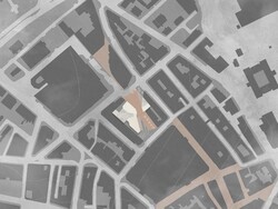
The main idea for the building and its landscape is to guide the pedestrian flow through the public squares, while allowing narrow pathways to the building core. Different types of paving is also a method of how to guide the flow. Besides, the pedestrian street direction is kept as it was originally, to create a connection between the pedestrian zone in North and South.
The main idea for the building and its landscape is to guide the pedestrian flow through the public squares, while allowing narrow pathways to the building core. Different types of paving is also a method of how to guide the flow. Besides, the pedestrian street direction is kept as it was originally, to create a connection between the pedestrian zone in North and South.
Posted 17 May 2021 18:14
// The handshake :: multifunctional bench design //
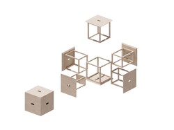
The design is inspired from Cube 6 design by Naho Matsuno. It is a great way of how to keep large amount of stools without taking much room. These can be used both as a cube and disassem¬bled to function as six separate stools. The structure for each stool is different, so they can fit properly when assembled in a box. The material is timber to fit in the overall building concept. I chose to avoid screw fixtures as much as possible so the material can be easily disassembled and reused after stools life cycle.
The design is inspired from Cube 6 design by Naho Matsuno. It is a great way of how to keep large amount of stools without taking much room. These can be used both as a cube and disassem¬bled to function as six separate stools. The structure for each stool is different, so they can fit properly when assembled in a box. The material is timber to fit in the overall building concept. I chose to avoid screw fixtures as much as possible so the material can be easily disassembled and reused after stools life cycle.
Posted 17 May 2021 18:13
// Corner model : The knot //
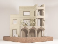
This corner of is located approximately in the middle of the building. It is a place, where multiple routes and purposes meet [archway, corridors, main entrance] and ties in a knot. View from E side.
This corner of is located approximately in the middle of the building. It is a place, where multiple routes and purposes meet [archway, corridors, main entrance] and ties in a knot. View from E side.
Posted 17 May 2021 18:13
// Envelope studies //
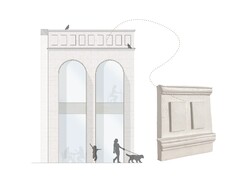
The developed envelope design. The sandstone cladding is mixed with extended glulam window frames. The parapet is ornamented with cornices and square details largely inspired from surrounded buildings.
The parapet 1:10 model shows the exploration on clay material in detail after the lecture ‘Out of the Studio. Into the Factory’.
Posted 17 May 2021 18:13
// The big pebble :: Green atrium //
The project’s agenda works towards developing multiple experiences for people by the path they choose. However, most paths and entrances are leading to The Big Pebble- the green atrium and main staircase. It is the place that collects largest mass of people internally, and even allows curious bypassers to enter it.
The picture shows how the building is divided into masonry and glazed blocks.
Posted 17 May 2021 18:12
// Elemental studies :: Arch and roof //
Archway: the archway is inspired from a structure from Al Islah Mosque by Formwerkz, 2015. It is a glulam structure with waffle slab and inbuilt light tunnels to lit the dark areas of archways from above.
Roofs: this diagonal zig-zag roof type extends over the main staircase. This allows much more light into the centre of the building and gives the feel¬ing of the masonry block slowly opening up onto the atrium zone. The same pattern is repeated for gallery atrium roof.
Posted 17 May 2021 18:12
// Feels :: Precedent studies //
Exterior: simple, natural, earthy tones, clear, masonry x lightweight
Interior: simple, natural, warm, minimal, clear, cozy
Exterior: simple, natural, earthy tones, clear, masonry x lightweight
Interior: simple, natural, warm, minimal, clear, cozy
Posted 17 May 2021 18:11
// Technical position //
Tehcnical position of the project consists of three main aspects:
-to let the building structure mirror the programme [picture]: glazed structures and larger windows identifies public place in a building, whereas masonry: private;
-localization: looking for local materials and manufacturers
-minimal co2 emissions x maximal performance: using low conductivity materials, as well as reusing materials rather than recycling due to pollution and lowered performance
Posted 17 May 2021 18:11
// Window studies :: Reflecting the context //
To develop fenestration proportions, I created a diagrammatic window analysis that explores the window tendencies in the local surroundings. This strategy would allow the upcoming building to camouflage into the context better.
To develop fenestration proportions, I created a diagrammatic window analysis that explores the window tendencies in the local surroundings. This strategy would allow the upcoming building to camouflage into the context better.
Posted 17 May 2021 18:11
Beautiful Chaos: As we finally draw the curtains, we hope the journey in finding the beautiful chaos and the moments in the city has brought us all to appreciate the erased, concealed and unbuilt. Where deep falseness lies upon our imagination, we are able to construct an interface between the city and the room. It is in these mundane scenes, we see the perfect depiction of chaos; a wonderful presentation of drawings of people, space and time into their narrative structure.
Posted 12 May 2021 14:36
Beautiful Chaos: As we finally draw the curtains, we hope the journey in finding the beautiful chaos and the moments in the city has brought us all to appreciate the erased, concealed and unbuilt. Where deep falseness lies upon our imagination, we are able to construct an interface between the city and the room. It is in these mundane scenes, we see the perfect depiction of chaos; a wonderful presentation of drawings of people, space and time into their narrative structure.
Posted 12 May 2021 14:35
Beautiful Chaos: To describe our project as a series of spaces and its simultaneous connection to the city and the chaos and narration of the city, we were thinking of that one image that could help us lay everything in place. We felt that it should be a hypothetical image or something that is surreal and imaginary. It is like how we begin our journey with the Invisible City, something so ever surreal; we want to introduce this tension between the stories and the reality.
This piece seeks to distort the present, revealing snippets of the past whilst injecting the new possibilities of the emerging future. It is indeed the encounter of timelines that we wish to portray and what you receive in exchange is this beautiful chaos within the City of Bradford.
This piece seeks to distort the present, revealing snippets of the past whilst injecting the new possibilities of the emerging future. It is indeed the encounter of timelines that we wish to portray and what you receive in exchange is this beautiful chaos within the City of Bradford.
Posted 12 May 2021 14:34
Axonometric: One of the buildings in our Communal Villa network.
Posted 12 May 2021 14:33
Axonometric: One of the buildings in our Communal Villa network.
Posted 12 May 2021 14:33
A work in progress: Inspired by the visual ambiguity of invisible Cities, this is an experimental montage of handrawn pieces to express the parallel layers that is a fleeting apparition; ephemeral and ethereal.
Posted 12 May 2021 14:30
Experimental: This illustration was initiated by collaging the existing floor plans of the Communal Villas (all drawn to the same scale). We realised how the dimension of things act as a point of transfer between buildings and how we could make some sense of all the small works while also trying to use them together to create a little city that made sense too. This experimentation expanded to form a metaphoric expression of the inbetween spaces in the notion of parallel layers.
Posted 12 May 2021 14:28
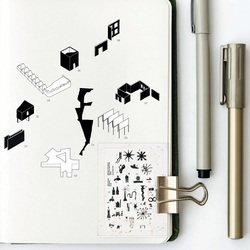
Catalogue of statement pieces: Inspired by John Hejduk, these were pieces selected from our many interventions and would create a certain sequence in space as one takes on a route that intertwines from private to public spaces. These are the statement pieces that have been catalogued however we would expect this catalogue to be expanded as time passes by; hoping the city will be filled with insertions like these.
Posted 12 May 2021 14:25
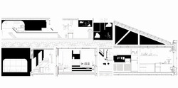
Looking at details: Along the way we were very critical in our presentation of the monochrome drawings and used it as a means to communicate the honesty in our drawings. It occurred to us that working with black and white either turn spaces on or shut them off- and it is about finding harmony in dichotomy.
Posted 12 May 2021 14:23
Zero Axonometric: The creative process always begins with a good old sketch where a constructive, compositional and symbolic thought is born.
Posted 12 May 2021 14:22
Zero Axonometric: The creative process always begins with a good old sketch where a constructive, compositional and symbolic thought is born.
Posted 12 May 2021 14:22
Zero axonometric: The creative process always begins with a good old sketch where a constructive, compositional and symbolic thought is born.
Posted 12 May 2021 14:21
