Final perspectives // the performance space
Yifan He, Yuxin Jiang and Juliet Tremble
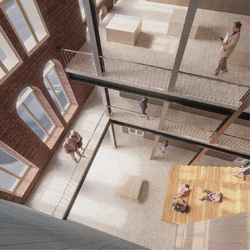
This image demonstrates how the final performance space and gallery will look and feel. Visitors can sit on the stair seats or peer down from the gallery overlooking the performance area. The steel columns are distinctly modern and respect the wishes of the client, who wanted a contemporary, industrial feel to the building.
Posted 15 Jun 2021 16:54
Design development // interior design of the performance space
Yifan He, Yuxin Jiang and Juliet Tremble
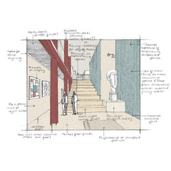
This sketch explores options for the materiality and atmosphere of the new performance space on the lower ground floor of the building. This space terminates the visitors journey through the building from Darley Street. The blue timbercrete wall was used as a continuation of the façade of the new extension. Complementary red steel columns have been shown, although these were left plain silver in the final images of the interior spaces.
Posted 15 Jun 2021 16:53
Final perspectives // to the studio
Yifan He, Yuxin Jiang and Juliet Tremble
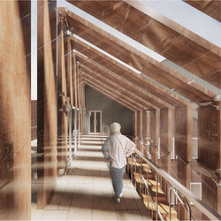
This perspective shows the space at the top of the circulation link, which is enwrapped with the vertical timber slats. This is the journey from the top floor residency accommodation to the studio spaces, which is made exciting by the play of light that the shading device creates.
Posted 15 Jun 2021 16:51
Final perspectives // in transition
Yifan He, Yuxin Jiang and Juliet Tremble
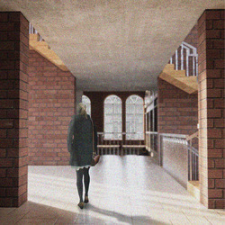
This image shows the single height space which leads to the quadruple height area at the back of the building. Light can be seen entering through the glazed circulation link.
Posted 15 Jun 2021 16:48
The circulation link // section
Yifan He, Yuxin Jiang and Juliet Tremble
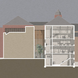
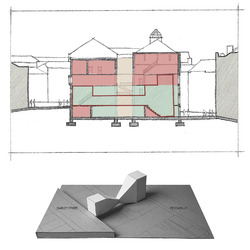
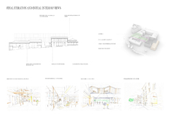
This building section shows how the final shading device for the new glass link would sit in context between the two street-facing sides of the building. The glazed nature of the link ensures that plenty of natural daylight enters the core of the building while creating an interesting play of light internally.
Posted 15 Jun 2021 16:44
The circulation link // model-making
Yifan He, Yuxin Jiang and Juliet Tremble
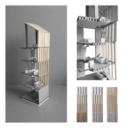
We experimented with various arrangement options of the vertical timber slat shading device for the new glazed link. We then made a grey board and balsawood model which depicts the final design idea. Physically making the model also helped us to think about how the shading device would work technically.
Posted 15 Jun 2021 16:43
Design development // model-making
Yifan He, Yuxin Jiang and Juliet Tremble
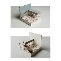
These experimental models were created to explore different options for the final interior finish of the building. The model depicts the new double-height entrance space and the final material options were a timber terrazzo floor finish, blue timbercrete walls and plain white plaster walls.
Posted 15 Jun 2021 16:40
Design development // the entrance hall
Yifan He, Yuxin Jiang and Juliet Tremble
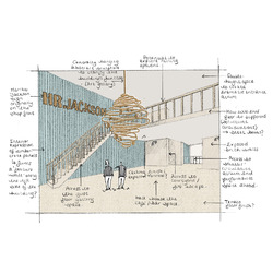
This sketch demonstrates ideas for how the entrance area will look and feel. The HR Jackson sign, which sat above the entrance of the building, when it was a fine china shop, has been used as a wall piece. A complimentary abstract sculpture hangs within the double-height void. Bar furniture has been removed to draw focus to the architectural quality of the space.
Posted 15 Jun 2021 16:39
Concept // summarising the key design idea
Yifan He, Yuxin Jiang and Juliet Tremble
The key concept behind the project, to design an art space for FUSE, was the visitors journey from the entrance to the performance area at the Piccadilly facing side of the building. Visitors are led through a double, single and then quadruple height space. This creates and releases tension which creates excitement for the visitor exploring the building for the first time.
Posted 15 Jun 2021 16:28
Site Analysis // sketching the local area
Yifan He, Yuxin Jiang and Juliet Tremble
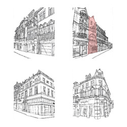
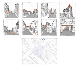
We made quick sketches using photographs of the site and the buildings immediately surrounding it. This helped us to identify small details within the façade designs and patterns which could come to inform our own design.
Posted 15 Jun 2021 16:26
Site Analysis // exploring the local area
Yifan He, Yuxin Jiang and Juliet Tremble
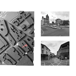
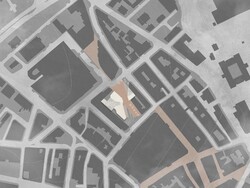
As a form of site analysis, we made a card site model. This helped to decipher the urban grain of the area in which our building, 46 Darley Street, was located (as indicated). We visited the site and analysed the architecture in the local vicinity, through photography, to find inspiration for our proposed reuse project design.
Posted 15 Jun 2021 16:24
// Final touch :: Envelope //
SE elevation showing the remaining sandstone wall, which holds the public space consisting of ramps and seating area. It also indicates the relationship between arched shapes in the context and in the new structure. One might also notice the glazed green atrium structure.
Posted 17 May 2021 18:14
// Landscaping :: Pedestrian street strategy //
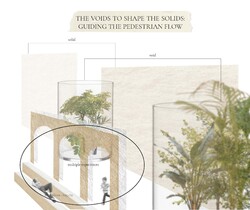
The main idea for the building and its landscape is to guide the pedestrian flow through the public squares, while allowing narrow pathways to the building core. Different types of paving is also a method of how to guide the flow. Besides, the pedestrian street direction is kept as it was originally, to create a connection between the pedestrian zone in North and South.
Posted 17 May 2021 18:14
// The handshake :: multifunctional bench design //
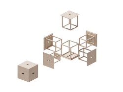
The design is inspired from Cube 6 design by Naho Matsuno. It is a great way of how to keep large amount of stools without taking much room. These can be used both as a cube and disassem¬bled to function as six separate stools. The structure for each stool is different, so they can fit properly when assembled in a box. The material is timber to fit in the overall building concept. I chose to avoid screw fixtures as much as possible so the material can be easily disassembled and reused after stools life cycle.
Posted 17 May 2021 18:13
// Corner model : The knot //
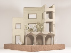
This corner of is located approximately in the middle of the building. It is a place, where multiple routes and purposes meet [archway, corridors, main entrance] and ties in a knot. View from E side.
Posted 17 May 2021 18:13
// Envelope studies //
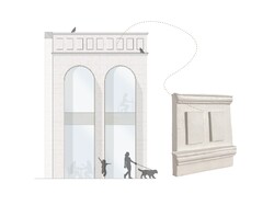
The developed envelope design. The sandstone cladding is mixed with extended glulam window frames. The parapet is ornamented with cornices and square details largely inspired from surrounded buildings.
The parapet 1:10 model shows the exploration on clay material in detail after the lecture Out of the Studio. Into the Factory.
Posted 17 May 2021 18:13
// The big pebble :: Green atrium //
The projects agenda works towards developing multiple experiences for people by the path they choose. However, most paths and entrances are leading to The Big Pebble- the green atrium and main staircase. It is the place that collects largest mass of people internally, and even allows curious bypassers to enter it.
The picture shows how the building is divided into masonry and glazed blocks.
Posted 17 May 2021 18:12
// Elemental studies :: Arch and roof //
Archway: the archway is inspired from a structure from Al Islah Mosque by Formwerkz, 2015. It is a glulam structure with waffle slab and inbuilt light tunnels to lit the dark areas of archways from above.
Roofs: this diagonal zig-zag roof type extends over the main staircase. This allows much more light into the centre of the building and gives the feel¬ing of the masonry block slowly opening up onto the atrium zone. The same pattern is repeated for gallery atrium roof.
Posted 17 May 2021 18:12
// Feels :: Precedent studies //
Exterior: simple, natural, earthy tones, clear, masonry x lightweight
Interior: simple, natural, warm, minimal, clear, cozy
Posted 17 May 2021 18:11
// Technical position //
Tehcnical position of the project consists of three main aspects:
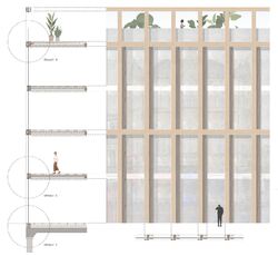
-to let the building structure mirror the programme [picture]: glazed structures and larger windows identifies public place in a building, whereas masonry: private;
-localization: looking for local materials and manufacturers
-minimal co2 emissions x maximal performance: using low conductivity materials, as well as reusing materials rather than recycling due to pollution and lowered performance
Posted 17 May 2021 18:11
// Window studies :: Reflecting the context //
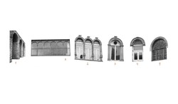
To develop fenestration proportions, I created a diagrammatic window analysis that explores the window tendencies in the local surroundings. This strategy would allow the upcoming building to camouflage into the context better.
Posted 17 May 2021 18:11
Epilogue
Posted 12 May 2021 14:37
Beautiful Chaos: As we finally draw the curtains, we hope the journey in finding the beautiful chaos and the moments in the city has brought us all to appreciate the erased, concealed and unbuilt. Where deep falseness lies upon our imagination, we are able to construct an interface between the city and the room. It is in these mundane scenes, we see the perfect depiction of chaos; a wonderful presentation of drawings of people, space and time into their narrative structure.
Posted 12 May 2021 14:36
Beautiful Chaos: As we finally draw the curtains, we hope the journey in finding the beautiful chaos and the moments in the city has brought us all to appreciate the erased, concealed and unbuilt. Where deep falseness lies upon our imagination, we are able to construct an interface between the city and the room. It is in these mundane scenes, we see the perfect depiction of chaos; a wonderful presentation of drawings of people, space and time into their narrative structure.
Posted 12 May 2021 14:35
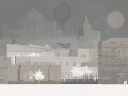
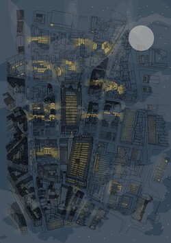
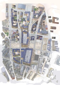
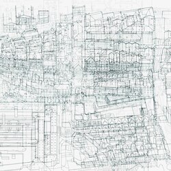
Beautiful Chaos: To describe our project as a series of spaces and its simultaneous connection to the city and the chaos and narration of the city, we were thinking of that one image that could help us lay everything in place. We felt that it should be a hypothetical image or something that is surreal and imaginary. It is like how we begin our journey with the Invisible City, something so ever surreal; we want to introduce this tension between the stories and the reality.
This piece seeks to distort the present, revealing snippets of the past whilst injecting the new possibilities of the emerging future. It is indeed the encounter of timelines that we wish to portray and what you receive in exchange is this beautiful chaos within the City of Bradford.
Posted 12 May 2021 14:34
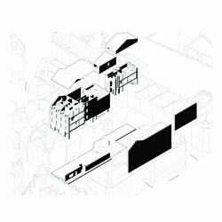
Axonometric: One of the buildings in our Communal Villa network.
Posted 12 May 2021 14:33
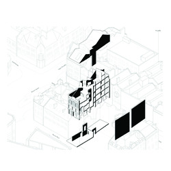
Axonometric: One of the buildings in our Communal Villa network.
Posted 12 May 2021 14:33
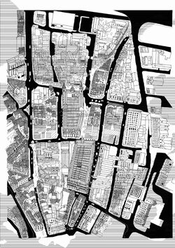
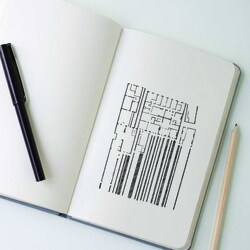
A work in progress: Inspired by the visual ambiguity of invisible Cities, this is an experimental montage of handrawn pieces to express the parallel layers that is a fleeting apparition; ephemeral and ethereal.
Posted 12 May 2021 14:30
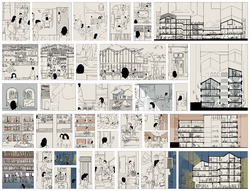
Experimental: This illustration was initiated by collaging the existing floor plans of the Communal Villas (all drawn to the same scale). We realised how the dimension of things act as a point of transfer between buildings and how we could make some sense of all the small works while also trying to use them together to create a little city that made sense too. This experimentation expanded to form a metaphoric expression of the inbetween spaces in the notion of parallel layers.
Posted 12 May 2021 14:28
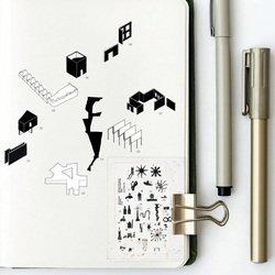
Catalogue of statement pieces: Inspired by John Hejduk, these were pieces selected from our many interventions and would create a certain sequence in space as one takes on a route that intertwines from private to public spaces. These are the statement pieces that have been catalogued however we would expect this catalogue to be expanded as time passes by; hoping the city will be filled with insertions like these.
Posted 12 May 2021 14:25
Looking at details: Along the way we were very critical in our presentation of the monochrome drawings and used it as a means to communicate the honesty in our drawings. It occurred to us that working with black and white either turn spaces on or shut them off- and it is about finding harmony in dichotomy.
Posted 12 May 2021 14:23
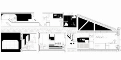
Zero Axonometric: The creative process always begins with a good old sketch where a constructive, compositional and symbolic thought is born.
Posted 12 May 2021 14:22
Zero Axonometric: The creative process always begins with a good old sketch where a constructive, compositional and symbolic thought is born.
Posted 12 May 2021 14:22
Zero axonometric: The creative process always begins with a good old sketch where a constructive, compositional and symbolic thought is born.
Posted 12 May 2021 14:21
Summary of 3.1. final iteration with sketch interior views.
Posted 8 May 2021 19:02
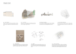
The timeline summary of design steps in term 1.
Starting from the site analysis, into the programme development, and initial design ideas.
Posted 8 May 2021 18:53
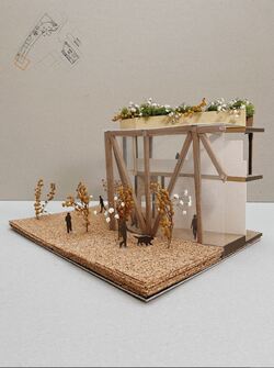
The corner model was made to physically recreate the atmosphere that the building would convey. The open gallery walk can
visibly decrease the sizing of the building because of its glass envelope and allows plenty of the views to the inside
where the artwork would be placed.
Posted 7 May 2021 15:30
Envelope for the Assembly building from Rawson's square
Posted 7 May 2021 15:27
// Experiences :: The explorer //
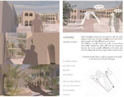
I created exemplary characters to show how the same building can be seen by different people by route they choose. All the voids the building creates are connected, but just the curious people will find out the other side of the building. The doors are open, will you look inside?
Urbanism works when it creates a journey as desirable as the destination Paul Goldberger
Posted 27 Apr 2021 09:06
// Public seating structure //
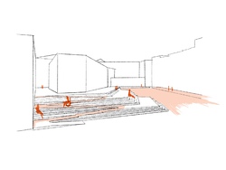
One of the most efficient landcape design tools, especially in such sloping site, is stairs. To create them more functional, they would work as a seating in the public realm scheme. To make it accessible, a large ramp and a secondary ramp incorporated in the stair design is installed.
Posted 27 Apr 2021 09:05
// Material reuse //
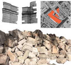
As there is a large part of the buildings that will get demolished in order to open the site for public, considerable amount of waste would be created. To reduce the amount of waste, the sandstone bricks from demolished blocks will be reused in the upcoming building.
Wainwright questions: could we continue to make and remake our cities out of what is already there? (Wainwright, 2020). He mentions a future where every part of a building would be treated as a temporary service, rather than owned.
Posted 27 Apr 2021 09:05
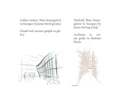
// Precedent :: Neue Staatsgalerie in Stuttgart by James Stirling [1984] //
Staatsgalerie is an example used for multiple aspects of the upcoming building. First and foremost, it is planned with narrow paths in between building blocks so that anyone can cross right through the building. Besides, the large gallery glazed wall shows how a space can be inviting just because of its materiality and application of it.
Posted 27 Apr 2021 09:02
// Voids to shape solids //
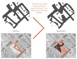
They [the courtyards] make the primary space; the rooms (..) are leftover space [Venturi, 1984:80]
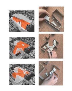
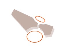
Inverted Nolli maps to explore massings and how voids can influence solids. Now, pedestrian street tresholds are more open and inviting, creating a larger overall area as well. There are a few pathways leading to the buidling core- the green atrium. These are for more private accesses, thus created quite narrow and less inviting. Therefore, the building controls the pedetrian flow.
Posted 27 Apr 2021 08:59
// Iterations :: process and final //
Starting from a simple building divided in two blocks that creates a large pocket for a public square.
Continuing with a connectivity from the public realm to the semi-private atrium through pathways.
Sized down massing according to building programme and planning; developed back of the building so it functions as a square from both sides and is connected in the middle.
Posted 27 Apr 2021 08:59
// Brainstorm :: Separated yet connected //
Cutting the building in blocks so it creates pockets functioning both as public or private square, so both bypassers and building users can enjoy the space properly. Pockets to be connected with narrow pathways.
Posted 27 Apr 2021 08:53
// Manifesto :: THE VOIDS TO SHAPE THE SOLIDS: GUIDING THE PEDESTRIAN FLOW //
After analysing the site, I came to a conclusion: site G has great potential in becoming a public square for people, for example, it already functions as a pedestrian street, it just needs arrangements in the existing structures.
In the end I ask myself: how to create a multifunctional building in the core of the town, that both accommodates public and private realm? To make the most of it with the experimentation of massing: so it creates different experiences based on the route one chooses to take and the places one chooses to visit
Posted 27 Apr 2021 08:51
// Window analysis //
Through site walks I noticed the tendency of arched window frames. The tendency can be an inspiration for the fenestration of the upcoming building.
Posted 27 Apr 2021 08:51
// Serial vision //
Series of site sketches moving from the Darley St, which is full of shops, making it a popular route of how to approach site G. Afterwards, the visions move onto the the Rawson Square, where sandstone architecture and the remaining part of Rawson hotel opens up. The route continues to explore the pedestrian street and the glazed passage of B&M store.
Posted 27 Apr 2021 08:47
// The first meeting with the site :: An abstract photocollage //
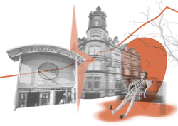
Once entering Bradford, one might notice the elevation towards top of town. Another significant factor is the beautiful sandstone architecture, which it is often constrastly juxtaposed with contemporary commercial structures.
To be built for people, both users and bypassers: what are they looking for in Bradford? There are some things I felt the town is lacking, such as greenery. The top of town would highly benefit from an attraction point in the core of the city, such as a public square for people to take a break or socialize.
Posted 27 Apr 2021 08:37
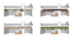
The main entrance is chosen to have a visually appealing look, so people are interested to see what more the building brings, thus iterations with possible entrance designs are created.
1 / Melted metal/mirror
The entrance would have melted metal detailing, similar to the precedent of Manchester Library Walkway. Although the mirror effect would brighten the area, the metal would feel colder compared to the exposed timber columns.
2 / Wood triangles
Choosing the same material that the building already has in its design creates a sense of connection. However, it can seem too similar.
3 / Flowing wood
Similarly to the melted metal,the ceiling creates an organic shape and connects with the exposed glulam columns of the building.
4 / Greenery
To further keep the green roofs in relation to the building design, greenery could also be implemented into the interior look of the building. Bringing nature within the building.
Posted 26 Apr 2021 11:46
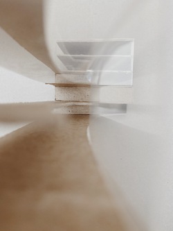
Sktech model to show the interior of the created void.
A void would open up the possibilities for larger sculptures and would enhance the idea of a 'open walk'. The building from the outside would seem smaller in scale as a large part of the building is glass.
Posted 25 Apr 2021 13:25
PS2
The FUSE Institute
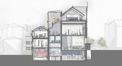
A glimpse through. Showing the proposed long section of the FUSE Institute gives an idea to the relationship between spaces and activities throughout. The new additional staircase provides access to the loft floor, circulating around a new sculpture gallery. The combination of both double and single height spaces provides atmosphere, creating appropriate climatic spaces; whether that be acoustics for the performance venue or grandeur for the entrance.
Posted 25 Apr 2021 13:00
PS2
The FUSE Institute
'the primary task lies in accommodating the program elements of use within this pre-existing form.' Wong. L (2016)
The initial programme is to be defined by the existing constraints of the Church Institute building. From this analysis we were then able to remove with understanding and propose appropriate interventions that consider the public and private interface accordingly and inhabit a programme that works for the FUSE Institute and its new functions.
Posted 25 Apr 2021 12:42
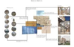
One of the six pages of Tasklet 7, the material selection. Materials are chosen by examining the existing materials on the site, thus creating building that would fit into the context and celebrate the closer Grade II lister buildings.
Posted 18 Apr 2021 13:40
The Big Pebble
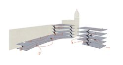
Movement diagram through the site into the building.
Posted 18 Apr 2021 13:39
CiA PS2 Adaptive Reuse
Fuse Art Space
Mise En Scene
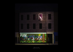
This proposal for FUSE counters the defensive, non-transparent architecture of conventional art institutions. The Northgate 'drawer', when used as a gallery, makes large installations visible from the street. Artwork, performances and events can be experienced even from the public realm of Top of Town.
Reference: Presence / Ebony G Patterson
Daryl Law
Jin Lee
Posted 14 Apr 2021 22:27

CiA PS2 Adaptive Reuse
Old Dog, New Tricks : The Greyhound Baldachin
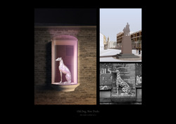
The dalmatian on the Northgate building is in fact a greyhound that once adorned a beer house called The Greyhound Inn.
The adjacent building had been the Bradford School of Industry, a Charity School founded in 1807 maintained by public subscriptions. After the Education Act of 1891 brought an end to charity schools (as children could then attend other free schools), the buildings were sold to D.W. Asman, an estate agent, who demolished both the school and the inn and replaced them with the present structures. The greyhound was reerected high above the building between two windows - reflecting the popular practice of preserving artefacts of previous buildings in Victorian architecture.
We think that this interesting part of Bradfords history should also be experienced from within the building. Hence the idea of transforming one of the windows into an external display case.
This gesture subverts the binary of indoor and outdoor spaces. It also partly critiques the museumification of historical buildings whose architectural form are rendered 'untouchable'.
We propose to repaint the greyhound sculpture in chrome and house it in a baldachin that enriches the architecture of Northgate and acts as a landmark. Curved bricks interface the baldachin with the existing built fabric.
Daryl Law
Jin Lee
Posted 14 Apr 2021 22:27
CiA PS2 Adaptive Reuse
Fuse Art Space
Draw the Curtains
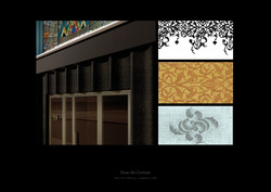
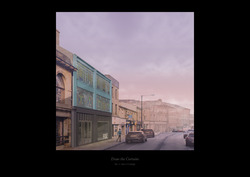
The curved frames and geometric floral patterns of the Art Deco stained glass windows facing North Parade are echoed in the new shopfront. Scalloped panels are imprinted with textile patterns from local mills preserved in the Bradford Textile Archive.
The new sculptural architecture establishes continuity with the existing glass-and-metal ornament, as well as Bradford's industrial heritage.
Daryl Law
Jin Lee
Posted 14 Apr 2021 22:26
CiA PS2 Adaptive Reuse
FUSE x Arma
The Anti-Institution
https://youtu.be/sXOvKc5UbYY
https://youtu.be/RQJRxAjVnCc
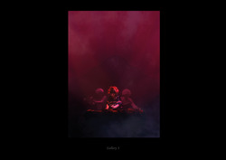
FUSE (and other independent arts venues of Top of Town) has always been a distinct counterpart to the larger cultural institutions of Bradford Bowl. At its heart is an enriching, engaging environment, where artists take ownership of its space to create visually and sonically rich worlds. This is a constant point of reference in our architectural impressions.
This visualization references Arma Agharta, one of the many artists who left their mark at FUSE.
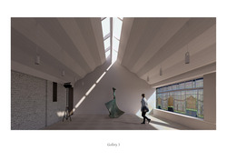
The pleated acoustic ceiling of Gallery 3 is a kinetic architectural element. The sunshade panels at the ridge can retract to create an enclosed environment for music and film events.
Daryl Law
Jin Lee
Posted 14 Apr 2021 22:25
CiA PS2 Adaptive Reuse
FUSE Art Space
Gallery 3
Art gallery #3, in the topmost floor of the North Parade block, is geared towards music and film events, so we made it more bright and airy. A new ceiling, defined by pleated panels, brings new interactions of texture and light with the existing stained glass windows and the brick wall. The pleated ceiling has a pair of integrated skylight shade panels that open and close depending on different events. The white timber panels conceal acoustic and insulation layers. In the morning hours, the stained glass windows could cast coloured light to the walls and floors.
Daryl Law
Jin Lee
Posted 14 Apr 2021 22:25
CiA PS2 Adaptive Reuse
FUSE Art Space
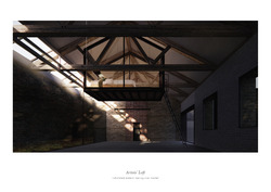
Interiors - Studio Loft (WIP; unfurnished)
Inserting the lightwell allows this space to still receive daylight in the afternoon. The visible roof structure and the spaciousness of this space make it ideal for artists' studio/workshop.
An open plan could allow visitors to freely interact with the artists and their work. The sleeping boxes for artists in residence, each a room-in-a-room, nested between the roof trusses, adds to the charm of this space.
The lightwells glass enclosure is integrated to the existing roof trusses. Transom windows nested between the trusses open to facilitate a combination of stack and cross ventilation when they act together with the vent panels of the windows across the room.
Daryl Law
Jin Lee
Posted 14 Apr 2021 22:24
CiA PS2 Adaptive Reuse
FUSE Art Space
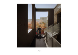
We want our architectural additions to bring disparate pockets of space into a more complete whole. Within them they are also reminded of their proximity to the city and its natural elements.
The Shelf is the main circulation core; it demonstrates the tectonic junction between the old and the new. Upon arriving at the topmost landing, the visitor is greeted by three planes framing views of the sky and the courtyard. The space is bright, airy and animated with dappled light filtered through the trees. It lends a moment of delight, before the visitor moves into a different atmosphere of the interior rooms.
Daryl Law
Jin Lee
Posted 14 Apr 2021 22:24
CiA PS2 Adaptive Reuse
FUSE Art Space
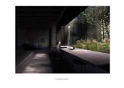
Courtyard Drawer - interior view
Part of our reuse strategy and our architectural insertions of 'drawers' and 'shelves' is to reintroduce visual and physical connections to the disused courtyard.
Setting views out through the picture window level with the courtyard heightens the sense of being submerged in the ground and surrounded by nature.
The datum from which the floor is lowered is expressed in the junction between the existing brick wall and the concrete base.
Daryl Law
Jin Lee
Posted 14 Apr 2021 22:23
CiA PS2 Adaptive Reuse
FUSE Art Space
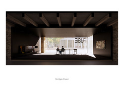
Northgate 'Drawer'
The Drawer as an architectural fragment is the new shopfront facing Northgate. Coming in from the foyer, one catches glimpses of the dining area and the spaces beyond through a long aperture. The base of the Drawer is gently lit, beckoning one to step inside. A slender ledge greets the visitor, and it holds books and artwork. One sees simultaneously the bustling street on the outside and the activities inside FUSE.
Daryl Law
Jin Lee
Posted 14 Apr 2021 22:23
CiA PS2 Adaptive Reuse
FUSE Art Space
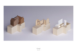
Maquettes
The three buildings on the site were separately built over time. They partly share loadbearing walls, but are not connected to each other. The courtyard that is surrounded by the buildings stood a desolate and unloved part of the site.
We propose new openings that are structurally reinforced to create physical connections between these buildings, Closer to the ground, the large architectural fragements, the Drawers, help turn the courtyard and the street into more active spaces.
The ground of the art space is sculpted into cascading plinths that lend a continuous movement through all three buildings. At key points it rises to receive the new architectural fragments.
The lightwell channels daylight into the deepest parts of the rooms. The Shelf is articulated as a stack of drawers that make gestures towards the ground and the sky. They are accentuated by a gentle outward curve from the plane of the existing wall.
Daryl Law
Jin Lee
Posted 14 Apr 2021 22:22
CiA PS2 Adaptive Reuse
FUSE Art Space
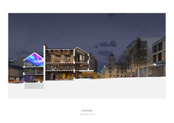
Principal Section (WIP_crop)
This principal section illustrates how our proposals - the new venue for FUSE and the residential development (PS1) - could enhance the night life and public realm of Bradfords Top of Town.
Warm lights from the ground floor commercial spaces illuminate the pavements. Diners sitting by the courtyard picture window are offered a view of the lush lit landscape.
People coming onto the studio loft can wonder around the open-plan workstations and display shelves whilst catching views of the sleeping boxes (for the resident artists) nested between the roof trusses.
The voluminous Gallery 3 comes alive with sound, light and motion during music, film and art performances - sometimes all three at once.
Daryl Law
Jin Lee
Posted 14 Apr 2021 22:22
CiA PS2 Adaptive Reuse
Redeveloping Top of Town
The proporal is situated within Bradfords historical and cultural point of interest (Oastler Square and Rawson Hotel), and also future development (Semi pedestrianized Nutter Square and Pavillion Cafe / Commercial Area from PS1).
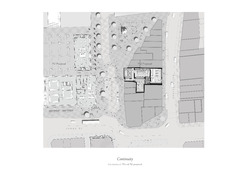
The site plan illustrates the buildings of our proposal as fields of potential energy that directs and gathers people. It portrays synergy of the future Nutter Place and informs how our proposal could be part of the public realm.
Daryl Law
Jin Lee
Posted 14 Apr 2021 22:21

CiA PS2 Adaptive Reuse
Concept
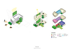
A series of insertion improves the connection between interior and the city.
Front Drawer holds large glazing revealing activity within, also opening up to the 360 view from Oastler Square to Cafe Pavillion and bustling activity from John Street.
Side Drawer frames view and draws user to inhabit the space hence
allow them to be closer to nature at the shade garden.
Shelf manages level difference between North Gate block and North Parade block.
Light well at the centre block allows light to wash the existing brick wall, breathing new life on to the old textured wall.
Connectivity
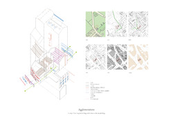
At ground level, sequence of platforms negiotiates the 1.5 fall from North Gate to North Parade. Ramp leads to the North Gate drawer offer viewing point higher than street level. Middle block is lowered below courtyard level.
Moving through the different platforms, series of spaces with compression and release is curated. Openings are framed and controlled to highlight the specific moments in the building, as visitors crossed into different parts of the building.
At upper floors, circulation axis is flanked by light wells and glazing, allows users to register either the textured brick wall or outdoor shade garden space.
Jin Lee
Daryl Law
Posted 14 Apr 2021 22:20

CiA PS2 Adaptive Resue
Survey : Existing Architecture
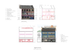
NORTHGATE ELEVATION
The Northgate facade is dilapidated - much of the windows are are damaged or obstructed by banners and boards. There is a juxtaposition between the decay of the building and the accretion of objects.
The mismatched proportions of the ground floor envelope and the exposed transfer beam above the passageway indicate the possibility of designing a modern shopfront without compromising the existing building structure.
NORTH PARADE ELEVATION
The most striking (and valuable) feature of the North Parade facade are the Art Deco stained glass windows. These north-facing openings are much larger, most possibly to admit more daylight.
The structural bones of the North Parade block appear to be covered by wooden panels painted in blue, and are showing wear and tear in several spots.
Considering the narrower street space along North Parade, we would propose a modern but more understated shopfront, in a similar architectural language to the Drawer facing Northgate.
Daryl Law
Jin Lee
Posted 14 Apr 2021 22:19

CiA PS2 Adaptive Reuse
FUSE Art Space
Survey : Building Section
NORTHGATE BLOCKS
The blocks constructed with 19th century construction methods: structural cavity wall with timber deck floor.
Roof language suggests it has been adapted to accomodate the wall that separates the two blocks. Therefore we see roof well integrated in the middle block whereas gabled roof are angled in a strange geometry. The North Gate-facing block catches evening light. Despite the openings facaing the courtyard. no evidence of openings on the roof or wall for the middle block, therefore interior is poorly lit.
NORTH PARADE BLOCK
North Parade block is of modern construction methods while retaining the structural front facing wall. Active usage of the space ensures well maintenance of the space.Sky light introduced and small alterations to the facade are made. Abundant sunlight into the spaces promotes active business space and healthy working environment.
THE MIDDLE LANDSCAPE
At a greater spatio-temporal scale, the proposal responds to the middle landscape of Northgate/North Parade. The site exists somewhere between peri-urban agriculture and the industrial remnants of urban sprawl. Our transformation of the agglomeration of structures on site could bring to fore their unique quality as thresholds to the city.
Daryl Law
Jin Lee
Posted 14 Apr 2021 22:18
CiA PS2 Adaptive Reuse
FUSE Art Space
Survey : Site Section
The site is flanked by Northgate and North Parade, two of the oldest extant routes into Bradford city centre. As the city densifies, the streets and the buildings facing them have alternated between an extroverted character and being a back-of-house space.
The site today has a peculiar juxtaposition of extroverted and introverted character. Oastler Square and the space of Rawson Road (serving Oastler Shopping Centre) are dedicated for public activities, yet the interior space of the disused warehouse building is completely disconnected from this public realm. In contrast, the building facing North Parade has been well used, housing small businesses and a bar-cum-music venue, yet North Parade appears to dedicate more of its space for vehicle parking than peoples experience of walking or idling in the city.
Daryl Law
Jin Lee
Posted 14 Apr 2021 22:16
PS2 Adaptive Reuse
Sensitivity and Recollections
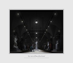
Transformation is the opportunity of doing more and better with what is already existing... The demolishing is a decision of easiness and short term. It is a waste of many things - a waste of energy, a waste of material, and a waste of history. Moreover, it has a very negative social impact. For us, it is an act of violence
Lacaton and Vassal, 2021 Pritzker Prize Winner
Danito Oledan
Kathleen Karveli
Posted 14 Apr 2021 16:34
PS2 Adaptive Reuse
Content and Approval
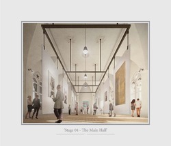
The final stage is to Verify, present your efforts and test the validity of your ideas, whatever you produce, you can deliver and exhibit. Ascend the Institution, just before the Roof Garden you will arrive at the Main Exhibition Hall, its hard to miss, its the grandest of space within the Institution, this is where you present, find content, receive approval, sense validation, however, dont forget that validation is
within, the Institution is more than just a destination to exhibit, it is a place which stimulates the journey of creativity.
Danito Oledan
Kathleen Karveli
Posted 14 Apr 2021 16:31
PS2 Adaptive Reuse
Comfort and Privacy
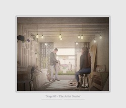
The third stage is to Illuminate, you have gathered all elements, you have prepared and have let your mind wonder, now proceed to create. Descend the Institution, at the rear building opposite the courtyard is the location for the Artist Studios, in here you will
find comfort and privacy, a space for yourself, its flexible sliding doors allows you to either isolate or observe, however, and most importantly this is a space to create.
Danito Oledan
Kathleen Karveli
Posted 14 Apr 2021 16:30
PS2 Adaptive Reuse
Warmth and Escape
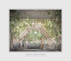
The second stage is to Incubate, plan your distractions and mentally process unconsciously. Explore the Institution, at the highest level you will find the Roof Garden, you will feel warmth even if its enclosed, you have escaped the hastiness of the city, you are now free from your thoughts. Up there in the Roof Garden, you should let your mind wonder, let go of any anticipations and experience the space with your full consciousness.
Danito Oledan
Kathleen Karveli
Posted 14 Apr 2021 16:28
PS2 Adaptive Reuse
Knowledge and Awareness
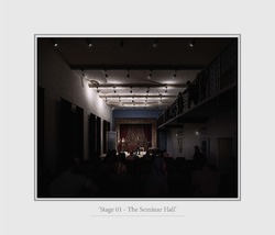
The first stage is to Prepare, to compile your knowledge and to accumulate intellectual resources. Head to the Institutions rear building and you will arrive at the Seminar Hall, it offers an environment where one can construct new ideas, learn from others who are also willing to learn, a space which offers flexibility of use;
from seminars, to lectures, to performances. With whatever use and whoever within, you will leave with a new awareness and perception.
Danito Oledan
Kathleen Karveli
Posted 14 Apr 2021 16:27
PS2 Adaptive Reuse
A Place for All
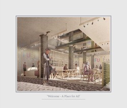
From Church Institute, to Fuse Institution, the building evolves into a place which serves the community, provides public service, a place in which artists can represent their ideas, escape from reality and let their minds wonder, a building that is more than just a shell. The building is open for all, therefore one should wonder and experience the diverse spaces the Institution offers.
Danito Oledan
Kathleen Karveli
Posted 14 Apr 2021 15:06
PS2 Adaptive Reuse
A Holistic Approach
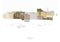
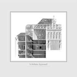
The opportunity for change and restoration was approached with a certain sensitivity and can be seen with the buildings section. An assertive control and limitation can be seen with the minimal changes and additions that can be seen throughout the building, only proposing major changes where necessary, such as the reinstating
of the roof and the retransformation of the façade. The new FUSE Institution as whole is an act of recollections, an act of respect, an agent for sensitive restoration.
Danito Oledan
Kathleen Karveli
Posted 14 Apr 2021 14:29
