PS2 Adaptive Reuse
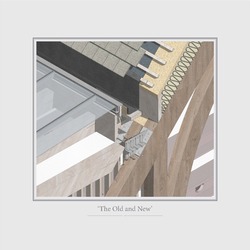
The Old and New
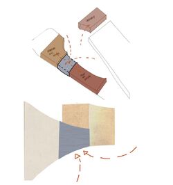
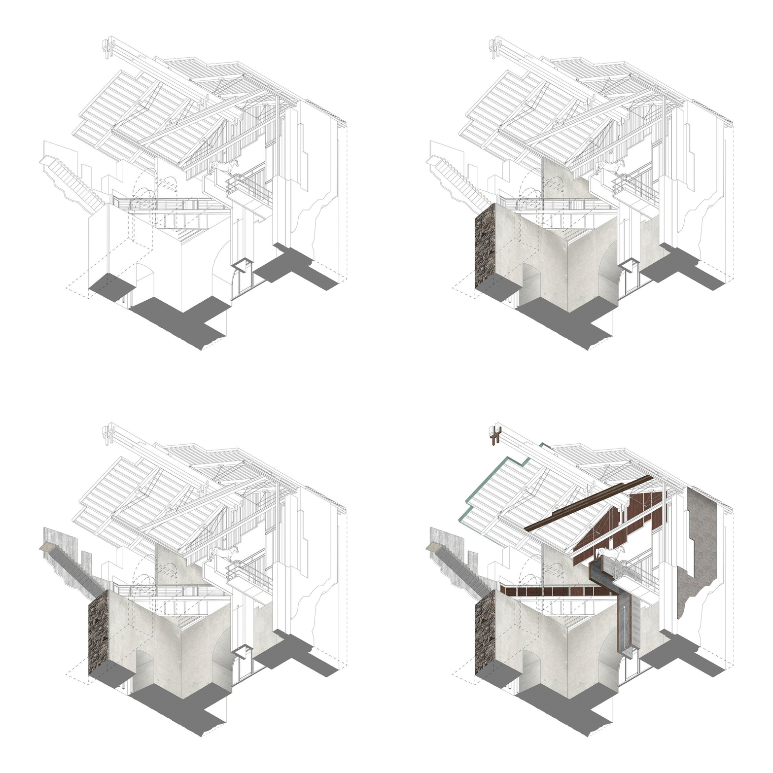
Creating a clear contrast and distinction between the existing and proposed had always been our overarching approach in constructing the Institution. This approach is highlighted more so in the detailed junction of the roof and how the proposed structures are built and attached around the existing hammer beams. The additions and repetitions of the proposed structure provides a clear intervention,
it does not pretend to be old, it is distinct, it exposes the traces of work from the past and present, it gives new life to what was then a forgotten space.
Danito Oledan
Kathleen Karveli
Posted 14 Apr 2021 14:28
PS2 Adaptive Reuse
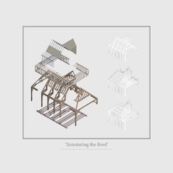
Reinstating the Roof
Using one of Phillips Roberts Concepts of Conversion, the reinstating of the roof is approached by building around the assumed existing hammer beam structures. An approach which respects the
existing and creates a space in which the additions becomes a backdrop to the remnants of the past and allows it to be the spatial centre of focus. By building around the existing, a contrast and distinction between the existing and proposed is also highlighted
through their detailed connections, an act of display and discovery.
Danito Oledan
Kathleen Karveli
Posted 14 Apr 2021 14:27
PS2 Adaptive Reuse
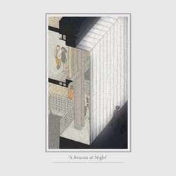
A Beacon at Night
In this re-transformation, first,
we traced the grid, the original and the existing,
proposing a proportion which respected the past
and reflected its contemporary context. Then, a new
materiality, the use of polycarbonate façade allows
daylight to flood in, while blocking UV and infrared,
it allows the façade to be open yet provides mystery
to the public from the outside with its controlled
opaqueness. By day it portrays an introverted
architecture, however, by night it acts as a beacon in
North Parade.
Danito Oledan
Kathleen Karveli
Posted 14 Apr 2021 14:26
PS2 Adaptive Reuse
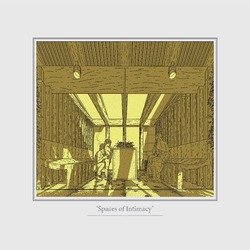
Spaces of Intimacy
Through the new additions, we can create new functions. The reinstating of the roof lends itself to be a garden, full of daylight, tucked away from the hustle of the city. The roof garden offers a place to Incubate, to let ones mind wonder, to imagine, to be intimate with ones being. It provides a phenomenological experience, where all the senses are in action, from the smell of the plants, the acoustic of the wooden floors, the tactility of the furniture, the taste of air, to the warmth and escape the space provides.
Danito Oledan
Kathleen Karveli
Posted 14 Apr 2021 14:23
PS2 Adaptive Reuse
Exhibit by Night
Phillipe Roberts use of the term Palimpsest as an architectural concept intends to identify the traces of the buildings past, overlaying its history and alterations within the buildings fabric, then celebrating it. Through the act of layering as forwarded by Phillippe Robert, we were able to fully understand and identify the opportunity for changes and restore the decayed grandeur of the building.
Danito Oledan
Kathleen Karveli
Posted 14 Apr 2021 14:22
PS2 Adaptive Reuse
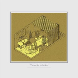
The Artist in Action
A gallery, an art space, a performance venue. The current Fuse Art Space within Bradford
offers a space in which artist can host their exhibitions. However, Fuse has the potential
to be so much more, the potential to be an Institution, to represent the creative product of
Bradfords multicultural context.
Danito Oledan
Kathleen Karveli
Posted 14 Apr 2021 14:18
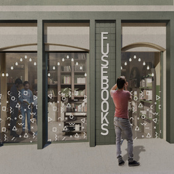
Identity
One of the main focuses in the development of the proposal consisted of defining the identity for FUSE Collective and its appreance on the street frontage.
Alexandru Munteanu
Diana Ursachianu
Posted 12 Apr 2021 15:42
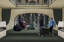
Performance space
The proposed performance space is located at the first floor, establishes new connections with the streetscape.The large window is dynamic, offering the opportunity to create either intimate perfomances or to leave it exposed, animating the street. When not in used, the stage area is used as gallery space.
Alexandru Munteanu
Diana Ursachianu
Posted 12 Apr 2021 15:40
Atrium Views
The proposed atrium intends to act as a connecting element both horizontally and vertically within the layout of the building and at the same time mediation between two general atmosphere 'rooms', one on Darley St and the other on Piccadilly St, allowing vantage points that divulge the activities held within the spaces. Viewports are created towards the artefact of the programme, the Vertical Library, reconnecting the visitor spatially.
Alexandru Munteanu
Diana Ursachianu
Posted 12 Apr 2021 15:37
Tectonic Study - Vertical Library
Through an iterative process the
vertical library and its monolith have
been checked to meet the regulation
standards, enhancing some of the
elements for design purposes. The
stairs that act as a processional route
have railings and ballustrades on both
sides, maintaining a simmetry of design
which is complemented through the
inclusion of ceramic tiles picturing the
ornament developed in the process.
The book shelves have been placed at
a height within reaching possibilities,
following through their expression the
course of the stairs. This is linked to a
hit and miss principle where towards
the end instead of a shelf there is a
viewport placed, bringing back the rules
established.
Alexandru Munteanu
Diana Ursachianu
Posted 12 Apr 2021 15:34
Tectonic Study Area
The materiality of the building on
Piccadilly St side is intended to
act as a more industrial approach,
continuing the existing facade typical
to victorian warehouse designs
with metal elements. The contrast
is assured by the colour palette in
the elements, acting as a definitory
principle for the identity of FUSE
occupation.
While the structure is generally preserved,
being complemented only by new finishes
that hide new thermal lines in order to
increase energy performance, elements
such as timber joists and internal existing
walls are maintaned exposed to ensure
a contrast between the new and the old
fabrics. The extension is defined by a
loadbearing timber frame sitting on a
reinforced concrete slab.
Alexandru Munteanu
Diana Ursachianu
Posted 12 Apr 2021 15:32
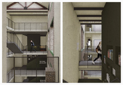
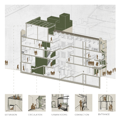
Vertical Library
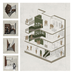
The library is a motif of the proposed building, expressing verticality and providing a clear reference point in the narrative through the building. The proposed massing focuses heavily on Schumachers concept of the contrast between the solid and the void. The stairs wrap around a monolith, creating a series of double height spaces, intimate seating
spaces, cross connections and viewports. The form of the monolith changes on all the levels in order to provide functional space on all the levels. Nonetheless, it remains constant to the human eye through the use of materials. Its position allows constant connection with the Darley side through the atrium.
Alexandru Munteanu
Diana Ursachianu
Posted 12 Apr 2021 15:31
Narrative, connections and atmosphere
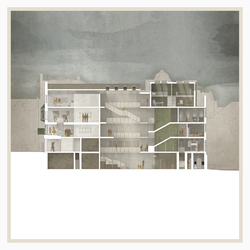
Architecture, more fully than any other art forms, engages the immediacy of our sensory perceptions. The passage of time; light, shadow and transparency; colour phenomena, texture, materials and detail all participate in the complete experience of architecture.
Holl, S. - Questions of Perception: Phenomenology of Architecture (1994)
The section highlights the hierarchy of spaces and the connections established, emphasising the role of light in creating the atmosphere of building as a whole.
Alexandru Munteanu
Diana Ursachianu
Posted 12 Apr 2021 15:31
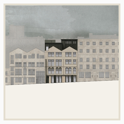
Picadilly Elevation
Piccadilly St side takes a similar approach
on activating the ground floor, though
reverted, having columns that act as
an extrusion. The flatter layering of
the facade is therefore complemented
and activate more from the side on
the streetscape, acting as a beacon to
attract the visitors. This treatment is
connected to the extension design, that
follows the grid of the existing elevation
as well, having a slight setback that
does not act as a heavy addition to the
frontage.
The intent of the extension is to mediate
the difference of height between the
adjacent building, acting as a gradient
that complements the streetscape.
An addition to the design is the
petrusion of the existing pitch to insert
a fenestration unit that acts as a seating
bay at the top of the building, creating a
vantage point.
Alexandru Munteanu
Diana Ursachianu
Posted 12 Apr 2021 15:30
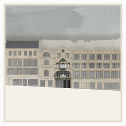
Darley Elevation
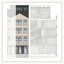
On Darley St side of the building the
intent is to maintain as much of the
existing facade, reactivating the ground
floor in order to be more inviting for
the public. Similar to the contemporary
context surrounding the building, the
ground floor treatment follows a similar
rule, acting as a shopfront defined by a
horizontal banner that exemplifies the
identity of the space within.
Rich in ornamental string courses and
fenestration details, the ground floor
takes this pattern which is placed on
opaque panels that act as emergency
exit as well. The first floor window is the
main artefact of the facade, opening to
the streetscape, creating a connection
on two levels between the street and
interal activity.
Extruded signals are placed, working
in relation to the operable mechanism
of the first floor window, giving new
dimension to the facade when looked
at from the side.
Alexandru Munteanu
Diana Ursachianu
Posted 12 Apr 2021 15:30
Concept
Our aspiration is to create a multidisciplinary art centre that result in connections between individuals. We are addressing the dual aspect of the existing building by establishing cross connections between the two parts, treating them as one. The language of the building is influenced by the characteristics of the urban rooms, respecting the past by maintaining the existing fabric and empasising them through building up a contrast with new materials.
Following up the exercises using sensory words, it dictated the position of the spaces, letting the new functions of the building naturally blend within the existing fabric.
Alexandru Munteanu
Diana Ursachianu
Posted 12 Apr 2021 15:29
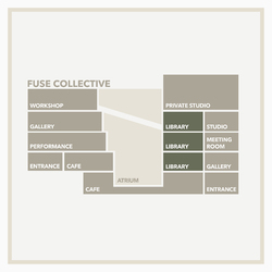
Programmatic Narrative
The atrium breaks and connects the two parts of the building in the middle. Gallery can be found at lower floors, taking into consideration quiet galleries on Piccadilly and interactive ones on Darley. The studio spaces are allocated on the Piccadilly side, but act as semi private.
The circulation of the types of users were considered, placing the public rooms in closer proximity of the proccesional stairs, while the creative studios, meeting rooms and individual studios are close to the Piccadilly core. Storage spaces for staff are found on all levels.
Alexandru Munteanu
Diana Ursachianu
Posted 12 Apr 2021 15:29
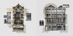
Atmospheric Collages
Early analysis of the context focused on
capturing the atmosphere defined by the
site and the presence of the facades on
the street frontage. As presented, the
diagrams created through the technique
of a collage aim to capture elements
of materiality, gridlines, symmetry and
particular characteristics of the double
aspect building.
Alexandru Munteanu
Diana Ursachianu
Posted 12 Apr 2021 15:27
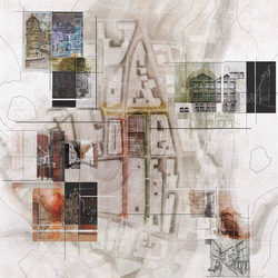
Urban rooms
In PS1 we focused on understanding the city through Khans theory about urban rooms. As our building has a dual aspect it makes us wonder: is the building sitting in between two rooms? If so, how could the character of the rooms influence our approach? We identified the differences between the two streets by using collage as a technique and by assigning sensory descriptive words to depict the atmospheric phenomena.
Alexandru Munteanu
Diana Ursachianu
Posted 12 Apr 2021 15:23

Manifesto
The overarching approach guiding the strategy of adaptive reuse for 46 Darley Street focuses on the concept of bringing new meanings to ordinary buildings, complementing the existing fabric with new programmatic functions that draw the attention to the particularities of the plot. While the building is part of a group of blocks in the urban grain, seamlessly being integrated between the adjacent fabrics, the intent is to complement the existing condition with a new purpose that reactivates the built environment and closely interacts with the street realm. Continuity of the purpose is intended to be assured by the adaptability of the old fabric to the contemporary needs, assuring flexibility for possible future changes.
The aim is to preserve and repair the present status of the structure by paying attention to the history of its upbringing and enhancing with new characteristics, all this acting as a bridge in the relationship between the past and the present. This in turn represents an aggregate in its contextual position, repositioning the building as a definitory artefact within the city.
Alexandru Munteanu
Diana Ursachianu
Posted 12 Apr 2021 15:20
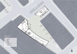
Ground floor plan.
Buildings form a public square that has to be later filled with landscaping to accumulate people.
Longer facade works as a glass gallery, which can be seen from the outside of the building. Reaching art from the outside.
Posted 8 Apr 2021 14:12
Building connection. In order to create a distinctive enterance that would still seperate BCS and Fuse art gallery, a glass enterance could be implemented as a seperation point between two uses of the building.
Posted 8 Apr 2021 14:07
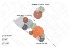
Adjecancy diagram showing needed areas in the building and their possible size, overlaping needs. Conclusion, BCS and Fuse art gallery mostly overlap in needs for auditorium and cafe, thus must be placed together.
Posted 8 Apr 2021 14:04
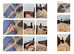
Editing the view - part B.
Unusual / First iteration was of an oval shape, thus
still maintaining the current two way pedestrian
street. However, the oval shape does not fit
into the wider context.
Pathway / Creating a cluster of buildings that would create
a particular pathway of unusual
forms. However, does not create a public accumulating square.
Cut out / Inspired by the first oval shape, the buidling
is cut out to create a larger gap on the site,
thus creating an enclosure.
Posted 8 Apr 2021 14:01
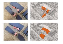
Spatial arrangement development.
Seperating the buildings into three seperate masses for each client.
Connecting the buildings, thus creating one larger mass and one seperate. Main goal is to form a public square, thus creating a circular 'cut out'
Posted 8 Apr 2021 13:58
Sheep, Industry and the City: Weaving a space of art production in Bradford
CiA PS2: 46 Darley Street
City to the landscape
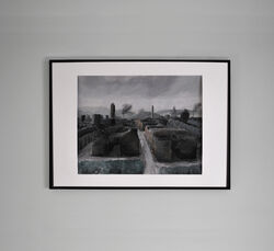
As a final reflection on the project we completed a painted visual that captures the ethos and key themes of the project yet places our proposal in the wider context of Bradford. It was important for us to return to the first image shown that depicts the city from the fields and landscape that surrounds Bradford looking towards the city. Opposing this, the final image captures a view out to the hills, just past the industrial mills, from the city placing you within its context.
Acrylic on linen paper 410mm x 310mm
Jonathan Barker
Jamie Reed
Posted 7 Apr 2021 18:25
Sheep, Industry and the City: Weaving a space of art production in Bradford
CiA PS2: 46 Darley Street
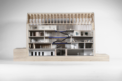
Refining space (1:50 spatial model)
Developing a sectional model expresses this movement between spaces and gives a coherent understanding on how the spaces connect and weave together. As a spatial translation of the section it refines the details of inhabitation in the assignment of spaces in the building, capturing the nature of the act of demolition and creating a new circulation space as fulcrum which, directing people around and between the two separate sides of 46 Darley Street.
Jonathan Barker
Jamie Reed
Posted 7 Apr 2021 18:10
Sheep, Industry and the City: Weaving a space of art production in Bradford
CiA PS2: 46 Darley Street
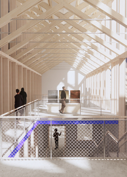
Gallery Space: Repeating elements into form
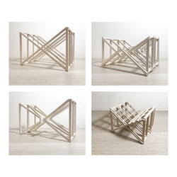
A large part of the design development was the articulation of the roof truss system that would frame the upper galleries and flood light into the spaces below. The trusses had to be lightweight and airy to enable light to pass through but be dense enough to be read as a form or a room. This new intervention would then be place on the existing walls to highlight it lightweight nature.
Jonathan Barker
Jamie Reed
Posted 7 Apr 2021 18:08
Sheep, Industry and the City: Weaving a space of art production in Bradford
CiA PS2: 46 Darley Street
Attitude to detail: Roof truss iteration models (1:50, balsa)
Jonathan Barker
Jamie Reed
Posted 7 Apr 2021 18:06

Sheep, Industry and the City: Weaving a space of art production in Bradford
CiA PS2: 46 Darley Street
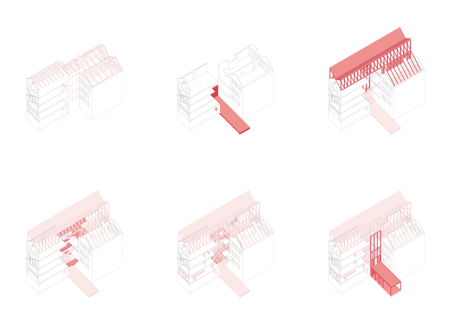
Construction sequencing
The construction sequencing for the new building requires firstly an in-depth audit and strategy for controlled demolition before any new ground work and foundations can be added. Once added and existing floors are supported by ackrow props, the new steel between floors can be installed to provide support at the end of the existing floors. Included in this steelwork is central steel staircase, this would be covered to provide protection as construction work continues.
After the steelwork is installed, the roof structure is fitted to ensure the building is watertight before any new finishings are installed. Once watertight, the new floors, new internal walls and finishings can be built. The last section to be built will be the light controlled gallery as the existing yard space will be needed for the aid of construction throughout the process.
Jonathan Barker
Jamie Reed
Posted 7 Apr 2021 18:03
Sheep, Industry and the City: Weaving a space of art production in Bradford
CiA PS2: 46 Darley Street
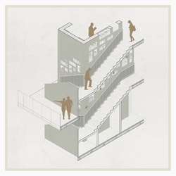
Collection of Axos: The External Gallery, The Stairwell and The Shopfront
Public entry into the building is accessed through a modest shop front entrance. Moving through this space, and into the central space, the dramatic fulcrum space is revealed to the visitor as views up between each floor is observed. The ground floor also makes use of the yard space and roof of the light controlled gallery by providing an external gallery used for different external mediums of producing art such as large scale sculpture and murals.
Jonathan Barker
Jamie Reed
Posted 7 Apr 2021 17:54
Sheep, Industry and the City: Weaving a space of art production in Bradford
CiA PS2: 46 Darley Street
The act of controlled demolition: Adapting to create new space
What we also gained from the analysis of Carlo Scarpas Castelvecchio was his controlled use of demolition that allowed the Cangrande space to be revealed to the visitor. It encouraged thoughts on how demolition can be seen as a controlled activity, accentuated to reveal the historic and new interventions in the building.
As such, we took a controlled demolition strategy to understand what spaces we wanted to create through this act. Again, identifying weakness such as light and access in the existing building audit informed many decisions in the act of demolition.
Demolishing such a large part of the existing building was possible due to the disposable and relatively unimportant nature of the building. Not being listed, it provided greater scope what we could demolish.
Jonathan Barker
Jamie Reed
Posted 7 Apr 2021 17:49
Sheep, Industry and the City: Weaving a space of art production in Bradford
CiA PS2: 46 Darley Street
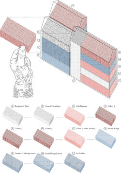
Splitting Stock: Assigning spaces
The next stage of our process involved splitting and assigning different uses and functions to the existing spaces in the building, alike the process of grading and sorting stock within wool production. We began by analysing each of the spaces and what they provided, much of the decision making was a result in seeing what the building wanted and understanding what space best suited the different functions needed in the art space.
Aiding the decision making, the existing building audit helped grade a number of the existing spaces; dark areas such as the basement level could be assigned to ancillary spaces and toilets, upper levels that gave more light were assigned gallery spaces to make use of the flood of light taller spaces the roof provided.
Jonathan Barker
Jamie Reed
Posted 7 Apr 2021 17:44
Sheep, Industry and the City: Weaving a space of art production in Bradford
CiA PS2: 46 Darley Street
Space as fulcrum: Castelvecchio, Carlo Scarpa
Carlo Scarpas Castelvecchio in Verona uses the existing castle to express a knot of different periods of architecture and history in the celebration of the Cangrande space. Scarpa places the Cangrande sculpture to express its importance and, through his architectural intervention, creates a fulcrum space. The building allows the visitor to move around the statue through a web of circulation that brings you right up to the artwork.
Jonathan Barker
Jamie Reed
Posted 7 Apr 2021 17:40
Sheep, Industry and the City: Weaving a space of art production in Bradford
CiA PS2: 46 Darley Street
Inquisition of space: Front and Back
To begin our investigation on a new inquisition of art space in Bradford, we returned to early images of sheep wondering the streets, envisaging 46 Darley Street as one of these sheep within the heard. The exploratory photomontage provoked thought on the public presence of each facade, Darley street providing more welcoming civic presence through its ornament, while the Piccadilly side looked to be the working area, or the back end of the building.
Jonathan Barker
Jamie Reed
Posted 7 Apr 2021 14:22
Sheep, Industry and the City: Weaving a space of art production in Bradford
CiA PS2: 46 Darley Street
Triptych: The former inhabitants of Bradford
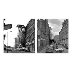
The connection between settlement and industry should be commonly referred to when talking about the textile boom. We looked at how sheep might inhabit the city today as a way of reclaiming their land. Placing the animals awkwardly between and behind different buildings to provide an almost dystopian Bradford. It marked the start of the project and the process of producing textiles in the city, this kick-started our interest in this process which became invariably connected with our own.
Jonathan Barker
Jamie Reed
Posted 7 Apr 2021 14:19
Sheep, Industry and the City: Weaving a space of art production in Bradford
CiA PS2: 46 Darley Street
Tapestry of Worsted Production in Bradford
Following the historic progression of the wool industry and how the production of wool helped shape the city today gave a contextual insight into the development of the area. As such, it highlighted the importance of gaining a better understanding of the process of wool production. Grasping an awareness of the craft, from its initial stages of wool collection and sorting right through to the ways of weaving garments and cloths became a crucial part in the narrative for our project as a way of keeping our design approach focussed on the context of Bradfords history. The tapestry is a research by drawing activity, the pieces fragments of knowledge to create a coherent visual mapping of the industrialised process of worsted production.
Jonathan Barker
Jamie Reed
Posted 7 Apr 2021 14:16
Sheep, Industry and the City: Weaving a space of art production in Bradford
CiA PS2: 46 Darley Street
Sheep: From the landscape to the city (The former inhabitants of Bradford)
Bradford was shaped and moulded by the events of the industrial revolution and the role the city played in making textiles. The area became a hot spot for producing textiles out of worsted, a finer type of wool taken from sheep, washed, combed, spun and woven to create different types of material. In many ways, Bradford is indebted to the sheep that provided the city with the materials in which it built an industry and economic viability.
Jonathan Barker
Jamie Reed
Posted 7 Apr 2021 14:10
Serial Vision / Site G
A journey from the main traffic street towards the site. Seeing a distinct point at the end of the street, thus being a destination point. With closer proximity it becomes more detailed, becoming a focus point of the site.
Posted 6 Apr 2021 11:11
Investiagtion of the Top Of Town in regards to site F. Views through the trees.
Posted 6 Apr 2021 11:05
CiA PS2 Adaptive Reuse
FUSE Art Space
Courtyard Drawer - interior view
Daryl Law
Jin Lee
Posted 11 Mar 2021 16:17
Interlude
Posted 10 Mar 2021 21:41
Looking within the Bowl: As the series of exploring the Bradford Bowl continues, we see the Top of Town in Bradford as a series of parallel layers through the manifestation of the medieval town. Our research digs deep into the individual buildings; piecing a city together by taking its object apart and eventually forming a collective set of pockets within the city.
Posted 10 Mar 2021 21:40
The intersection: The public intervention project was a prequel to our collective set of buildings. The illustration depicts the connection of the two key interventions that is being proposed to form a network; hopefully in the late future, a typology that is being replicated in the pockets of the Top of Town area.
Posted 10 Mar 2021 21:38
Lessons from Leon Krier: Upon decoding the essence of the place, we began to initiate the possibilities of the scheme. Referencing theories by Leon Krier where he made comparisons between the traditional and modernist approach, we began to draw parallels with it and illustrate his theory in the Top of Town area. Leon Krier introduces two scenarios one being an architectural speech and another which he calls it an architectural stutter. These two scenarios were illustrated to compare what the Top of Town area could be- will it make Bradford ore Bradford or will it steer away and create a brand-new urban landscape for Bradford?
Posted 10 Mar 2021 21:37
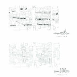
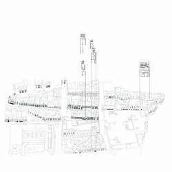
Parallel layers:The drawing indicates the network of buildings sitting within the east-west axis which potentially feed into a collective set of building reuse projects.
Posted 10 Mar 2021 21:36
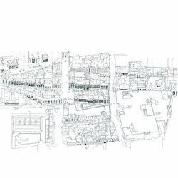
Parallel layers: The drawing is an aerial view of the Top of Town area where it highlights the parallel layers through the post-medieval configuration. The emphasis on the layering of windows defines the character of the city that is identifiable as a landscape.
Posted 10 Mar 2021 21:33
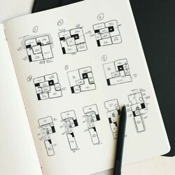
Diagramming spaces: This is one of the buildings in our collection of building reuse projects which are developing as a whole scheme of Communal Villas.
Posted 10 Mar 2021 21:29
Diagramming spaces: This is one of the buildings in our collection of building reuse projects which are developing as a whole scheme of Communal Villas.
Posted 10 Mar 2021 21:29
Diagramming spaces: This is one of the buildings in our collection of building reuse projects which are developing as a whole scheme of Communal Villas.
Posted 10 Mar 2021 21:28
Medieval Towns: Inspired by M.R.G Conzens British Town Plan Analysis, the Ordnance Survey plan of both Coventry and Bradford were used to create a base plan to trace out its morphological skeleton and its axes formed through the street pattern and plots. We felt that it was a methodology to trace the past which would reveal the hidden meaning of the places.
Posted 10 Mar 2021 21:26
Prologue
Posted 10 Mar 2021 21:06
The Bradford Bowl: We felt that we needed an image to conclude our Studio 01 journey. From getting to know the Top of Town up to rendering Bradford as Invisible Cities, we wanted to capture everything in the bowl.
Posted 10 Mar 2021 21:03
The Invisible Cities of Bradford: What if Bradford itself is a series of cities? This series was drawn to illustrate the 'cities' in the Bradford across the timeline. With the Invisible Cities by Italo Calvino as an inspiration, we sought to reveal the invisible cities within Bradford.
Posted 10 Mar 2021 21:00
Editing The View
The best form is already given
Adolf Loos from Heimatkunst, 1971.
Extending on the sketch serial visions of the promenades through the Top of Town by incorporating monolithic massing elements inspired by key urban remnants or artefacts in order to form initial design concepts.
Posted 7 Mar 2021 18:48

CiA PS2 Adaptive Reuse
FUSE Art Space
Evocation/ Continuity - Northgate Drawer study (WIP)
We are learning to use visualizations to drive conversations around the imagined experience of inhabiting FUSE's new arts space, its sense of place, functionality, and junctions between new and existing architecture. Front-loading them in this project is helping us to think of how architectural detail affects how buildings feel, rather than presenting them as passive translations of the assembly of elements normally undetectable by the eye.
The Drawer as an architectural fragment is the new shopfront facing Northgate. Coming in from the foyer, one catches glimpses of the dining area and the spaces beyond through a long aperture. The base of the Drawer is gently lit, beckoning one to step inside. A slender ledge greets the visitor, and it holds books and artwork. One sees simultaneously the bustling street on the outside and the activities inside FUSE. Microperforated ceiling panels aid in acoustic comfort.
WIP
- refine base corners
- increase base lighting; base thickness check
- remove empty table groups- highlight women in conversation
- spotlight on book ledge
- add artwork on ledge or wall
- focus exterior composition on planter bench
- add people peering through foyer aperture
- demonstrate in 2d detail shadow gap with existing brick pier
Daryl Law
Jin Lee
Posted 4 Mar 2021 18:18
PS2
The FUSE Institute
An outdoor area doesnt have to be a huge open space, its about making the most of what youve got. Some of the most interesting outdoor spaces are in urban areas. For The FUSE Institute, we wanted to create an inviting and sociable area.
Posted 4 Mar 2021 15:11
PS2
The FUSE Institute
'...processes and activities involved should respect their history, current needs and future potentials..'
Stone. S (2019)
The proposed treatment of the front Church Institute facade respects the original ornamentation of the building and does not intend to mimic details. The proposals pick up on the existing symmetry of the facade and propose modern interventions that bring light into the double-height space, creating an appropriate atmosphere for the new function.
Posted 4 Mar 2021 12:48
PS2
The FUSE Institute
Differentiating between the original and the existing front facade. The Church Institute has seen the removal of the ground floor ornate detail to be replaced by a modern shop-front facade which contrasts considerably to the original construction. Our initial design intentions consider the remembering and reinstating of the original detailing of the Church Institute with modern interventions.
Posted 4 Mar 2021 12:36
PS2 Adaptive Reuse
A Celebration of Creativity
The term Restoration and the thing itself are both
modern. To restore a building is not to preserve
it, to repair, or rebuild it; it is to reinstate it in
a condition of completeness which could never
have existed at any given time
Viollet-le-Duc, 1854
Danito Oledan
Kathleen Karveli
Posted 28 Feb 2021 17:18
PS2 Adaptive Reuse
The Four Stages of Creativity
The first in time I shall call Preparation, the stage during which the problem was investigated... in all directions; the second is the stage during which he was not consciously thinking about the problem, which I shall call Incubation; the third, consisting of the appearance of the happy idea together with the psychological events which immediately preceded and accompanied that appearance, I shall call Illumination. And I shall add a fourth stage, of Verification...
Graham Wallis, The Art of Thought, 1926
Danito Oledan
Kathleen Karveli
Posted 28 Feb 2021 17:14
PS2 Adaptive Reuse
A Beacon for Creativity
What is needed most in architecture today is the very thing that is most needed in life - Integrity. Just as it is in a human being, so integrity is the deepest quality in a building... Stand up for integrity in your building and you stand for integrity not only in the life of those who did the building but socially a reciprocal relationship is inevitable
Frank Lloyd Wright, Integrity, 1954
Danito Oledan
Kathleen Karveli
Posted 28 Feb 2021 17:13
As the visitor enters the building via the ramp, they catch glimpses of the courtyard and the dining space contained by the Drawer. One then travels through a compressed space and treated to an expansive view of North Gate as they maneuver around the Drawer.
The visitor descends to the kitchen/ dining gallery. The second Drawer frames view out towards the courtyard for those sitting by the counter. The long kitchen borrows daylight from the light well. The loo and the existing chimney forms a key transition space for people moving around the building.
The Shelf contains the stairs and lift . Views towards the courtyard dominates one's experience as they move across different levels.
Jin Lee
Daryl Law
Posted 25 Feb 2021 18:14

Street, Sky and Earth
A series of insertion improves the connection between interior and the city.
Front Drawer holds large glazing revealing activity within, also opening up to the 360 view from Oastler Square to Cafe Pavillion and bustling activity from John Street.
Side Drawer frames view and draws user to inhabit the space hence
allow them to be closer to nature at the shade garden.
Shelf manages level difference between North Gate block and North Parade block.
Light well at the centre block allows light to wash the existing brick wall, breathing new life on to the old textured wall.
Connectivity
At ground level, sequence of platforms negiotiates the 1.5 fall from North Gate to North Parade. Ramp leads to the North Gate drawer offer viewing point higher than street level. Middle block is lowered below courtyard level.
Moving through the different platforms, series of spaces with compression and release is curated. Openings are framed and controlled to highlight the specific moments in the building, as visitors crossed into different parts of the building.
At upper floors, circulation axis is flanked by light wells and glazing, allows users to register either the textured brick wall or outdoor shade garden space.
Jin Lee
Daryl Law
Posted 25 Feb 2021 17:41
CiA PS2 Adaptive Reuse
FUSE Art Space
Survey : Building Section
NORTHGATE BLOCKS
The blocks constructed with 19th century construction methods: structural cavity wall with timber deck floor.
Roof language suggests it has been adapted to accomodate the wall that separates the two blocks. Therefore we see roof well integrated in the middle block whereas gabled roof are angled in a strange geometry.
The North Gate-facing block catches evening light. Despite the openings facaing the courtyard. no evidence of openings on the roof or wall for the middle block, therefore interior is poorly lit.
NORTH PARADE BLOCK
North Parade block is of modern construction methods while retaining the structural front facing wall. Active usage of the space ensures well maintenance of the space.
Sky light introduced and small alterations to the facade are made. Abundant sunlight into the spaces promotes active business space and healthy working environment.
Daryl Law
Jin Lee
Posted 25 Feb 2021 17:30
Life in the New Quarter...
There is an art of relationship just as there is an art of architecture. Its purpose is to take all the elements that go to create the environment: and weave them together in such a way that drama is released - G.Cullen, 1961
Posted 24 Feb 2021 16:08
A New Quarter...
A small area of the wider masterplan surrounding the monumental has been developed through an iterative process. This will be Bradford's new intergenerational quarter that will knit the existing residential area and top of town area creating a new neighbourhood derived from the monumental form and surrounding context.
Posted 24 Feb 2021 16:05
The Gateway Route...
The Gateway is an important route that symbolically elevates the monumental form which will be used to weave together the existing residential area with the Top of town area.
Posted 24 Feb 2021 15:03
Setting the Base...
Several massing options were explored to set the foundations of the masterplan strategies to take forward. This option considers key urban principles including;
- The pedestrianised Gateway route connecting the 'top of town' area with the residential neighbourhood.
- A diverted traffic-way system following the partial removal of the ring road.
- Blocks derived from the monumental form, creating a hierarchy of public and private spaces.
Posted 24 Feb 2021 14:30
The Image of the City...
Yet there are fundamental functions of which the city forms may be
expressive: circulation, major land-uses, key focal points... Above all, if the environment is visibly organized and sharply identified, then the citizen can inform it with his own meanings and connections. Then it will become a true place, remarkable and unmistakable. - K.Lynch, 1964.
Using Lynchs theory the City a selection of Istanbul's mosques have been explored including the architectural features, the complexes and private/public spaces. The analysis of Istanbul and the chosen mosques have allowed me to understand the surroundings, in particular how the religious form is embedded within the context and how the relationship between both the urban surroundings and the monumental form have a corresponding relation. Following on from this I was able to develop the urban design principles, that set the foundations of the masterplan proposal.
Posted 23 Feb 2021 21:10
Remnants
Extending the experimentation with form and materiality through the development of a simplified site model. The brick remnants are then assembled to form intricate paths, voids and volumes from which a greater form can be devised.
Posted 23 Feb 2021 11:30
Breaking The Mould
Recalling the pensive meditations of Alvar Alto...what may seem to be just playing with form may unexpectedly, over a long period, lead to the emergence of an architectural form.
Tuomey, J., 2008. Architecture, craft, and culture
Coarse and unrefined yet rich in raw texture and rough tactile sensation, brick is an element of earthiness, poetry and simplicity. Sourced to allude to the material heritage of Bradford, the bricks are broken as an act of liberation. Once shattered, the pieces were carefully examined and retained on a basis of expressivity. Those chosen are to then serve as models to form 1:500 programmatic volumes for a built scheme.
Posted 23 Feb 2021 11:11
The Promenade as Poetry - A collection of Serial Visions
To facilitate the choice a site, I then investigated alternative routes to access the Top of Town in which I explored the fabric of alleyways and derelict spaces as well as material expressions and light contrasts.
Posted 23 Feb 2021 11:03
The Ghosts of Time
Evidence of Bradford's once bustling industrial scene remains, lone standing amidst the new city. Although largely demolished, with a fraction of the original factories persisting, their delicate traces on the verge of disappearance, create a intensity and poetry of space amidst which I would like my project to operate.
Posted 23 Feb 2021 10:52
Ambient
Investigating alternative modes of developing site models in groups as a way to understand and familiarise ourselves with the scales, materialities and patterns of Bradfords Top of Town.
Posted 23 Feb 2021 10:39
A Corridor of Light.
Initial conceptual sketch of the space. Punching through the inner part of a mill building and creating a walkway through, forming connection between adjacent buildings s well as providing more natural light to the currently dim inner space.
Posted 22 Feb 2021 13:12
A Journey Through.
An initial design concept in a chosen site above along the Canal Road. The idea was to open up and to create a sky journey through series of existing vacant structures, where the passageway and small courtyards behind the existing facade becomes a hidden paradise for the residents.
Posted 22 Feb 2021 13:00
Armature of Intervention.
Following the vacancy studies along the Bradford Beck, we have developed our masterplan using the beck as an armature for interventions. The beck will be exposed to create a corridor of green space at the periphery of central Bradford, where developments will take place utilising the vacant buildings. The sites we identified along the beck become series of steppingstones, where each of them will have its own community and identity. Through this strategy, we aim to regenerate the waterscape of the old Bradford, as well as to celebrate diversity of the multicultural city.
Posted 22 Feb 2021 12:48
Descending the Armature.
The exposed Beck now a structure to the city enclosing islands along with itself, informing development and revival of the communities and forgotten histories.
Posted 22 Feb 2021 12:32
Canal Road as Archipelagos.
Using John Hejduks (Masques) and Mathias Ungers (Berlin as Green Archipelago) as a precedent to interpret our site as an enclaved set of islands. The Canal road site however lacks connectivity of the precedents. A route to be explored within our proposal.
Posted 22 Feb 2021 12:30
