The Spectator and the Spectacle.
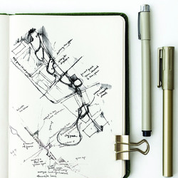
The spectator and spectacle is the start of our journey along Bradfords Beck, the uncovering of the river allowed a path to be carved out of the existing creating an enfilade of spaces aimed at revealing lost, hidden and forgotten artefacts whilst continuing the idea of perspective.
Posted 27 Nov 2020 17:03
Setting the Stage
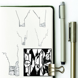
Our studies into the city unveiled various layers of history that have been covered up, forgotten, or lost. The streetscape of Bradford also provided various perspective views allowing for a theatrical interpretation, looking into theatre stage sets of Serlio, Vitruvius and Inigo Jones. Researching further inspired us to create these montages that illustrate a collection of past artefacts and perspective.
Posted 27 Nov 2020 17:01
Conceptual Sketch.
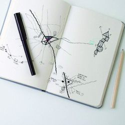
Through researching Bradford, we have found out that the city consists of many elements that were hidden, lost or forgotten. With our recognition of the loss of vitality and character in the city, we have come to believe that such features are crucial to explain the identity of the city it used to have. The idea is explained by the phrase a city as a palimpsest, influenced by Rumiko Handa, which reading indicates how such traces in the physical environment can work as a catalyst to recall past deeds and events. We are going to use this theory as a reference to firstly reveal the hidden, lost and forgotten artefacts in the city and consequently reconstructing them to regenerate the memory and the vitality of life in Bradford.
Posted 27 Nov 2020 17:00
Breaking the Barrier
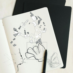
The diagrams intertwine as a collective analysis to how the negative connotations of a separation wall, barrier or border wall can be overcome. The various diagrams represent research by scholar Derek Denman who states that the power of the wall is greater than the wall itself, through artist research such as cutting through as wall as Gordon Matta Clark's interventions and through Rem Koolhaas' AA studies on the Berlin Wall and its uses other than intended.
Posted 27 Nov 2020 16:57
Site Selection
The thematics of the overarching research; authority, control, discipline and power, lead to the site selection within the city of Milan. All sites reflect the overarching research themes as well as link to previous states of the wall eras of the city; Roman walls, Medieval walls and Spanish walls.
Posted 27 Nov 2020 16:52
Applique
Applying the applique terminology to Bradford shows the understanding of the many layers that make up the urban fabric. From the analysis, we can question if the current urban layer is good enough or can we add more layers into the urban fabric for a richer urban masterplan?
Posted 27 Nov 2020 16:52
Architecture as a Monument
Through the urban mapping analysis of walled cities, this comparison map shows both Milan and Berlin where the state of the wall lies as a monument to the city. Both cities previously occupied with walls for various reasons both compare today with architectural monuments such as gates or ruins or artistic features to hold the memory of what the wall stood for.
Posted 27 Nov 2020 16:44
A look at an initial masterplan. An 'elegant' tower - designed through rigorous facade testing and analysis - which cast views towards the surrounding landscapes and provides a new point-marker in the city of Bradford, adding to its skyline. The residential tower sits on a podium which is home to a revitalised market scene, with stores and office space, while connecting with the soon-to-be pedestrianised Nutter Place.
Posted 27 Nov 2020 16:38
The City Pattern
The first attempt is to find patterns in Bradford. The pattern is identified by the various arrangements and configurations of buildings in their immediate context. From that, we have 7 patterns at Midland Mills.
Posted 27 Nov 2020 16:33
Lister Mill facade study. The contrasting elegance between the Mill's tower and its 'podium' helps shape the building as a beautiful point-marker. Looking closely at the verticality of the tower, accentuated through varying recesses and windows alike, the structure maintains its height without being overbearing to its surroundings. It can be seen from all over the city and holds a significant place in the Bradford skyline.
Posted 27 Nov 2020 16:27
Derelict Mills within Bradford
The urban analysis started with Kevin Lynch methodology as our tool to identify the isolation area within Bradford. The main focus of this diagram is to show the isolation area that increasing moving outwards away from the City Centre. However, this scheme does not work with the mills, even the mills are located near the city centre, the city treats all the mills as an isolated building that dont have any relation with the urban fabric.
Posted 27 Nov 2020 16:21
A short study of the mill in Bradford, to understand location and significance within the previously stated 'wool capital of the world'. This initial project driver aims to utilise Bradford's past industry as inspiration for design and methodology, with the outcome of engaging communities with new work and economical awareness.
Posted 27 Nov 2020 16:19
an Illustration,
The intervention at the intersection of Tyrrel Street, Bank Street, Hustlergate, Queensgate, and The Drum Winder alley represent the approach of Reduce to Reveal as a treatment to the Place to enhance the spatial experience and exhibit the Invisible City in the Junction. The temporal structure blends in with the existing circulation and context axes as a response to the site location. It acts as a flexible shaded public realm available for various events, complementing the original usage of the Junction.
Posted 27 Nov 2020 16:19
a Section,
Nestled within, looking Beyond.
Posted 27 Nov 2020 16:14
Research Through Design 4:
The theme EPHEMERALITY was chosen to represent Sarahs fleeting use of the building. A temporary installation seemed the most appropriate way to represent her experience. A number of concepts were sketched, including a painted mural to illustrate the Manc Commandments, a list of house rules compiled by the residents. The squatter inhabitants were hidden during their time in the building but it is important that the installation makes their presence more widely known. The installation could be a projection on a window or a piece of street art.
Posted 27 Nov 2020 16:12
Research By Design 3:
The theme of REVEAL has been represented by opening up a window or entry point. This could be on the front facade, or in fact be represented by opening up the railway arches to connect to the site.
The final concept intervention looks at opening up a single arch to allow greater footfall off Whitworth Street as it is much busier. This allowed promotion of any new businesses in the Medlock Mill.
Posted 27 Nov 2020 16:12
Research Through Design 2:
The theme of OBSERVATION is illustrated through an extruded window and window seat in the basement, to represent the area where Tony would spend his time, looking out towards the river. The window may be coloured, to represent the fun experience that he had, or have a letter motif to represent his job at the Hotspur Press.
Posted 27 Nov 2020 16:11
Research Through Design 1:
This page of sketches looks at how we can represent one of our characters created in the Storybook through a simple design intervention on the site, in this case, the design represents the idea of repetition of a Cotton Mill Worker
Posted 27 Nov 2020 16:07
from the study of Morphology,
The significant rapid change of Bradford seen from ground and figure due to industrialization, the influence of Victorian architecture, and the impact of modernist planning created a series of ephemeral cities with distinct character. Despite its acceleration and transformation, traces of identity from different phases of Bradford could still be drawn up from todays urban pattern. Though temporal, the captured identities created an enduring impact in Bradford through the expression of ephemerality, presenting a juncture of temporality and permanence.
Posted 27 Nov 2020 16:06
When studying the building facades, we were particularly interested in the windows. At first glance, they appear somewhat regular yet the small changes to the windows reveal wider changes in the use of the building.
Posted 27 Nov 2020 16:05
The "Story" book looks at 4 characters across 4 periods of time. This was our concept drawing looking at how to display the characters daily life through a journey. The image below looks at ways we could display this, travelling past key locations/ events that summarises the culture of Manchester at that time.
Posted 27 Nov 2020 16:05
Looking at how we wanted to create our Lexicon, splitting the work into two books. One that looks at the tangible "The Setting" and the other looks at the intangible "The Story". The books are read together to understand the history of Manchester from both a factual and fictional perspective.
Posted 27 Nov 2020 16:03
Research into Manchester and the Medlock Mill building has revealed that both are comprised of a sequence of layers that have, over time, formed the places we see today.
Posted 27 Nov 2020 16:01
Many infrastructures built to improve its economic at a certain period adapting the changing in lifestyle and method. To promote the evolution and growth of small settlements whilst preserving our unique village culture, identity and character and protecting the quality of life and well-being of the residents, employers, employees, and other stakeholders.
Posted 27 Nov 2020 15:54
Migration is influenced by economic growth and development and by technological change and possibly also by conflict and social disruption. It is driven by pull factors that attract people to urban areas and push factors that drive people away from the countryside.
Posted 27 Nov 2020 15:52
Alternative lifestyle in smaller settlement with no less benefit than urban area, unfasten the disturbance living in villages, adopting to todays needs but preseving the charateristic of raual area. Allowing small settlement to be a substitute choice for the future generation with an intergenerational community.
Posted 27 Nov 2020 15:49
Dining Room Visual:
This is a space where the family comes together to eat, socialise and symbolises the heart of the home. It is located on the ground floor, between the kitchen and living room, creating a continuous flow between the three main social spaces within the home. This space can be viewed from every floor, through the void which runs through the core of the home.
Posted 27 Nov 2020 15:24
Focused Area:
This is the area within the masterplan in which we have decided to focus into. This area is located in the north end of the site. It includes two rows of multi-generational family home, facing each other to create a semi-private street in between. These homes, house 6-8 people and have their own private garden, this creates a sense of a more traditional home within the city centre.
Posted 27 Nov 2020 15:23
Masterplan Visual
This is a 3D visual of the masterplan. The Building block towards the south (1-2 bedroom apartments) gradually incline towards the east and west, the reasoning behind this, is so the courtyard has access to natural daylight and sunlight during the day, especially in the afternoon.
The Multi-generational family homes (6 bedrooms) is located in the north end of the site, we have chosen to create a house type which accommodates for a large family, which then can be adapted for a smaller family as well.
Posted 27 Nov 2020 15:23
Celebration of Invisible Cities: We begin to shift our interventions up to the Top of Town area and creating a connected public realm. We thought the intervention could be a portal leading into the city centre and could possibly be integrated into our main thesis project in Studio 02.
Posted 27 Nov 2020 15:20
Elevation Study
This is an initial elevation study of the apartment block that we are developing. We are using a mix of timber and buff brick as our material palette.
Posted 27 Nov 2020 15:17
Initial Masterplan
This is our masterplan, we have gone out of the boarders of the site to allow our site to connect with the mosque and nearby park, Infirmary Field. From our concept of creating a garden utopia with in Bradford, we have included a mix of public and private green spaces and rooftop gardens.
Posted 27 Nov 2020 15:14
The strategy to Re-integrate and re-activate the derelict Mill buildings in Bradford includes a process of redefining the form and use of the surrounding context, potentially through a series of interventions that indirectly enhance the social and economic value of the Mills in Bradford.
Posted 27 Nov 2020 15:13
Room of 5 Remote Views: We were at this point , very inspired by Italo Calvino's Invisible Cities and we thought how about seeing Bradford as a series of cities, Our task was to reveal these cities and the city within this chosen place for intervention. We begin to study the quality of the place and realised it was like a room of 5 remote views.
Posted 27 Nov 2020 15:12
PS1
Oastler Way
Alongside developing the elevational treatment, the interaction of the street and its occupants is explored. Thinking of the way the residents will inhabit and develop their own community, further space is proposed for social interactions, such as gardening.
Posted 27 Nov 2020 15:11
Parks Vs Car Parks
As part of our site analysis we did a study into parks vs car parks. It turns out that there are more car parks than there are parks. From this we have made it an integral part of our design concept to include green space creating a garden utopia in Bradford.
Posted 27 Nov 2020 15:08
The Overlaid Triangle: Upon deep diving into our individual works, Jo Lynn and I decided to overlay the figure ground drawings to trace the persistent pattern. This was our first step as both of us were working with a 'city-scale' and thought it would be a suitable starting point. We started off by tracing maps from 1750 up to 2020 and revealed a persistent area which was previously the market place. We decided, this, would be the place for our intervention.
Posted 27 Nov 2020 15:07
A successful building strategy partly relies on the fabrication of an urban layout or masterplan that encourages the the appropriate movement and activity throughout the City, to simplify this in 3 stages, there are the urban components, curated works that form connections and lastly, embellishments in the form of buildings, ornament and landmarks to enhance the City.
Posted 27 Nov 2020 15:07
PS1
Oastler Way
As Evans in Figures, Doors and Passages of 1978 looks at the plan of the Villa Madama as a picture of social relationships, we explored the aspect of forced circulation throughout the proposed building. In iteration two, the plan incorporates a central circulation path that every door opens into, encouraging the social relationship and interaction of residents.
Posted 27 Nov 2020 15:06
PS1
Oastler Way
A three-storey modular house providing flexibility in design and use. Providing ample space for a larger multi-generational family, the exploration looks towards the potential construction of the prefabricated modular build.
Posted 27 Nov 2020 15:05
A city in a Bowl: The first few weeks evolved around the understanding of Bradford since the Anglo-Saxon period up till the contemporary era; decoding forgotten stories, lost artefacts and the hidden Beck. I was particularly interested at the Unfinished Visions of Bradford through the master planning studies. There is the element of make believe here but it was pretty much a window to the ambiguous possibilities of Bradford.
Posted 27 Nov 2020 14:56
The urban analysis reveals evidence of boundaries and moments of isolation throughout the city, which influences our strategy of healing and overcoming these boundaries by creating new links and connections where possible, stitching the urban fabric back together in attempts to re integrate dilapidated and neglected Industrial Mills.
Posted 27 Nov 2020 14:56
This exploded axonometric diagram shows the basic structural strategy of our project.
Posted 27 Nov 2020 13:45
The current park is a cure to trauma, where everything has been wiped off ,the bad along with the good.
Posted 27 Nov 2020 13:44
How can the spaces in the Kowloon Walled City at its peak be re-interpreted/ translated into contemporary interventions?
Posted 27 Nov 2020 13:38
Both the Hasselt University Faculty of Law and Kowloon Walled City functioned as a City within a City. The Hasselt University was an enclosure to the city, whereas the Kowloon Walled City was a piece architecture that happened in a specific time and space. This sparked the beginning of the research.
Posted 27 Nov 2020 13:33
The elevation collage shows what the basic block in our proposal look like and the materials used for this housing block. We tried to rotate some bricks to create a pattern for envelope and to introduce more sunlights for interior spaces.
Posted 27 Nov 2020 13:22
The ground floor of the flat is for parking space and public space.Upper floors provide with 6 m*6 m basic living blocks which can be combined to large ones. If the large apartments stayed unoccupied when people need to rent small apartments, they can share if possible.
Posted 27 Nov 2020 13:22
After refining our masterplan, we attempted to use the storyboard of a young man living there to present various spaces in the site. This is one of sketches showing the commercial pedestrian zone of our proposal.
Posted 27 Nov 2020 13:16
After learning about the site situation, this sketch shows we want to retain part of the existing car park building, create a new facade with a better quality and introduce the social activities into the ground & roof level of the car park.
Posted 27 Nov 2020 13:10
This is a timeline image which shows Bradford's great contribution to British woolen industry and culture. Those elements in Bradford's history lead us to do further research on housing & infrastructure typology.
Posted 27 Nov 2020 13:10
Top of Town Assets - A study of the assets located in the immediate context of the Oastler shopping centre site. The work signifies the importance of maintaining the diverse range of assets the Top of Town region holds when developing the site into a residential typology.
Posted 27 Nov 2020 12:02
An unoccupied visual of Nutter Place. We're planning on doing a window study this week to try and make the facade a bit more delicate and not as imposing, so any thoughts would be welcome!
Posted 27 Nov 2020 12:01
After having analysed an Edward Hopper painting we used these little illustrations to show what we had taken from it and themes we wanted to value in our project.
Posted 27 Nov 2020 11:55
Our early concept section trying to communicate the atmosphere we wanted to create. The masterplan involved a community/cultural centre, a market place and a semi -private area for residents.
Posted 27 Nov 2020 11:38
Resident Narratives within a co-living typology. These individual apartments are designed to open onto communal terraces and cloisters, encouraging a sense of community. The resident narrative studies how the apartment supports events that are repeated once a day, once a week, once a year and once in a lifetime.
Posted 27 Nov 2020 11:16
These two sections show how the masterplan design develops in terms of height: Maintaining a relatively stable roofline despite the change in topography and picking up on the heights of existing buildings both on the edges and the centre of the site.
Posted 27 Nov 2020 11:13
Elevation option studies. Referencing typical facades found in Bradford these two options respond to the function within and the city without.
The thickness of the sandstone wall is expressed through relief in the facade.
Designing from the outside in, as well as the inside out, creates necessary tensions, which help make architecture. Since the inside is different from the outside, the wall - the point of change - becomes an architectural event Venturi
Posted 27 Nov 2020 11:12
This is a figure ground plan of our proposed urban design. With the decision to keep the car-park structure for adaptive re-use, we developed both urban and housing areas as well as public, semi-public and private realms, articulating itself especially from south to north.
Posted 27 Nov 2020 11:12
Concept sketches indicating spatial qualities within the masterplan.
Posted 27 Nov 2020 11:09
Choosing keeping! In our opinion the car-park should be kept as a structure for adaptive re-use. As of now, wed argue that it is neither ugly nor pretty, but very much unfinished. Furthermore we think that it has in fact contextual value as it preserved the course of Rawson Road and needs to be kept for environmental reasons. As Lacaton & Vassal put it: Never demolish!
Posted 27 Nov 2020 11:06


