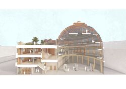
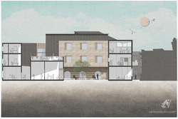
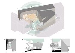
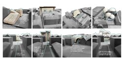
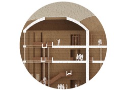
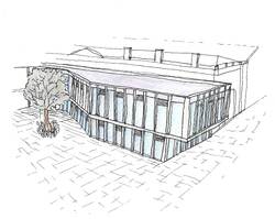
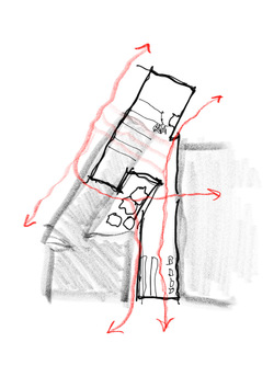
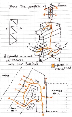
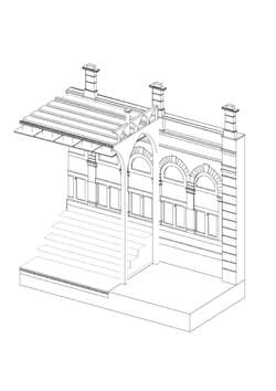
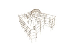
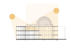
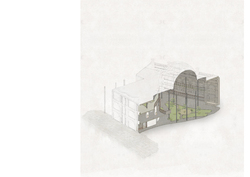
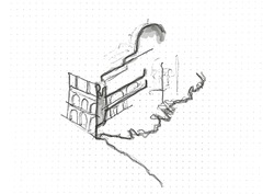
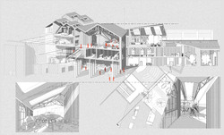
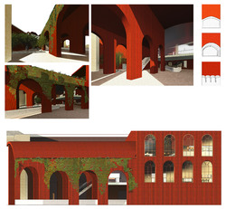
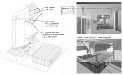
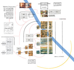
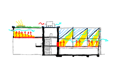
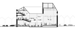
Final sectional perspective, included in the exhibition sheet for show build. The drawing shows occupants' activities in the renovated existing and in the new build, also showing the connection/ circulation between them
Posted 25 Jul 2022 11:31
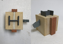
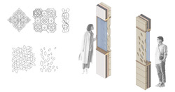
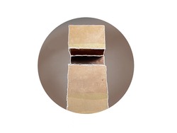
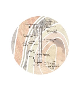
1:5 model of a section of the rotunda column. Main body is made of plaster dyed with yellow pigment to represent the sandstone colour. I cheizeled the exterior of the body to illustrate it is a rough surface in real life. Steel column was made of MDF and sprayed painted silver. The insulation layer is made of foam.
Posted 25 Jul 2022 11:25
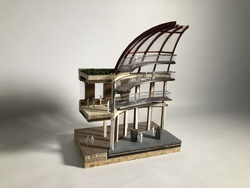
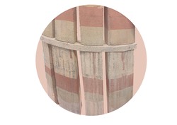
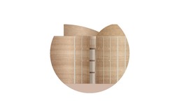
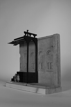
Final corner model, placing 1:50 scaled people to show the scale of the building and a sense of depth in the photos.
Posted 25 Jul 2022 11:17
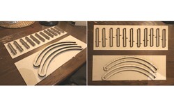
Making casting moulds using laser-cut greyboard to cast columns and ring beams for the 1:50 corner model. The materiality choice intended for the building columns would be sandstone with an uneven, rough surface. After casting with plaster/ jesmonite, it will be chiselled and painted to achieve the desired finishes and colour.
Posted 25 Jul 2022 10:56
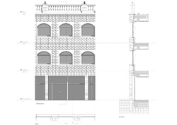
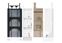
Finalised facade design, in elevation, plan, and section. I realised that the windows are blocked by the existing columns in this window placement, so further alterations in window locations on the facade will be made to allow a full undisrupted view outside the windows.
Posted 25 Jul 2022 10:54
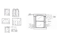
Window study showing the common window frame shapes in Accrington. This helps me determine the window shapes on the main facade and develop my own version of window frame unique to my building's programme
Posted 25 Jul 2022 10:51
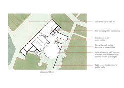
Identify problems in the floor plans, incorporating elements suggested by technology consultants into the design.
Posted 25 Jul 2022 10:45
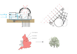
Technological aspects of the project were investigated and consolidated in material selections, structural strategy, passive strategies and more, which will be reflected in further plan iterations.
Posted 25 Jul 2022 10:38
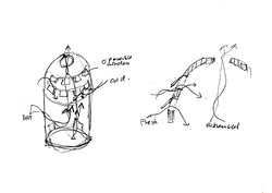
Initial concept sketches of passive strategies, aiming to use static ventilation to bring fresh air into the building and let out exhaust air through operable openings in the dome.
Posted 25 Jul 2022 10:27
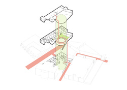
Key space identified at the rotunda and new first floor. This helps show where the main circulation should be and if the current stairs need improvements in terms of locations and flow in the building. This will be reflected in further plan iterations.
Posted 25 Jul 2022 10:15
12
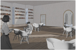
An interior rendering of the ground floor library depicting the interior qualities and intention of the space.
Posted 21 May 2022 21:21
11
A 1.100 sectional images of the developed proposal demonstrating interior uses of the spaces ranging from studios, two cafés, the archive and the central courtyard.
Posted 21 May 2022 21:20
10
Drawing from organic motifs in the ornamentation of the Town and market hall, additional ornamentation on the façade was considered. This displays the abilities of the craftsmen who will use the building, while forging a further connection to the sites context.
Posted 21 May 2022 21:20
9
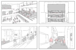
The interior qualities of the key spaces were further investigated through a series of quick water colour images. This enabled further plan development.
Posted 21 May 2022 21:19
8
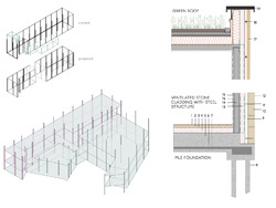
The structural grid and build up were considered. A steel-concrete composite structure was decided upon as steel's durability and spanning properties will enable it to be re-used beyond the proposed life cycle of the building. This is demonstrated in my reappropriation of the town hall extension. Local timber, reclaimed sandstone, green roofing and zinc roofing make up the façade of the building.
Posted 21 May 2022 21:19
7
Further development of the buildings formal massing was required as some elements were still rather ridged. Materiality and detailing were also explored.
Posted 21 May 2022 21:18
6
Following the resolutions of 3.1, the big pebble intended to investigate the buildings key spaces. These were the café and roof terrace areas.
Posted 21 May 2022 21:18
5
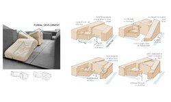
The sharp roof pitches of the townscape were rotated to create more dramatic sloping forms. This concept was then modelled accurately with the programme of the building in mind, in order to assess its credibility.
Posted 21 May 2022 21:17
4
Iterative sketch models physicalised a number of different concepts and allowed them to be assessed. Elements for the first three iterations continued to influence the project while the concepts of the final iteration were dismissed.
Posted 21 May 2022 21:17
3
Editing the view A series of site interventions and metaphorical massings that inspired both tangible and intangible elements of the projects progressions.
Posted 21 May 2022 21:16
2
Programme Proposal - The revival, preservation, and restoration of the historic fabric of Accringtons town centre through revitalising its cultural roots as a centre for craft and production. The scheme aligns with existing projects by the Town Council, which aim to improve the town scape through the restoration of historic buildings. The proposed concept will further this scheme, with the creation of a craft centre, focused on the preservation of built heritage, to allow Accrington to capitalise on its future through the memory of its past.
Posted 21 May 2022 21:14
1
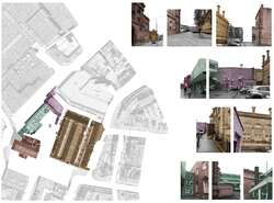
The project began with analysis to assess constraints and opportunities afforded by the site. As the above image illustrates, the site exists among four buildings that connect poorly to one another visually as well as functionally.
Posted 21 May 2022 19:47
Finalising general arrangement drawings and renders to determine the overall atmosphere and spatial quality of the building as well as how it stis in ints context.
Posted 16 May 2022 17:17
Exploring particularities in the design at a larger, personal scale to fully convey the palpable intricacies of the design.
Posted 16 May 2022 17:16
Modeling as a form of intimacy; communicating the perceptions and tactility of an internal space to convey scale comprehensively.
Posted 16 May 2022 17:15
Investigating the envelope in terms of its relation to techincal details and the atmospheric qualities evoked by material choices.
Posted 16 May 2022 17:14
Exploring tactility through material qualities and their environmental properties as well as their use in details and technical interfaces
Posted 16 May 2022 17:13
The Considering permeability as a key creative driver for my design, the natural flow of people through the building is highly significant. The public is invited to enter the space through a vareity of entrances and, with scale in mind, are primarily drawn to and welcomed up the largest rammed earth mass; The Dome Gallery. This journey upwards attempts to entice users up a grand helical stair which appears to float centrally in the space - a climb of curiosity where the journey aims to be just as alluring as the arrival. At this point, people are engulfed by the sheer scale and proximity of the tactile forms and gain an impressive sense of arrival overlooking the historic buildings of Accrington. Just as the natural strata within the materiality, the public ascend the building in layers, mimicking the organic fabric.
Posted 16 May 2022 17:12
These sketches demonstrate development towards my initial final plans and how the spaces and massing embeds permeability as a core concept to my design.
Posted 16 May 2022 17:09
Developing adjacency diagrams to gather an understanding of the various apces and how they may relate to one another. This also gives an overarching sense of scale and proximity to the programme.
Posted 16 May 2022 17:07
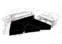
To test interventions to the site, I edited various 3D masses onto an aerial view to capture how the space may change. This was done with my key creative driver of permeability in mind.
Posted 16 May 2022 17:05
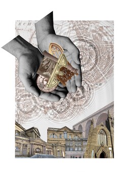
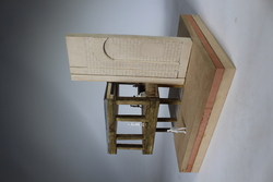
The handshake refining tactile elements of the building at scale 1:5 using a model and scale drawings.
Posted 16 May 2022 17:02
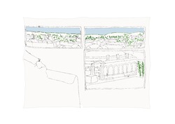
The view out of a window of the existing strucuture on site helps gather an understanding of the site's historic surrounding context and the potential sights out of my design.
Posted 16 May 2022 17:02
Bringing the 2D into the 3D using a 1:50 scale model allowing me to have 1:1 contact with the build ability and materials intended.
Posted 16 May 2022 16:58
To initially break down the site, I recorded craft aspects that were tangible whislt journeying through the town. This helped me understand the stark contrasts of Accrington, in terms of its former industrial glory, compared to current austerity and a state of disrepair.
Posted 16 May 2022 16:58
Taking a deeper dive into the envelope and exploring the details which make up the building.
Posted 16 May 2022 16:57
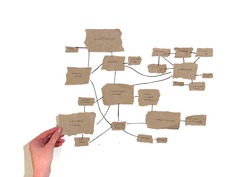
Mapping out technical, environmental and regulatory strategies for the building, what do we value most and what factors will alter the design?
Posted 16 May 2022 16:55
The Big Pebble (or tasklet 06) explored the routes taken by users of the building to enter one of the main spaces.
Posted 16 May 2022 16:54
Finalising the programme and the plan of the building and how each space relates or links with each other. From this working GAs were created as a basis to work from and carry into atelier 3.2
Posted 16 May 2022 16:54
Beginning to nestle the scheme into the masterplan of the town, how will it connect to the high street and reintegrate the community? Who will the building be available to and why?
Posted 16 May 2022 16:53
Massing models were key to developing the form of the building after taking inspiration from elements of Accrington; it allowed me to begin visualising the form of the arts and crafts centre in scale form.
Posted 16 May 2022 16:52
The second tasklet involved drawing a theoretical scene from a window overlooking the site, I chose to depict an elderly member of the town relaxing in their living room with a picture of Accrington hung proudly on their wall. Serial visions were also created exploring a route to site as if a worker was travelling from their home to a calico mill in the centre of town.
Posted 16 May 2022 16:52
Tasklet 01 allowed us to explore Accrington and the site so we could get an idea for the context, environment and community that we were working with. The site visit and historical research concluded by the atelier group revealed hidden histories buried within the towns fabric.
Posted 16 May 2022 16:49
Exhibition render showing one of the workshop spaces within the project. The desired and imagined atmosphere is well captured by the layering of colors and textures in the image. The light and movement aim to entice the viewer and really transport them in that space at that time.
Posted 14 May 2022 22:03
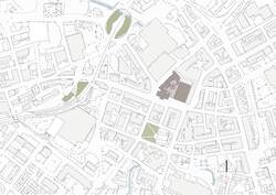
Drawing up final GA's for the project. This is the plan at the largest scale assigned. It gives a great idea of the further surroundings, as it shows some greenery and waterways which otherwise could not be seen. Its simplicity further enhances the presence of the site and the nature around it.
Posted 14 May 2022 21:56
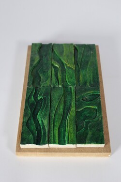
A 1:5 detail model of tiles. The detail chosen is wall tiles which have a few layers to them. I did six iterations at a scale of 1:5 and a final cast at 1:1. Through these iterations, I explored the texture and colors that this model could achieve. The 1:5 iterations are placed on a wooden base to better showcase them individually and as a potential more dense layout.
Posted 14 May 2022 21:43
Collaged photo of the final 1:50 physical model. Most of the aspects of the model were made at home and the listed facade was cast in the workshop. The slight editing helps to further visualize the design.
Posted 14 May 2022 21:39
To better understand the 1:50 physical model that I needed to produce, I made a quick digital version, which although not complete really helped with tackling the overall task.
Posted 14 May 2022 21:37
Concluding a more detailed development of the design. The image brings together the visual of where section and elevation are and draws their relation.
Posted 14 May 2022 21:34
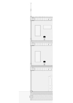
Continuing detail development by drawing up sections and plans more precisely. The cut is taken from where the project maintains part of an already existing structure - its steel structure and concrete floors - and builds on that - changing the facade and roof.
Posted 14 May 2022 21:28
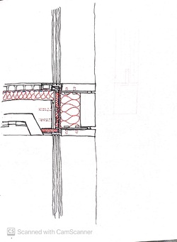
Investigating another aspect of the technological design and exploring some ideas of material use as well as wall, floor, and roof build-ups through sketching.
Posted 14 May 2022 21:24
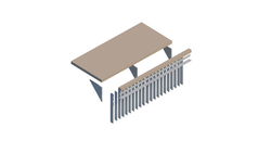
Looking into the structural strategies by using sketch diagrams and exploding them. This really helps with having clarity of the structural understanding and helps to see weak spots or gaps in the development.
Posted 14 May 2022 21:21
This diagram is the beginning of the more technological and environmental strategies. With a simple daylighting diagram further understanding of the implications and opportunities of the glass roof begins.
Posted 14 May 2022 21:18
Finalizing 'The Big Pebble' by using soft tones and textures to place the emphasis on the atrium space. The rest of the building is left only as a mark and the pavement outside serves as an indicator for a starting point.
Posted 14 May 2022 21:14
Iterating drawing concepts through sketches to find the most suitable imagery for 'The Big Pebble', an image encapsulating the path of people from the public space outside to the main destination inside. In my design, this main space creating the fluidity between outside and inside is the large atrium space, covered by a glass dome.
Posted 14 May 2022 21:11
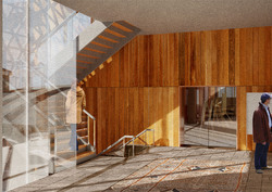
Interior view showing dramatic lighting and public area towards and artist and textiles studio, which can be visited a select times. There is supposed to be a permeability between spaces and an overlap between different forms of work, public and private.
Posted 11 May 2022 09:27
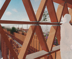
Brick/ceramic lattice detail to scale, with background features. This view from a stairwell to the inhabited rooftop shows the planting of native flowers and the rich material qualities of ceramics.
Posted 11 May 2022 09:25
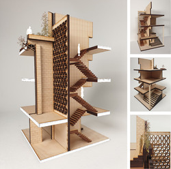
Modelmaking at 1:50 scale, isolating a stairwell section and partial façade, materiality and lighting. The rooftop planting is also included.
Posted 11 May 2022 09:22
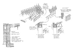
Structural strategy- suggestions for an extension to an existing steel framed structure, with a separate structure of solid concrete arches. Initial thoughts on envelope makeup is documented here too.
Posted 11 May 2022 09:19
"The Big Pebble"- a space where people congregate and is of particular focus- here an outdoor rooftop seating space is shown. The movement of people through the site is important, as is depicting the space in perspective.
Posted 11 May 2022 09:17
Materiality of largely brickwork with extensive foliage in an attempt at urban greening, with a roof/wall interface that contains planting and irrigation - detail to be finalised later. At this point, the amount of brick will be reduced and more timber and smooth concrete will be used.
Posted 11 May 2022 09:15
Typical analysis of an early design, critiquing obvious flaws and stimulating further changes.
Posted 11 May 2022 09:11
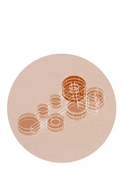
Adjacency diagrams showing proximity of different programmes, while indicating sun path and showing an underground river through the site, which the brewery on the site will use for water collection.
Posted 11 May 2022 09:09
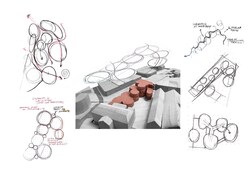
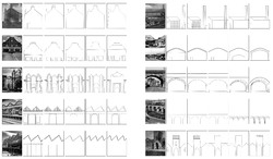
Identifying various landmarks and typical buildings in Accrington, then abstracting these often industrial forms down to the basic shapes, then iterating upon them to create new forms that references the originals. These will be influential in the form (elevation) of the new building.
Posted 11 May 2022 09:05
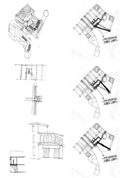
Collection of basic sketches, a series of simple proposals for new buildings from simple shapes, with the final choice being an almost parasitic re-use and subsuming of the town hall extension, that also has a clear route through the site.
Posted 11 May 2022 09:03
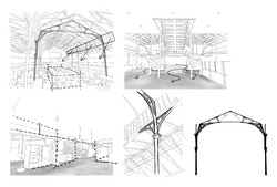
Internal sketches and details of the Market Hall, with a focus on the permeable floor space and seemingly temporary shops that can be reconfigured as necessary and have slightly loose borders. This is inspirational towards a flexible approach to spatial layouts and allowing adaptable re-use of the new build.
Posted 11 May 2022 09:00
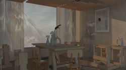
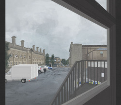
Digital Painting - a "view from a window" - depicting what may be an average day in Accrington, showing the contrast between the distinctly 'back of house' side of the Town Hall and the more ornate side of the Market Hall. Currently this space is used for parking and waste disposal.
Posted 11 May 2022 08:57
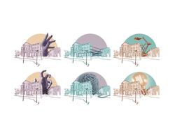
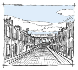
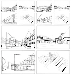
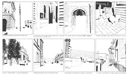
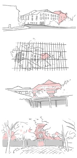
Cullen-style serial vision drawings, identifying landmarks and showing a narrative route to the site. The solid material permanence of the Town Hall and Market Hall is representing with bold shadows, while the town hall extension, with a steel frame, is seen as more permeable and could be infilled, with the historic buildings acting as hard borders and context to any future build.
Posted 11 May 2022 08:54
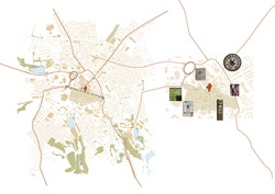
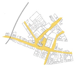
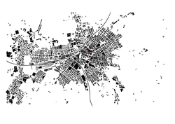
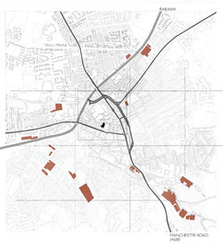
In the initial stages of the project, a broad understanding of the features of the site and town was needed. Here, a map of the whole town identifies transport links and routes to the town centre, location of historic warehouses and industrial buildings in decline, and the location of the site itself.
Posted 11 May 2022 08:52
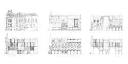
Elevation exercise for a contentious piece of heritage building.
In these quick sketches, we explore and ask how the Conservative Club would be dressed if it was hypothetically designed by Flores & Prats, Lacaton & Vassal, Palladio, Rafael Moneo, the original architect, and the mixture of them, clashing classical approaches with contemporary ones.
Posted 18 Mar 2022 07:09
Further analysis of the materiality and possible wall build up of my design. Exploring the idea of having a geometric grid pattern with stone cladding being the facing of the grid and the set back panels be glazing. The sketch iteration also allowed me to explore the floor build up and how the services will be ran below floor level.
Posted 11 Feb 2022 16:18
An investigation into the environmental strategy of my scheme, exploring daylighting, passive solar gain, water collection, green roofing, and air source heat pumps.
Posted 10 Feb 2022 09:25
I explore the structural elements in my scheme that need to be developed further in understanding. With the lens of my project focusing on the connection between the Broadway, market hall, and the main square, as well as the pathway through the existing building, the cantilever, and the doors which open the workshop into the public realm.
Posted 1 Feb 2022 14:05
Diagrams of Roman Chester, Walton-le-Dale, Manchester and York
The research about typology of Roman town planning has been carried out by investigating four specific sites. Based on the historic maps and articles, the relation between Roman town, roads and waterways was described in these diagrams.
Posted 24 Oct 2021 22:43
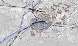
Sketched map showing various layers in Castlefield
To further understand about the context, we started our research from the existed layers in Castlefield, including waterways, railways and listed buildings. Through the context research, the situation of redevelopment or renovation within Castlefield have been clarified. Because of the "unreliable" reconstruction, the embarrassed position of the Roman heritage has become more and more obvious.
Posted 24 Oct 2021 22:42
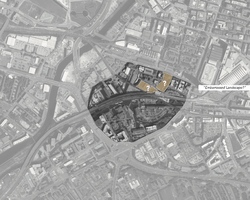
The map with highlights showing the initial interest
When wandering around Castlefield this summer, both of us took particular attention to the Roman Fort reconstruction in this area. As one of the most important heritages, this Roman heritage, to some extent, was under an "embarrassed" position. People just pass by, go jogging or take the dog for a walk. Few people truly stop to visit and understand about the Roman heritage. Due to the historic value, it keeps as ever. It is, to some extent, lying vacant and a little bit desolated. We believe it could contribute more and engage more in Castlefield, the surrounding context. So we would regard it as a starting point for our further exploration.
Posted 24 Oct 2021 22:40
Study of levels within the Hulme Hippodrome through section to capture important platforms of interaction and the scale of distances between audiences and performers as well as the opportunity to view the rococo plasterworks within the theatre.
Posted 24 Oct 2021 01:01
Various views towards the Hulme Hippodrome were captured to identify its identity within the neighbourhood and discover its strengths and weaknesses in creating a visual impact or attraction to the local community.
Posted 24 Oct 2021 00:53
Visualizing the past through sketches to understand the environment and usage of spaces through various angles of users such as the theatre audiences, performers and pub goers. Volume of spaces were also studied to build understanding on the experience throughout important spaces of Hulme Hippodrome.
Posted 24 Oct 2021 00:49
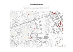
Understanding site context and morphology studies helped to identify significant listed buildings around the Hulme area, which leads to the discovery of the historical path which remained throughout the redevelopment of Hulme.
Posted 24 Oct 2021 00:42
