Identity
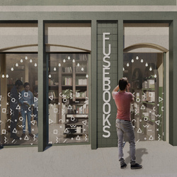
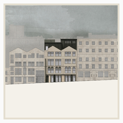
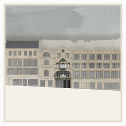
One of the main focuses in the development of the proposal consisted of defining the identity for FUSE Collective and its appreance on the street frontage.
Alexandru Munteanu
Diana Ursachianu
Posted 12 Apr 2021 15:42
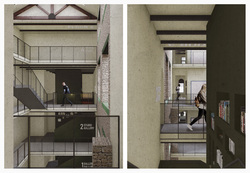
Atrium Views
The proposed atrium intends to act as a connecting element both horizontally and vertically within the layout of the building and at the same time mediation between two general atmosphere 'rooms', one on Darley St and the other on Piccadilly St, allowing vantage points that divulge the activities held within the spaces. Viewports are created towards the artefact of the programme, the Vertical Library, reconnecting the visitor spatially.
Alexandru Munteanu
Diana Ursachianu
Posted 12 Apr 2021 15:37
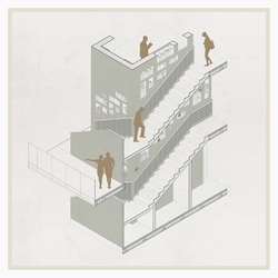
Tectonic Study - Vertical Library
Through an iterative process the
vertical library and its monolith have
been checked to meet the regulation
standards, enhancing some of the
elements for design purposes. The
stairs that act as a processional route
have railings and ballustrades on both
sides, maintaining a simmetry of design
which is complemented through the
inclusion of ceramic tiles picturing the
ornament developed in the process.
The book shelves have been placed at
a height within reaching possibilities,
following through their expression the
course of the stairs. This is linked to a
hit and miss principle where towards
the end instead of a shelf there is a
viewport placed, bringing back the rules
established.
Alexandru Munteanu
Diana Ursachianu
Posted 12 Apr 2021 15:34
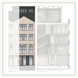
Tectonic Study Area
The materiality of the building on
Piccadilly St side is intended to
act as a more industrial approach,
continuing the existing facade typical
to victorian warehouse designs
with metal elements. The contrast
is assured by the colour palette in
the elements, acting as a definitory
principle for the identity of FUSE
occupation.
While the structure is generally preserved,
being complemented only by new finishes
that hide new thermal lines in order to
increase energy performance, elements
such as timber joists and internal existing
walls are maintaned exposed to ensure
a contrast between the new and the old
fabrics. The extension is defined by a
loadbearing timber frame sitting on a
reinforced concrete slab.
Alexandru Munteanu
Diana Ursachianu
Posted 12 Apr 2021 15:32
Picadilly Elevation
Piccadilly St side takes a similar approach
on activating the ground floor, though
reverted, having columns that act as
an extrusion. The flatter layering of
the facade is therefore complemented
and activate more from the side on
the streetscape, acting as a beacon to
attract the visitors. This treatment is
connected to the extension design, that
follows the grid of the existing elevation
as well, having a slight setback that
does not act as a heavy addition to the
frontage.
The intent of the extension is to mediate
the difference of height between the
adjacent building, acting as a gradient
that complements the streetscape.
An addition to the design is the
petrusion of the existing pitch to insert
a fenestration unit that acts as a seating
bay at the top of the building, creating a
vantage point.
Alexandru Munteanu
Diana Ursachianu
Posted 12 Apr 2021 15:30
Darley Elevation
On Darley St side of the building the
intent is to maintain as much of the
existing facade, reactivating the ground
floor in order to be more inviting for
the public. Similar to the contemporary
context surrounding the building, the
ground floor treatment follows a similar
rule, acting as a shopfront defined by a
horizontal banner that exemplifies the
identity of the space within.
Rich in ornamental string courses and
fenestration details, the ground floor
takes this pattern which is placed on
opaque panels that act as emergency
exit as well. The first floor window is the
main artefact of the facade, opening to
the streetscape, creating a connection
on two levels between the street and
interal activity.
Extruded signals are placed, working
in relation to the operable mechanism
of the first floor window, giving new
dimension to the facade when looked
at from the side.
Alexandru Munteanu
Diana Ursachianu
Posted 12 Apr 2021 15:30
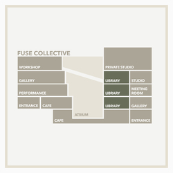
Programmatic Narrative
The atrium breaks and connects the two parts of the building in the middle. Gallery can be found at lower floors, taking into consideration quiet galleries on Piccadilly and interactive ones on Darley. The studio spaces are allocated on the Piccadilly side, but act as semi private.
The circulation of the types of users were considered, placing the public rooms in closer proximity of the proccesional stairs, while the creative studios, meeting rooms and individual studios are close to the Piccadilly core. Storage spaces for staff are found on all levels.
Alexandru Munteanu
Diana Ursachianu
Posted 12 Apr 2021 15:29
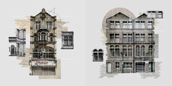
Atmospheric Collages
Early analysis of the context focused on
capturing the atmosphere defined by the
site and the presence of the facades on
the street frontage. As presented, the
diagrams created through the technique
of a collage aim to capture elements
of materiality, gridlines, symmetry and
particular characteristics of the double
aspect building.
Alexandru Munteanu
Diana Ursachianu
Posted 12 Apr 2021 15:27
New Top of Town Square At Night
Final visual representation that captures the new proposed square at night, showcasing the typologies of buildings that wrap around the open space.
Alexandru Munteanu
Diana Ursachianu
Posted 15 Dec 2020 18:24
Elevation and Structure Study
Inspired by the contextual brickwork, the proposal attempts to embrace it and present a continuity from heritage to contemporary conditions.Therefore, the verticality and certain architectural details are represented in light beige long format bricks contrasted by the red bricks that emphasise the solidity and scale of the massing.
As another principle expressed in the elevation treatment, lintels, string courses and retail facades are represented in glass reinforced concrete that maintain a similar colour tone to the light brickwork and addresses the stonework from the listed heritage buildings surrounding the site.
Alexandru Munteanu
Diana Ursachianu
Posted 15 Dec 2020 18:22
Facade Articulation
As a result from the contextual analysis and inspired by the articulation in the adjacent buildings, the proposed elevation treatments define key movements in representation such as separating vertically the volumes in Plinths, Bodies and Crowns, therefore defining height thresholds and correlating these heights to the ones interacting directly with the site. Another principle is to define clearly the horizontal lines and vertical rhythms that visually interrupt the elongated volumes.
Alexandru Munteanu
Diana Ursachianu
Posted 27 Nov 2020 19:03
Volumetric Development
Based on the existing urban grain of the Top of Town and permeability and programmatic functions imposed on the study site, the volumetric approach focuses on a contrast of open democratic spaces complemented by built volumes that act as both definitory boundaries and thresholds from one 'room' to another. This direction is intended to unlock key viewpoints from within the site looking outside towards the city and cross-connect the site.
Alexandru Munteanu
Diana Ursachianu
Posted 27 Nov 2020 19:02
Atmosphere Collages
In the first weeks of the project during our contextual analysis stage, we have focused on using the technique of the collage to analyse and deconstruct contextually appropriate facades adjacent to the Top of Town site in Bradford, in order to understand their rhythms, ornamental details and their embedded materiality. This in turn informed certain key design decisions reflected in our elevation studies in the attempt to represent a contemporary interpretation of the surrounding historic character.
Alexandru Munteanu
Diana Ursachianu
Posted 27 Nov 2020 19:01
