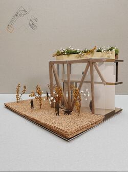
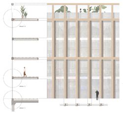
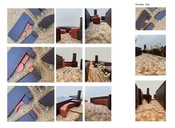
The corner model was made to physically recreate the atmosphere that the building would convey. The open gallery walk can
visibly decrease the sizing of the building because of its glass envelope and allows plenty of the views to the inside
where the artwork would be placed.
Posted 7 May 2021 15:30
Envelope for the Assembly building from Rawson's square
Posted 7 May 2021 15:27
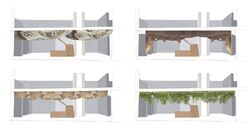
The main entrance is chosen to have a visually appealing look, so people are interested to see what more the building brings, thus iterations with possible entrance designs are created.
1 / Melted metal/mirror
The entrance would have melted metal detailing, similar to the precedent of Manchester Library Walkway. Although the mirror effect would brighten the area, the metal would feel colder compared to the exposed timber columns.
2 / Wood triangles
Choosing the same material that the building already has in its design creates a sense of connection. However, it can seem too similar.
3 / Flowing wood
Similarly to the melted metal,the ceiling creates an organic shape and connects with the exposed glulam columns of the building.
4 / Greenery
To further keep the green roofs in relation to the building design, greenery could also be implemented into the interior look of the building. Bringing nature within the building.
Posted 26 Apr 2021 11:46
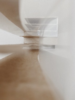
Sktech model to show the interior of the created void.
A void would open up the possibilities for larger sculptures and would enhance the idea of a 'open walk'. The building from the outside would seem smaller in scale as a large part of the building is glass.
Posted 25 Apr 2021 13:25
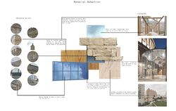
One of the six pages of Tasklet 7, the material selection. Materials are chosen by examining the existing materials on the site, thus creating building that would fit into the context and celebrate the closer Grade II lister buildings.
Posted 18 Apr 2021 13:40
The Big Pebble
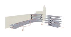
Movement diagram through the site into the building.
Posted 18 Apr 2021 13:39
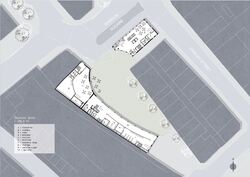
Ground floor plan.
Buildings form a public square that has to be later filled with landscaping to accumulate people.
Longer facade works as a glass gallery, which can be seen from the outside of the building. Reaching art from the outside.
Posted 8 Apr 2021 14:12
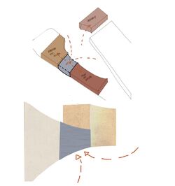
Building connection. In order to create a distinctive enterance that would still seperate BCS and Fuse art gallery, a glass enterance could be implemented as a seperation point between two uses of the building.
Posted 8 Apr 2021 14:07
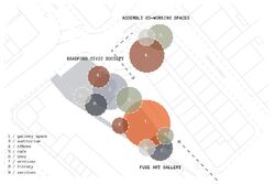
Adjecancy diagram showing needed areas in the building and their possible size, overlaping needs. Conclusion, BCS and Fuse art gallery mostly overlap in needs for auditorium and cafe, thus must be placed together.
Posted 8 Apr 2021 14:04
Editing the view - part B.
Unusual / First iteration was of an oval shape, thus
still maintaining the current two way pedestrian
street. However, the oval shape does not fit
into the wider context.
Pathway / Creating a cluster of buildings that would create
a particular pathway of unusual
forms. However, does not create a public accumulating square.
Cut out / Inspired by the first oval shape, the buidling
is cut out to create a larger gap on the site,
thus creating an enclosure.
Posted 8 Apr 2021 14:01
Spatial arrangement development.
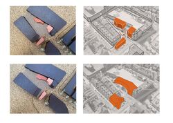
Seperating the buildings into three seperate masses for each client.
Connecting the buildings, thus creating one larger mass and one seperate. Main goal is to form a public square, thus creating a circular 'cut out'
Posted 8 Apr 2021 13:58
Serial Vision / Site G
A journey from the main traffic street towards the site. Seeing a distinct point at the end of the street, thus being a destination point. With closer proximity it becomes more detailed, becoming a focus point of the site.
Posted 6 Apr 2021 11:11
Investiagtion of the Top Of Town in regards to site F. Views through the trees.
Posted 6 Apr 2021 11:05
