// Final touch :: Envelope //
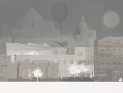
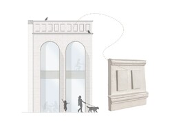
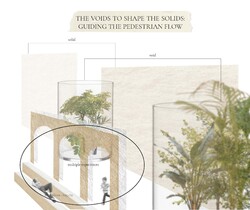
SE elevation showing the remaining sandstone wall, which holds the public space consisting of ramps and seating area. It also indicates the relationship between arched shapes in the context and in the new structure. One might also notice the glazed green atrium structure.
Posted 17 May 2021 18:14
// Landscaping :: Pedestrian street strategy //
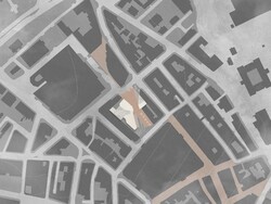
The main idea for the building and its landscape is to guide the pedestrian flow through the public squares, while allowing narrow pathways to the building core. Different types of paving is also a method of how to guide the flow. Besides, the pedestrian street direction is kept as it was originally, to create a connection between the pedestrian zone in North and South.
Posted 17 May 2021 18:14
// The handshake :: multifunctional bench design //
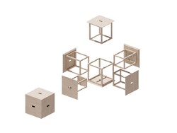
The design is inspired from Cube 6 design by Naho Matsuno. It is a great way of how to keep large amount of stools without taking much room. These can be used both as a cube and disassem¬bled to function as six separate stools. The structure for each stool is different, so they can fit properly when assembled in a box. The material is timber to fit in the overall building concept. I chose to avoid screw fixtures as much as possible so the material can be easily disassembled and reused after stools life cycle.
Posted 17 May 2021 18:13
// Corner model : The knot //
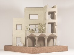
This corner of is located approximately in the middle of the building. It is a place, where multiple routes and purposes meet [archway, corridors, main entrance] and ties in a knot. View from E side.
Posted 17 May 2021 18:13
// Envelope studies //
The developed envelope design. The sandstone cladding is mixed with extended glulam window frames. The parapet is ornamented with cornices and square details largely inspired from surrounded buildings.
The parapet 1:10 model shows the exploration on clay material in detail after the lecture Out of the Studio. Into the Factory.
Posted 17 May 2021 18:13
// The big pebble :: Green atrium //
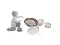
The projects agenda works towards developing multiple experiences for people by the path they choose. However, most paths and entrances are leading to The Big Pebble- the green atrium and main staircase. It is the place that collects largest mass of people internally, and even allows curious bypassers to enter it.
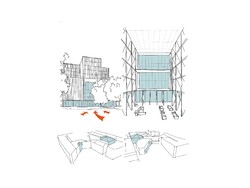
The picture shows how the building is divided into masonry and glazed blocks.
Posted 17 May 2021 18:12
// Elemental studies :: Arch and roof //
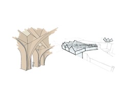
Archway: the archway is inspired from a structure from Al Islah Mosque by Formwerkz, 2015. It is a glulam structure with waffle slab and inbuilt light tunnels to lit the dark areas of archways from above.
Roofs: this diagonal zig-zag roof type extends over the main staircase. This allows much more light into the centre of the building and gives the feel¬ing of the masonry block slowly opening up onto the atrium zone. The same pattern is repeated for gallery atrium roof.
Posted 17 May 2021 18:12
// Feels :: Precedent studies //
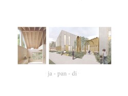
Exterior: simple, natural, earthy tones, clear, masonry x lightweight
Interior: simple, natural, warm, minimal, clear, cozy
Posted 17 May 2021 18:11
// Technical position //
Tehcnical position of the project consists of three main aspects:
-to let the building structure mirror the programme [picture]: glazed structures and larger windows identifies public place in a building, whereas masonry: private;
-localization: looking for local materials and manufacturers
-minimal co2 emissions x maximal performance: using low conductivity materials, as well as reusing materials rather than recycling due to pollution and lowered performance
Posted 17 May 2021 18:11
// Window studies :: Reflecting the context //
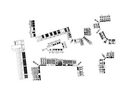
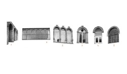
To develop fenestration proportions, I created a diagrammatic window analysis that explores the window tendencies in the local surroundings. This strategy would allow the upcoming building to camouflage into the context better.
Posted 17 May 2021 18:11
// Experiences :: The explorer //
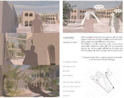
I created exemplary characters to show how the same building can be seen by different people by route they choose. All the voids the building creates are connected, but just the curious people will find out the other side of the building. The doors are open, will you look inside?
Urbanism works when it creates a journey as desirable as the destination Paul Goldberger
Posted 27 Apr 2021 09:06
// Public seating structure //
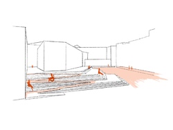
One of the most efficient landcape design tools, especially in such sloping site, is stairs. To create them more functional, they would work as a seating in the public realm scheme. To make it accessible, a large ramp and a secondary ramp incorporated in the stair design is installed.
Posted 27 Apr 2021 09:05
// Material reuse //
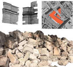
As there is a large part of the buildings that will get demolished in order to open the site for public, considerable amount of waste would be created. To reduce the amount of waste, the sandstone bricks from demolished blocks will be reused in the upcoming building.
Wainwright questions: could we continue to make and remake our cities out of what is already there? (Wainwright, 2020). He mentions a future where every part of a building would be treated as a temporary service, rather than owned.
Posted 27 Apr 2021 09:05
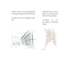
// Precedent :: Neue Staatsgalerie in Stuttgart by James Stirling [1984] //
Staatsgalerie is an example used for multiple aspects of the upcoming building. First and foremost, it is planned with narrow paths in between building blocks so that anyone can cross right through the building. Besides, the large gallery glazed wall shows how a space can be inviting just because of its materiality and application of it.
Posted 27 Apr 2021 09:02
// Voids to shape solids //
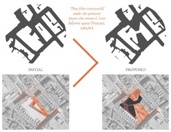
They [the courtyards] make the primary space; the rooms (..) are leftover space [Venturi, 1984:80]
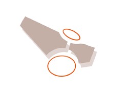
Inverted Nolli maps to explore massings and how voids can influence solids. Now, pedestrian street tresholds are more open and inviting, creating a larger overall area as well. There are a few pathways leading to the buidling core- the green atrium. These are for more private accesses, thus created quite narrow and less inviting. Therefore, the building controls the pedetrian flow.
Posted 27 Apr 2021 08:59
// Iterations :: process and final //
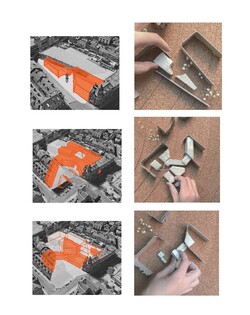
Starting from a simple building divided in two blocks that creates a large pocket for a public square.
Continuing with a connectivity from the public realm to the semi-private atrium through pathways.
Sized down massing according to building programme and planning; developed back of the building so it functions as a square from both sides and is connected in the middle.
Posted 27 Apr 2021 08:59
// Brainstorm :: Separated yet connected //
Cutting the building in blocks so it creates pockets functioning both as public or private square, so both bypassers and building users can enjoy the space properly. Pockets to be connected with narrow pathways.
Posted 27 Apr 2021 08:53
// Manifesto :: THE VOIDS TO SHAPE THE SOLIDS: GUIDING THE PEDESTRIAN FLOW //
After analysing the site, I came to a conclusion: site G has great potential in becoming a public square for people, for example, it already functions as a pedestrian street, it just needs arrangements in the existing structures.
In the end I ask myself: how to create a multifunctional building in the core of the town, that both accommodates public and private realm? To make the most of it with the experimentation of massing: so it creates different experiences based on the route one chooses to take and the places one chooses to visit
Posted 27 Apr 2021 08:51
// Window analysis //
Through site walks I noticed the tendency of arched window frames. The tendency can be an inspiration for the fenestration of the upcoming building.
Posted 27 Apr 2021 08:51
// Serial vision //
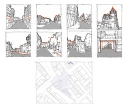
Series of site sketches moving from the Darley St, which is full of shops, making it a popular route of how to approach site G. Afterwards, the visions move onto the the Rawson Square, where sandstone architecture and the remaining part of Rawson hotel opens up. The route continues to explore the pedestrian street and the glazed passage of B&M store.
Posted 27 Apr 2021 08:47
// The first meeting with the site :: An abstract photocollage //
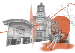
Once entering Bradford, one might notice the elevation towards top of town. Another significant factor is the beautiful sandstone architecture, which it is often constrastly juxtaposed with contemporary commercial structures.
To be built for people, both users and bypassers: what are they looking for in Bradford? There are some things I felt the town is lacking, such as greenery. The top of town would highly benefit from an attraction point in the core of the city, such as a public square for people to take a break or socialize.
Posted 27 Apr 2021 08:37
