Final perspectives // the performance space
Yifan He, Yuxin Jiang and Juliet Tremble
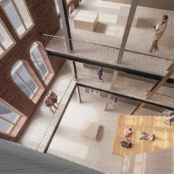
This image demonstrates how the final performance space and gallery will look and feel. Visitors can sit on the stair seats or peer down from the gallery overlooking the performance area. The steel columns are distinctly modern and respect the wishes of the client, who wanted a contemporary, industrial feel to the building.
Posted 15 Jun 2021 16:54
Design development // interior design of the performance space
Yifan He, Yuxin Jiang and Juliet Tremble
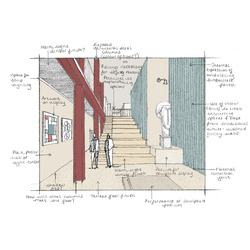
This sketch explores options for the materiality and atmosphere of the new performance space on the lower ground floor of the building. This space terminates the visitors journey through the building from Darley Street. The blue timbercrete wall was used as a continuation of the façade of the new extension. Complementary red steel columns have been shown, although these were left plain silver in the final images of the interior spaces.
Posted 15 Jun 2021 16:53
Final perspectives // to the studio
Yifan He, Yuxin Jiang and Juliet Tremble
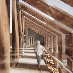
This perspective shows the space at the top of the circulation link, which is enwrapped with the vertical timber slats. This is the journey from the top floor residency accommodation to the studio spaces, which is made exciting by the play of light that the shading device creates.
Posted 15 Jun 2021 16:51
Final perspectives // in transition
Yifan He, Yuxin Jiang and Juliet Tremble
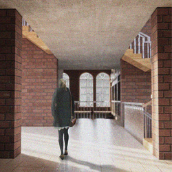
This image shows the single height space which leads to the quadruple height area at the back of the building. Light can be seen entering through the glazed circulation link.
Posted 15 Jun 2021 16:48
The circulation link // section
Yifan He, Yuxin Jiang and Juliet Tremble
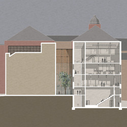
This building section shows how the final shading device for the new glass link would sit in context between the two street-facing sides of the building. The glazed nature of the link ensures that plenty of natural daylight enters the core of the building while creating an interesting play of light internally.
Posted 15 Jun 2021 16:44
The circulation link // model-making
Yifan He, Yuxin Jiang and Juliet Tremble
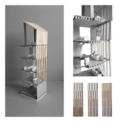
We experimented with various arrangement options of the vertical timber slat shading device for the new glazed link. We then made a grey board and balsawood model which depicts the final design idea. Physically making the model also helped us to think about how the shading device would work technically.
Posted 15 Jun 2021 16:43
Design development // model-making
Yifan He, Yuxin Jiang and Juliet Tremble
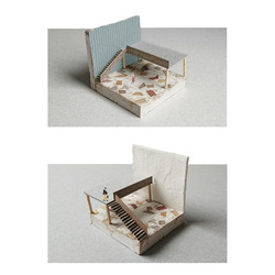
These experimental models were created to explore different options for the final interior finish of the building. The model depicts the new double-height entrance space and the final material options were a timber terrazzo floor finish, blue timbercrete walls and plain white plaster walls.
Posted 15 Jun 2021 16:40
Design development // the entrance hall
Yifan He, Yuxin Jiang and Juliet Tremble
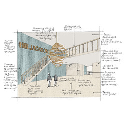
This sketch demonstrates ideas for how the entrance area will look and feel. The HR Jackson sign, which sat above the entrance of the building, when it was a fine china shop, has been used as a wall piece. A complimentary abstract sculpture hangs within the double-height void. Bar furniture has been removed to draw focus to the architectural quality of the space.
Posted 15 Jun 2021 16:39
Concept // summarising the key design idea
Yifan He, Yuxin Jiang and Juliet Tremble
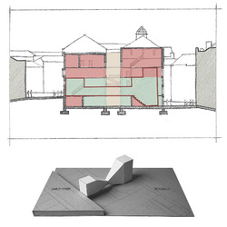
The key concept behind the project, to design an art space for FUSE, was the visitors journey from the entrance to the performance area at the Piccadilly facing side of the building. Visitors are led through a double, single and then quadruple height space. This creates and releases tension which creates excitement for the visitor exploring the building for the first time.
Posted 15 Jun 2021 16:28
Site Analysis // sketching the local area
Yifan He, Yuxin Jiang and Juliet Tremble
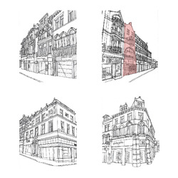
We made quick sketches using photographs of the site and the buildings immediately surrounding it. This helped us to identify small details within the façade designs and patterns which could come to inform our own design.
Posted 15 Jun 2021 16:26
Site Analysis // exploring the local area
Yifan He, Yuxin Jiang and Juliet Tremble
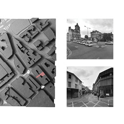
As a form of site analysis, we made a card site model. This helped to decipher the urban grain of the area in which our building, 46 Darley Street, was located (as indicated). We visited the site and analysed the architecture in the local vicinity, through photography, to find inspiration for our proposed reuse project design.
Posted 15 Jun 2021 16:24
Elevational Treatment
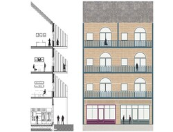
A study into the elevational treatment of our chosen building. A structural system of CLT with a flemish brick bond cladding has been utilised.
Posted 27 Nov 2020 20:38
Masterplan
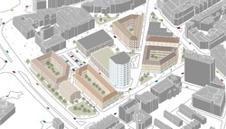
Initial masterplan concept which draws on diagonal routes across the site and creates connections with the Oastler statue adjacent. The central taller building interacts with Highpoint, which is to the right of the site (as shown).
Posted 27 Nov 2020 20:30
Site Analysis
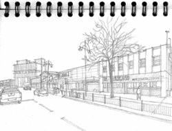
Initial site sketch of the Oastler Shopping Centre, which is currently situated on our site in the 'Top of Town' area of Bradford.
Posted 27 Nov 2020 20:24
