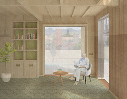
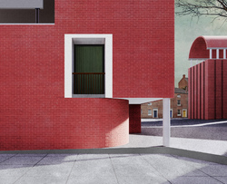
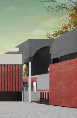
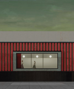
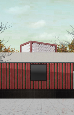
Parks Vs Car Parks
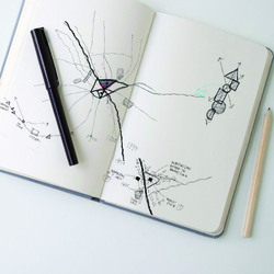
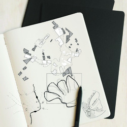
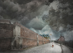
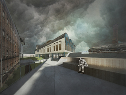
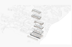
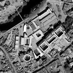
As part of our site analysis we did a study into parks vs car parks. It turns out that there are more car parks than there are parks. From this we have made it an integral part of our design concept to include green space creating a garden utopia in Bradford.
Posted 27 Nov 2020 15:08
The Overlaid Triangle: Upon deep diving into our individual works, Jo Lynn and I decided to overlay the figure ground drawings to trace the persistent pattern. This was our first step as both of us were working with a 'city-scale' and thought it would be a suitable starting point. We started off by tracing maps from 1750 up to 2020 and revealed a persistent area which was previously the market place. We decided, this, would be the place for our intervention.
Posted 27 Nov 2020 15:07
A successful building strategy partly relies on the fabrication of an urban layout or masterplan that encourages the the appropriate movement and activity throughout the City, to simplify this in 3 stages, there are the urban components, curated works that form connections and lastly, embellishments in the form of buildings, ornament and landmarks to enhance the City.
Posted 27 Nov 2020 15:07
PS1
Oastler Way
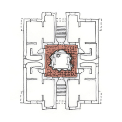
As Evans in Figures, Doors and Passages of 1978 looks at the plan of the Villa Madama as a picture of social relationships, we explored the aspect of forced circulation throughout the proposed building. In iteration two, the plan incorporates a central circulation path that every door opens into, encouraging the social relationship and interaction of residents.
Posted 27 Nov 2020 15:06
PS1
Oastler Way
A three-storey modular house providing flexibility in design and use. Providing ample space for a larger multi-generational family, the exploration looks towards the potential construction of the prefabricated modular build.
Posted 27 Nov 2020 15:05
A city in a Bowl: The first few weeks evolved around the understanding of Bradford since the Anglo-Saxon period up till the contemporary era; decoding forgotten stories, lost artefacts and the hidden Beck. I was particularly interested at the Unfinished Visions of Bradford through the master planning studies. There is the element of make believe here but it was pretty much a window to the ambiguous possibilities of Bradford.
Posted 27 Nov 2020 14:56
The urban analysis reveals evidence of boundaries and moments of isolation throughout the city, which influences our strategy of healing and overcoming these boundaries by creating new links and connections where possible, stitching the urban fabric back together in attempts to re integrate dilapidated and neglected Industrial Mills.
Posted 27 Nov 2020 14:56
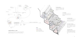
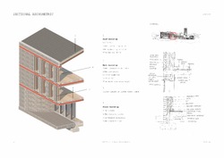
This exploded axonometric diagram shows the basic structural strategy of our project.
Posted 27 Nov 2020 13:45
The current park is a cure to trauma, where everything has been wiped off ,the bad along with the good.
Posted 27 Nov 2020 13:44
How can the spaces in the Kowloon Walled City at its peak be re-interpreted/ translated into contemporary interventions?
Posted 27 Nov 2020 13:38
Both the Hasselt University Faculty of Law and Kowloon Walled City functioned as a City within a City. The Hasselt University was an enclosure to the city, whereas the Kowloon Walled City was a piece architecture that happened in a specific time and space. This sparked the beginning of the research.
Posted 27 Nov 2020 13:33
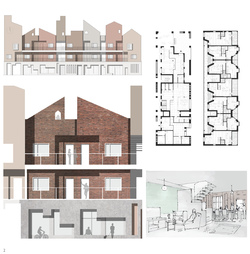
The elevation collage shows what the basic block in our proposal look like and the materials used for this housing block. We tried to rotate some bricks to create a pattern for envelope and to introduce more sunlights for interior spaces.
Posted 27 Nov 2020 13:22
The ground floor of the flat is for parking space and public space.Upper floors provide with 6 m*6 m basic living blocks which can be combined to large ones. If the large apartments stayed unoccupied when people need to rent small apartments, they can share if possible.
Posted 27 Nov 2020 13:22
After refining our masterplan, we attempted to use the storyboard of a young man living there to present various spaces in the site. This is one of sketches showing the commercial pedestrian zone of our proposal.
Posted 27 Nov 2020 13:16
After learning about the site situation, this sketch shows we want to retain part of the existing car park building, create a new facade with a better quality and introduce the social activities into the ground & roof level of the car park.
Posted 27 Nov 2020 13:10
This is a timeline image which shows Bradford's great contribution to British woolen industry and culture. Those elements in Bradford's history lead us to do further research on housing & infrastructure typology.
Posted 27 Nov 2020 13:10
Top of Town Assets - A study of the assets located in the immediate context of the Oastler shopping centre site. The work signifies the importance of maintaining the diverse range of assets the Top of Town region holds when developing the site into a residential typology.
Posted 27 Nov 2020 12:02
An unoccupied visual of Nutter Place. We're planning on doing a window study this week to try and make the facade a bit more delicate and not as imposing, so any thoughts would be welcome!
Posted 27 Nov 2020 12:01
After having analysed an Edward Hopper painting we used these little illustrations to show what we had taken from it and themes we wanted to value in our project.
Posted 27 Nov 2020 11:55
Our early concept section trying to communicate the atmosphere we wanted to create. The masterplan involved a community/cultural centre, a market place and a semi -private area for residents.
Posted 27 Nov 2020 11:38
Resident Narratives within a co-living typology. These individual apartments are designed to open onto communal terraces and cloisters, encouraging a sense of community. The resident narrative studies how the apartment supports events that are repeated once a day, once a week, once a year and once in a lifetime.
Posted 27 Nov 2020 11:16
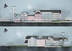
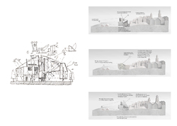
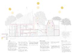
These two sections show how the masterplan design develops in terms of height: Maintaining a relatively stable roofline despite the change in topography and picking up on the heights of existing buildings both on the edges and the centre of the site.
Posted 27 Nov 2020 11:13
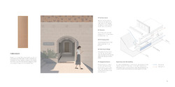
Elevation option studies. Referencing typical facades found in Bradford these two options respond to the function within and the city without.
The thickness of the sandstone wall is expressed through relief in the facade.
Designing from the outside in, as well as the inside out, creates necessary tensions, which help make architecture. Since the inside is different from the outside, the wall - the point of change - becomes an architectural event Venturi
Posted 27 Nov 2020 11:12
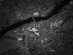
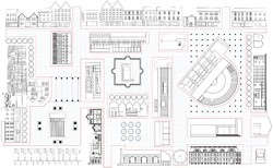
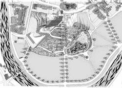
This is a figure ground plan of our proposed urban design. With the decision to keep the car-park structure for adaptive re-use, we developed both urban and housing areas as well as public, semi-public and private realms, articulating itself especially from south to north.
Posted 27 Nov 2020 11:12
Concept sketches indicating spatial qualities within the masterplan.
Posted 27 Nov 2020 11:09
Choosing keeping! In our opinion the car-park should be kept as a structure for adaptive re-use. As of now, wed argue that it is neither ugly nor pretty, but very much unfinished. Furthermore we think that it has in fact contextual value as it preserved the course of Rawson Road and needs to be kept for environmental reasons. As Lacaton & Vassal put it: Never demolish!
Posted 27 Nov 2020 11:06
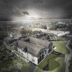
WALKING DOWN VICTORIA STREET WHILE VIEWING THE BELVEDERE TOWER
-Belvedere Tower
A symbolic abstraction from a watching tower. In the project of wellbeing, it has been transformed into a belvedere tower and becomes a part of perimeter wall.
-Perimeter Wall
A retained part of perimeter wall which has been interpreted in a different meaning - a heritage with its historical constrain turns into a part of memory machine, an architectural redemption for remembering. And it composes a new definition of privacy and security with the watching tower at the end of it.
Posted 18 Jun 2020 14:57
PUBLIC - WALKING THROUGH OLD ROOFSCAPE, LOOKING TO ARCADE PILOTIS
Even flowing space has implied being outside when inside, and inside when outside, rather than both at the same time. Such manifestations of articulation and clarity are foreign to an architecture of complexity and contradiction, which tends to include both-and rather than exclude either-or.
-Venturi Robert, Complexity and contradiction in architecture
Posted 18 Jun 2020 14:56
NORTHWEST BIRDVIEW IN SUNSHOWER
Posted 18 Jun 2020 14:56
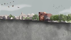
A key idea of the masterplan is to create spaces that allow views out to Shrewsbury. The image shows one of the shared spaces that looks over the Market Hall clock tower.
Posted 18 Jun 2020 09:37
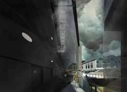
PUBLIC - LOGGIA VIEW BRIDGE THROUGH A WING WITH THE CELLS ALONGSIDE
Architectural Uncanny, Whistling In The Dark While Walking Towards The Light!
The contrast between a secure and homely interior and the fearful invasion of an alien presence...At the heart of anxiety provoked by such alien presences was a fundamental insecurity: that of a newly established class, not quite at home in its own home.
The uncanny habit of history to repeat itself, to return at unexpected and unwanted moments; the stubborn resistance of nature to the assimilation of human attributes and its tragic propensity to inorganic isolation, seemed, for many, to confirm the impossibility of living comfortably in the world.
-Anthony Vidler, The architectural uncanny: essays in the modern unhomely
Posted 18 Jun 2020 08:43
PUBLIC - VIEW BRIDGE THROUGH A WING IN SUNSHOWER
How Deep The Light Could Reach Into A Building!
Yet such a spatial paradigm was, as Foucault pointed out, constructed out of an initial fear, the fear of Enlightenment in the face of darkened spaces, of the pall of gloom which prevents the full visibility of things, men and truths.
-Anthony Vidler, The architectural uncanny: essays in the modern unhomely
Posted 18 Jun 2020 08:17
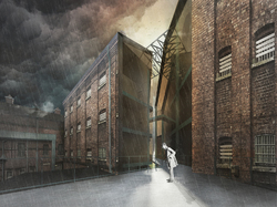
PUBLIC - VIEW FROM PROPOSED PARK,
LOOKING TO DIAGONAL CUT THROUGH FORMER MALE CELLS AT A WING
Quintillian says, when we return to a place after a considerable absence, we do not merely recognize the place itself, but remember things that we did there, it is possible to use this property of places to construct a kind of memory machine.
-Anthony Vidler, The architectural uncanny: essays in the modern unhomely
Posted 17 Jun 2020 16:32
The Voyage
Tobi Sobowale and Niall Coleman
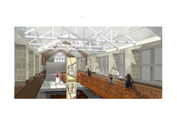
Render of the Charles Darwin Museum situated in the East Wing. The image depicts the meandering walkway, archival exhibits, partial glazed roof and double-height space
Posted 16 Jun 2020 19:33
The Voyage
Tobi Sobowale and Niall Coleman
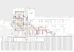
1:100 Design showing the greenhouse sitting within the North Wing and is connected to the outdoor pavilion in the courtyard.
The walkway tapers over the existing building to highlight it as an independent structure, that sits apart from the library building
Posted 16 Jun 2020 19:30
The Voyage
Niall Coleman and Tobi Sobowale
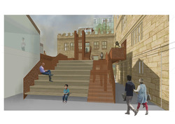
Outdoor Events Space in Courtyard - The staircase emphasises the courtyard as a key location. The council liked how this space - that is currently unused - has been transformed and integrated with the main building. It encourages visitors to get up close to the building and appreciate it from a new perspective.
Posted 16 Jun 2020 19:11
Wyle Cop Community Hub
Tobi Sobowale and Niall Coleman
A playful design that encourages better well-being through design and integration of the community. Our home is designed to tackle the increasing rate of anxiety amongst young people in Shrewsbury. The 7 townhouses are designed for young people who suffer from anxiety and their families but it is not exclusive to them. The site is located on the bank of the River Severn, with flooding being a major concern, residential programmes are placed above the ground floor. Through a series of communal spaces, a shared roof garden, facing front doors and balconies, a home is created that encourages interaction between residents and the wider community. Nature, daylight and flexible spaces were used as tools to promote a healthier well-being, furthering the idea of the home as a safe haven
Posted 16 Jun 2020 19:01
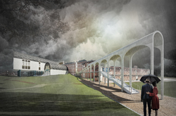
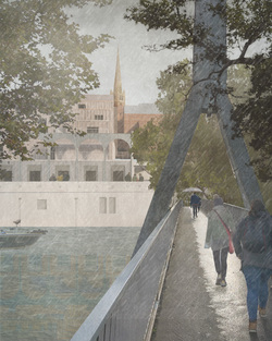
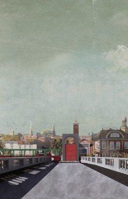
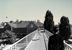
Approach: The following image shows the approach to the Old Town of Shrewsbury through the Bendy Bridge.
Posted 15 Jun 2020 11:01
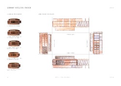
North-West elevation of the new library units.
Posted 15 Jun 2020 00:43
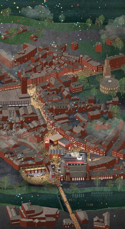
Masterplan | Thesis: At Shrewsbury, the way what town and building are mediated is by a sophisticated manipulation of fragments. The west gate of the medieval town Shrewsbury became fragmented after 1960s urban clearance. Instead of viewing the fragments needed rectification, this project looked in and exacerbated these differences, by learning from these 'anonymous' fragments and the demolished fabric to create a series of defined artifacts with scripted characters. Meanwhile, applying ideal spaces to both open space and figures to form a taxonomy of parts, making the town as a stage and backdrop for theatrical life. The project is to find the missing forms, to reinterpret Shrewsbury and to regenerate Shrewsbury, to bridge the old and the new, and to create the dialogue with the existing, achieving continuity and renewal in architecture.
Posted 12 Jun 2020 17:09
The figures define the square; the openings tell plot
Posted 12 Jun 2020 17:06
Curtain House | Corner
Posted 12 Jun 2020 17:02
Curtain House | The curtain reveals the stage; the square becomes the seating area
Posted 12 Jun 2020 17:00
Curtain House | Light cube on the film studio
Posted 12 Jun 2020 16:58
Shrewsbury Gateway | View from the Welsh Bridge
Posted 12 Jun 2020 16:56
Making Shrewsbury | Collective Forms | Learning from the vernacular and urban artifacts and inspired by the films
Posted 12 Jun 2020 16:39
Methodology | Town of Elevation |Town of Fragments | The west gate of the mediaeval town Shrewsbury became fragmented after 1960s urban clearance. Instead of viewing the fragments needed rectification, this project looked in and exacerbated these differences, by learning from these 'anonymous' fragments and the demolished fabric to create a series of defined artifacts with scripted characters.
Posted 12 Jun 2020 16:27
Celebrating Shrewsbury | Shrewsbury Film Festival | Root the Ritual into the Physical Forms | Celebrate the Temporal in the Permanent
Posted 12 Jun 2020 16:21
SECTIONS
Posted 12 Jun 2020 15:13
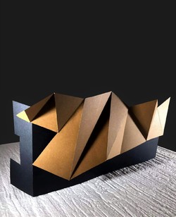
Model produced during lockdown out of coloured card and textured foam base. It is a quick experiment to test the proposed geometries for the new facade of the former Darwin Shopping Centre. The aim was to portray the triangular geometries of Shrewsburys traditional Tudor architecture in a contemporary way.
Posted 12 Jun 2020 14:09
Understanding Shrewsbury's roofscape //
An analysis of the roof profiles surrounding the site and how the Library will respond to them whilst framing the views of surrounding urban artefacts.
Posted 12 Jun 2020 13:59
The Desire Path - An alternative journey from Frankwell Footbridge to the High Street through the 70 steps. The path has been carved through the former Riverside and Darwin Shopping Centres to bring back a sense of place and improve the public realm through the site.
Posted 12 Jun 2020 13:59
From concept to proposal //
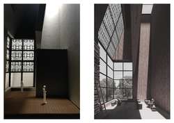
Using a 1:50 model to understand the atmospheric qualities of the Libraries Mayoral Parlour.
Posted 12 Jun 2020 13:54
Environmental diagram //
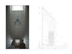
The Library strategically takes light through to the interiors to combat the lack of light beneath the ground.
Posted 12 Jun 2020 13:47
Engaging with the town //
The book depository kiosk sits within a redundant plot in the Town centre. The form and materiality emulates the pitched roofs and board-formed concrete of the library. Inside, two mirrors placed at 45° reveal an image of the library when in the Town centre to deposit books.
Posted 12 Jun 2020 13:43
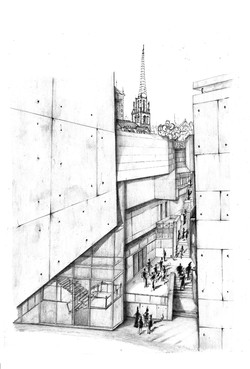
View towards St Mary's Church and the historical 70 steps from the proposed university facilities located in the former Darwin Shopping Centre.
Posted 12 Jun 2020 13:37
WIP image //
The image illustrates the flow of people from the town into the New Library after completing the first stage of the design process.
Posted 12 Jun 2020 13:08
Exploring how water influences the thresholds into buildings.
Posted 12 Jun 2020 12:59
Spatial organisation
Posted 12 Jun 2020 12:57
Shared living- The sketch explores the spaces that can be shared without compromising privacy.
Posted 12 Jun 2020 12:54
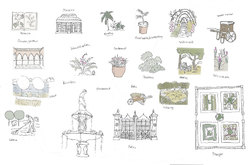
Sketch // A collection of key garden elements for the Quarry. Creating a visual 'language' for details to look out for in the garden.
Posted 25 Apr 2020 22:11
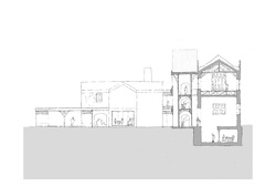
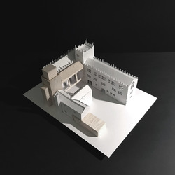
Concept image // The Garden Museum complex is organised around a series of enclosures to accommodate the program. The glasshouse is positioned on the border between private and public functions; the location provides access to the service courtyard as well as being public facing.
Posted 25 Apr 2020 20:20
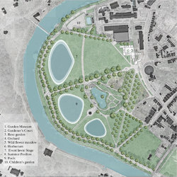
Masterplan // The proposal features permanent and temporary elements as well as additions to the landscape of the Quarry. It includes a pavilion offering views to river Severn and a Garden Museum to showcase Shrewsbury's horticultural heritage.
Posted 25 Apr 2020 20:16
PS2 | Shrewsbury Library | Sketch section indicating proposed circulation atrium and structural alterations to ground floor slab of the library building, as well as changes to Rigg's Hall.
Posted 24 Apr 2020 20:45
PS2 | Shrewsbury Library | Early massing model of proposed scheme.
Posted 24 Apr 2020 20:44
PS1 | The Wyle Cop | Visual looking into a central courtyard.
Posted 24 Apr 2020 20:43
PS1 | The Wyle Cop | Sketch ground floor plan of typical house typology with a courtyard.
Posted 24 Apr 2020 20:43
PS1 | The Wyle Cop | A masterplan sketch of housing development for elderly.
Posted 24 Apr 2020 20:42
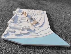
This Work In Progress model shows the seamless relationship between landscape and architecture. The stepping of the topography reference the rising water levels of Shrewsburys future predicted flood risk.
Posted 24 Apr 2020 20:06
A radical remodelling of Shrewsburys recreational park (The Quarry) into a public place that invites, inspires and influences action against Climate change. It will accommodate large gatherings of hundreds of people who assemble to demonstrate, discuss and learn about the actions that need to take place. This will provide a platform for climate change activists to reach out to the wider community and ground an identity in Shrewsbury. The hub will need to engage with artists, performers, events and markets as it is essential for it to become a place of culture, identity and expression; one that forbids oppression and a homogenous society. We need energy, activism, and rebellion to fight for our future. With this at the forefront of design, I aim to create stimulating and narrative architecture that stresses the gravity of our global environmental crisis.
Posted 24 Apr 2020 20:05
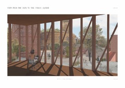
View to the square from the library cafe shows the atmosphere that I aim to create.
Posted 24 Apr 2020 18:29
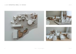
This model shows how the library and office buildings sit within the wider Shrewsbury landscape. A model is still in process and will later show wider area of the park.
Posted 24 Apr 2020 18:28
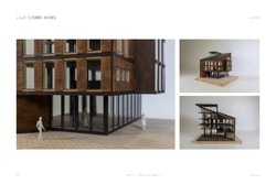
1:50 corner model of library building. This model shows the interaction between the library spaces and public square in between the buildings
Posted 24 Apr 2020 18:24
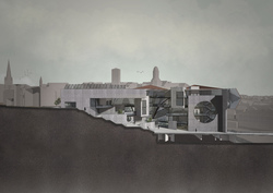
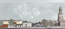
The 8 spaces are unseen interior rooms, hidden within the existing urban fabric of the shopping centres. They reveal themselves only by their protruding roofs, which engage in a dialogue between the church spires and market hall clock tower of the Shrewsbury skyline.
Posted 24 Apr 2020 17:46
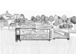
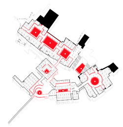
8 sunken spaces are injected into the hearts of these neglected buildings, each with their own spatial character and relevant functional definition. During times of high water they are flood basins, protecting the town from the frequent flooding of the nearby River Severn. During dry times they are basketball courts, theatres, gardens, playgrounds and art spaces.
Posted 24 Apr 2020 17:43
Due to the rise of online shopping and closing of major retail stores, high streets across the UK are slowly dying. In order to extend the life span of the 3 shopping centres in Shrewsbury, the buildings are to be converted into a series of rational public spaces that can hold a variety of uses, and link together into one memorable experience.
Posted 24 Apr 2020 17:24
'The Gap' car park located between the Pride Hill, Charles Darwin & Riverside Shopping Centres is currently an under-used area. It holds the potential to become a centre for public performances, at the heart of these three buildings.
Posted 24 Apr 2020 17:21
The Riverside Mall is currently a neglected space on the outskirts of Shrewsbury, awaiting demolition. The image above provokes ideas about how the Riverside Mall could be reinterpreted to become a valuable space for the town of Shrewsbury.
Posted 24 Apr 2020 17:17

