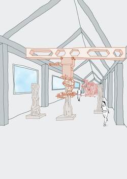
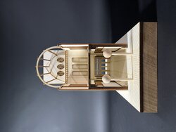
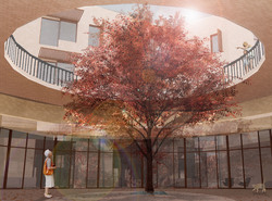
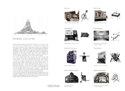
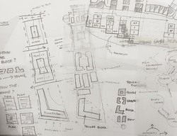
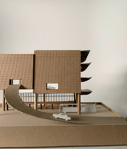
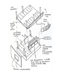
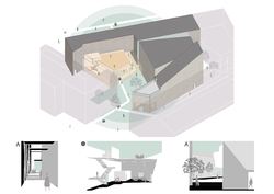
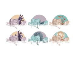
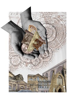
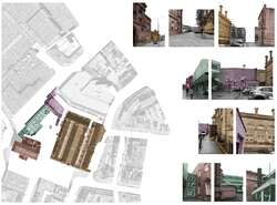
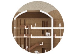
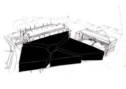
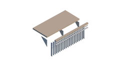
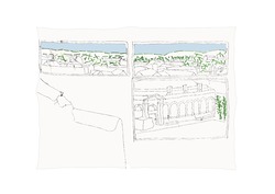
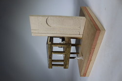
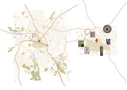
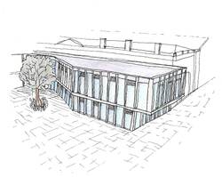
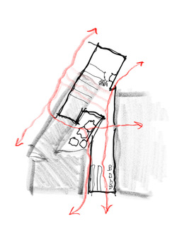
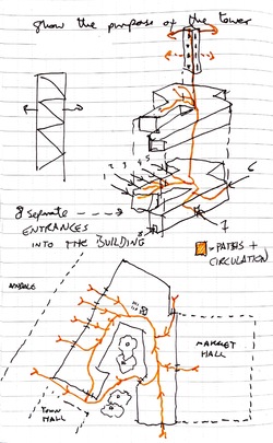
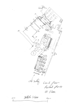
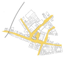
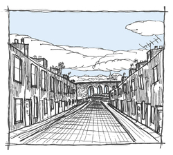
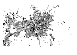
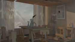
08/12/22 - Final tutorial before submission of 3.1 portfolio. Along with collating and curating my portfolio, I produced a final conceptual perspective image of one of the spaces to help visualise the atmospheric qualities of the space.
Posted 6 Jan 2023 17:41
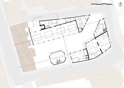
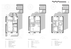
01/12/22 - Tasklet 05 One-to-Two-Hundred. After multiple iterations of plans and sections, I produced a final set of GAs. These are as developed as possible so far, however will be evaluated and improved upon in later Tasklets.
Posted 6 Jan 2023 17:40
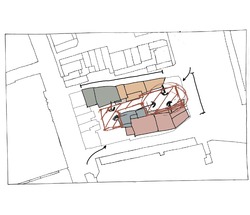
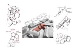
24/11/22 - Development of sketch plans coming off the back of massing models and accommodation schedule created previously. Diagramming spatial qualities onto the plans help manipulate forms in order to achieve the desired outcome for each of the spaces.
Posted 6 Jan 2023 17:38
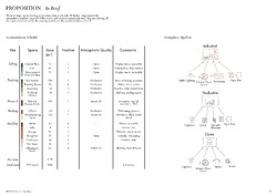
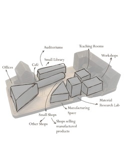
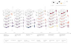
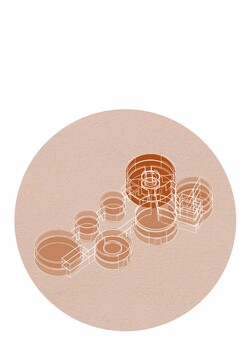
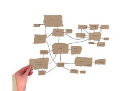
17/11/22 - Tasklet 04 In Brief. Continuing on from massing models, an understanding for what spaces required by the scheme was realised, and an accommodation schedule along with atmospheric diagrams were made, allowing to develop a set of sketch plans next.
Posted 6 Jan 2023 17:37
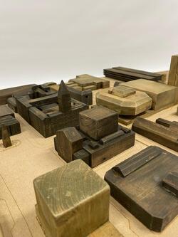
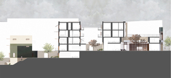
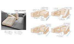
10/11/22 - Tasklet 03 Contextualism. Sketch massing models taking design stimuli from Editing the View and contextualising them through simple massing forms. Feedback provided on these at cross atelier review.
Posted 6 Jan 2023 17:36
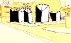
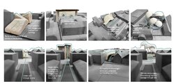
03/11/22 - Tasklet 02 Editing the View. Continuing on from V2 Serial Vision, taking the sketches from this task and editing over with basic massing forms on the site, influenced by Rossi.
Posted 6 Jan 2023 17:34
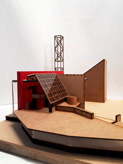
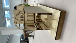
27/10/22 - Tasklet 01 Site in Context. Split into groups and tasked with producing 1:500 site model. Constructed using timber, MDF boards and stained after laser cutting details. Listed buildings are highlighted in a darker stain.
Posted 6 Jan 2023 17:33
20/10/22 - Final Miller Arcade presentation accompanied by complete model, presentations from other V1 groups as well. Main areas investigated with Miller Arcade such as hodology will be carried through into my Studio 3.1 project.
Posted 6 Jan 2023 17:32
14/10/22 - First group presentation on Miller Arcade case study, looking into hodology, thresholds, Industrial Revolution, and commerce. Experimenting with changing arrangements of the Arcade to increase its potential success.
Posted 6 Jan 2023 17:29
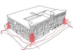
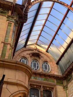
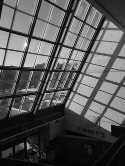
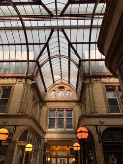
06/10/22 - Introduction to CiA and all its members. Assigned groups for V1 Urban Artefacts assignment and went to visit Miller Arcade, documenting experience on the site and specifically looking at the concept of thresholds.
Posted 6 Jan 2023 17:27
Week 11 - Final Studio Tutorial
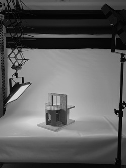
I used the final week before xmas break to focus in further detail and build a 1:20 sectional model depicting and exploring the 'Mud-room' Vestibule at the entrance of the townhouses. The Mud-room provides families with a place to shed the detritus of items needed in everyday life without bringing these into the home. The internal bench provides a place to take off muddy shoes and store them, while the external bench provides a spot for neighbours to chat or parents to watch their children while they are playing in the mews.
Posted 20 Dec 2022 02:14
Week 10 -Studio Tutorial 6
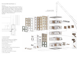
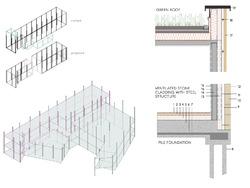
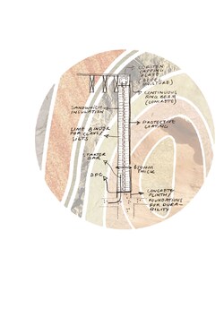
The final week of visiting tutorial consisted of Building Regulation Tutorials and a masterclass with Kevin Singh and Roger Stephenson. In order to present my scheme through a series of scales ranging from masterplan to detail, I worked quickly, narrowing my scope and focusing in on a detailed section of the building. I also explored and defined the structural make up of the building [SIPs] and its role within the adaptability and permeance of the two-hundred year home.
Posted 20 Dec 2022 02:12
Week 9 - Studio Tutorial 5
The second round of visiting tutorials consisted of an Sustainability Expert and a focused tutorial on our Tactile Models. Zooming in on the site, I chose one urban block to explore in further detail and developed as set of plans and elevations through an iterative process. The individual unit consists of an annex 'Granny Pad' to the ground floor and 3 storeys of raised townhouse below a second Annex unit which is accessed by a series of decks.
Posted 20 Dec 2022 02:08
Week 8 - Studio Tutorial 4
The visiting tutorials begin with structure and Passivhaus, Alongside looking further into the structure of the buildings and my environmental considerations, I also began exploring further the concept of creating cinematic moments on the site. Mirroring the previous purpose and social role of the cinema, the re-imagined foyer on the site of the former crush hall creates a reflective space for visitors and residents to withdraw from the high street into. The space mirrors that of the foyer seen in 'The Grand Budapest Hotel' using symmetry, enveloping nature, warm tones and central sightlines to draw the eye to the light entering from the opening above.
Posted 20 Dec 2022 02:03
Week 7 - Studio Tutorial 3
Following Research Methods focused week, I returned having explored my concept further and the ideology behind the two-hundred year home. My use of multigenerational housing units with a central townhouse typology sandwiched by two annex units to be used by older or young relatives who desire independence while remaining close to the core family unit. The adaptability of these units in combination allow the homes to not only remain standing for two hundred years but remain within one family unit over time, creating a rooted community protecting the longevity of the site.
Posted 20 Dec 2022 01:58
Week 5 - Cross Atelier Review
Cross Atelier Review Presentations alongside the Infrastructure Space Atelier. I presented my masterplan scheme alongside my initial site analysis and concept studies, concluding in a wider site section [a section of which is shown above].
Posted 20 Dec 2022 01:54
Week 4 - Studio Tutorial 2
In the lead up to the Cross Atelier next week, I continued to draw up and explore my ideas for the site. I began thinking about the cinematic past of the site and how this may be continued throughout its new use and programme. I explored the cinema and cinematic architecture through a series of spatial criteria which I will carry through into my masterplan and later on in the scheme.
Posted 20 Dec 2022 01:50
Week 3 - First Studio Tutorial
Following the Urban Artefact Model presentations we began to look at our site and brief for PS1. Working in small groups we collectively sketched out a number of concepts and masterplans for the site at varying scales. This quick and loose activity provoked me to get pen to paper and begin to explore some of the concepts and narratives I had derived from my personal site research.
Posted 20 Dec 2022 01:46
Week 2 - V1 Urban Artefacts Modelmaking
In the second week of the vertical project we presented our initial research and began working on the final 1.100 scale sectional model. Our aspirations were to show the layering of space within the Bus Station and the division of automobile, bus and pedestrian via the different levels. The Bus Station is typical of brutalist infrastructure of the era, which reflects aspirational views of a motor-age where the car took precedent over the pedestrian.
Posted 20 Dec 2022 01:40
Week 1 - V1 Urban Artefacts
Introductions to the Brief and Atelier, and site walks of Preston. We were assigned to vertical groups to undertake a site research task and building model over the next two weeks. I was assigned Group 3 - Preston Bus Station. Our group began with visiting the Bus Station and starting some initial sketch ideas for the model and research
Posted 20 Dec 2022 01:38
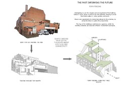
17/11/2022 New approach to the scheme after the Cross Atelier Review. Looking more into heritage, medieval traces, and what the building looked like before the fire, a new potential scheme emerges that responds more accurately to its context, while still keeping the initial three urban scales in mind (the park, the garden, and the alley).
Posted 20 Nov 2022 17:10
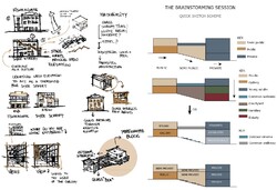
27/10/2022 Workshop on creating a residential sketch scheme in less than a day. The brainstorm started with identifying the users and attempting to create a functioning programmatic arrangement taking into consideration the context, the heritage of the Burnt down theatre, and the needs of the potential users. There is also a very rough outline of some of the materials and precedents used to inform the sketch scheme.
Posted 20 Nov 2022 17:07
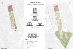
3/11/2022 Cross Atelier Review. Presenting an initial concept of the residential scheme conducted on the site of the Burnt Down Theatre in Preston with a focus on three scales of open spaces: park, garden, and alley. The scheme proposes mixed typologies of various sized houses and apartments that could be inhabited by young people in the transition from student to work life. The possibility of expanding the site to the South was explored in one of the options, but was voted against during the Review.
Posted 20 Nov 2022 17:03
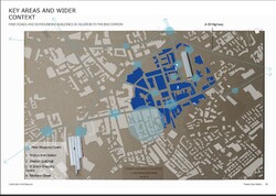
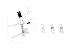
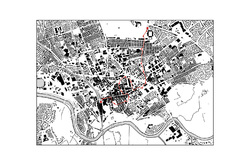
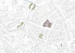
20/10/2022 V1 Urban Artefacts Workshop Review. Pictured is a map of Preston's road network in relation to the Bus Station building overlaid on a laser-cut site model, part of the group work conducted for the workshop. The group identified some of the opportunities and constraints of the Preston Bus Station and learned more about Preston's infrastructure in the process. What followed was the presentation of those findings to the other year groups.
Posted 20 Nov 2022 16:59
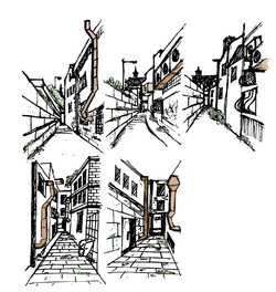
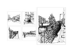
14/10/22 V2 Serial Vision Workshop. Using Urban Sketching as a tool to explore the site in Preston, Lancashire. Pictured is the journey through a pedestrian path next to the site that connects the high street to the site and all the way down the slope of the site to the other side.
Posted 20 Nov 2022 16:56
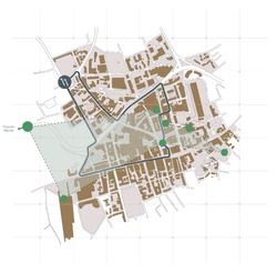
Cross Atelier Review focusing on the early stage design of the PS1 housing scheme. The following diagrams show the choice of creating two different housing typologies, specifically for performers and those who choose single living, connected by a public green space.
Posted 14 Nov 2022 16:19
Tutorials about initial design thoughts regarding the Two Century Home PS1 brief. The above V2 serial vision represents an investigation of the Burnt Down Theatre site and leads to the project's research topic: Housing for the Many - An Accidental Community in Preston's Theatrical Scene.
Posted 14 Nov 2022 16:08
V1 Urban Artefacts final presentations of models. Our group showcased a sectional model of the National Football Museum in Preston by describing the building's main architectural features, explaining the connection with the theme of thresholds and specifying the mode of production.
Posted 14 Nov 2022 15:45
Initial presentation of the assigned building, considering the wider context of Preston. Our group work focused on understanding the idea of journey through the city on large and small scales, as well as investigating the thresholds within the National Football Museum in order to create a final physical model.
Posted 14 Nov 2022 15:06
Visit to the initial National Football Museum in Preston as part of the CiA Urban Artefacts project. The theme of Thresholds in the City was explored through photographs and talks about the design of the building.
Posted 14 Nov 2022 14:39
06/10/22 - Presentation of mapping exercises as a starting point for site analysis of Preston and introduction to all CiA members. My focus was on the Preston Guild, a significant part of Preston's culture and history.
Posted 7 Nov 2022 17:24
14/10/22 - Initial presentation of our Miller Arcade case study which included topics such as the industrial revolution, thresholds, social fragmentation alongside small maquette models which would direct our idea for our final model. Feedback was provided by the tutors and the gaps were to be filled the following week.
Posted 7 Nov 2022 17:21
20/10/2022 - V1 Review. Short presentations from all of the group on their building case studies. We presented our final model of Miller Arcade. Topics such as social fragmentation, identity and thresholds came up in this case studies and will be referenced through my thesis project.
Posted 7 Nov 2022 17:17
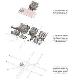
03/11/2022 Camillo Sitte: Modern City Planning. This reading layed out key principles when it comes to city planning and in particular, squares and plazas, using historic examples as precedents. I applied these principles to the Flag Marker in Preston. This analysis style will become a feature of my thesis project.
Posted 7 Nov 2022 15:46
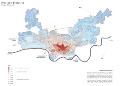
27/10/2022: First individual tutorial with Alberto discussing my thesis project. The image above summarises the detailed mapping I am undertaking to understand the impacts of the Industrial Revolution, both good and bad, on Preston.
Posted 7 Nov 2022 15:44
Final sectional perspective, included in the exhibition sheet for show build. The drawing shows occupants' activities in the renovated existing and in the new build, also showing the connection/ circulation between them
Posted 25 Jul 2022 11:31
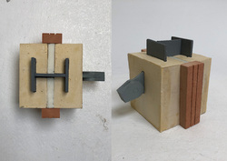
1:5 model of a section of the rotunda column. Main body is made of plaster dyed with yellow pigment to represent the sandstone colour. I cheizeled the exterior of the body to illustrate it is a rough surface in real life. Steel column was made of MDF and sprayed painted silver. The insulation layer is made of foam.
Posted 25 Jul 2022 11:25
Final corner model, placing 1:50 scaled people to show the scale of the building and a sense of depth in the photos.
Posted 25 Jul 2022 11:17
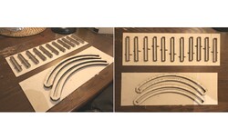
Making casting moulds using laser-cut greyboard to cast columns and ring beams for the 1:50 corner model. The materiality choice intended for the building columns would be sandstone with an uneven, rough surface. After casting with plaster/ jesmonite, it will be chiselled and painted to achieve the desired finishes and colour.
Posted 25 Jul 2022 10:56
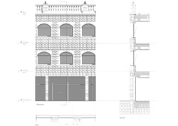
Finalised facade design, in elevation, plan, and section. I realised that the windows are blocked by the existing columns in this window placement, so further alterations in window locations on the facade will be made to allow a full undisrupted view outside the windows.
Posted 25 Jul 2022 10:54
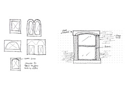
Window study showing the common window frame shapes in Accrington. This helps me determine the window shapes on the main facade and develop my own version of window frame unique to my building's programme
Posted 25 Jul 2022 10:51
Identify problems in the floor plans, incorporating elements suggested by technology consultants into the design.
Posted 25 Jul 2022 10:45
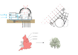
Technological aspects of the project were investigated and consolidated in material selections, structural strategy, passive strategies and more, which will be reflected in further plan iterations.
Posted 25 Jul 2022 10:38
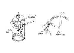
Initial concept sketches of passive strategies, aiming to use static ventilation to bring fresh air into the building and let out exhaust air through operable openings in the dome.
Posted 25 Jul 2022 10:27
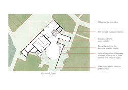
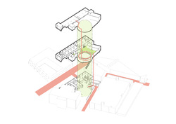
Key space identified at the rotunda and new first floor. This helps show where the main circulation should be and if the current stairs need improvements in terms of locations and flow in the building. This will be reflected in further plan iterations.
Posted 25 Jul 2022 10:15
12
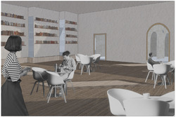
An interior rendering of the ground floor library depicting the interior qualities and intention of the space.
Posted 21 May 2022 21:21
11
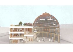
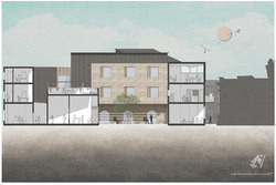
A 1.100 sectional images of the developed proposal demonstrating interior uses of the spaces ranging from studios, two cafés, the archive and the central courtyard.
Posted 21 May 2022 21:20
10
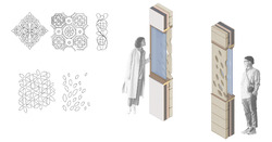
Drawing from organic motifs in the ornamentation of the Town and market hall, additional ornamentation on the façade was considered. This displays the abilities of the craftsmen who will use the building, while forging a further connection to the sites context.
Posted 21 May 2022 21:20
9
The interior qualities of the key spaces were further investigated through a series of quick water colour images. This enabled further plan development.
Posted 21 May 2022 21:19
8
The structural grid and build up were considered. A steel-concrete composite structure was decided upon as steel's durability and spanning properties will enable it to be re-used beyond the proposed life cycle of the building. This is demonstrated in my reappropriation of the town hall extension. Local timber, reclaimed sandstone, green roofing and zinc roofing make up the façade of the building.
Posted 21 May 2022 21:19
7
Further development of the buildings formal massing was required as some elements were still rather ridged. Materiality and detailing were also explored.
Posted 21 May 2022 21:18
6
Following the resolutions of 3.1, the big pebble intended to investigate the buildings key spaces. These were the café and roof terrace areas.
Posted 21 May 2022 21:18
5
The sharp roof pitches of the townscape were rotated to create more dramatic sloping forms. This concept was then modelled accurately with the programme of the building in mind, in order to assess its credibility.
Posted 21 May 2022 21:17
4
Iterative sketch models physicalised a number of different concepts and allowed them to be assessed. Elements for the first three iterations continued to influence the project while the concepts of the final iteration were dismissed.
Posted 21 May 2022 21:17
3
Editing the view A series of site interventions and metaphorical massings that inspired both tangible and intangible elements of the projects progressions.
Posted 21 May 2022 21:16
2
Programme Proposal - The revival, preservation, and restoration of the historic fabric of Accringtons town centre through revitalising its cultural roots as a centre for craft and production. The scheme aligns with existing projects by the Town Council, which aim to improve the town scape through the restoration of historic buildings. The proposed concept will further this scheme, with the creation of a craft centre, focused on the preservation of built heritage, to allow Accrington to capitalise on its future through the memory of its past.
Posted 21 May 2022 21:14
1
The project began with analysis to assess constraints and opportunities afforded by the site. As the above image illustrates, the site exists among four buildings that connect poorly to one another visually as well as functionally.
Posted 21 May 2022 19:47
Finalising general arrangement drawings and renders to determine the overall atmosphere and spatial quality of the building as well as how it stis in ints context.
Posted 16 May 2022 17:17
Exploring particularities in the design at a larger, personal scale to fully convey the palpable intricacies of the design.
Posted 16 May 2022 17:16
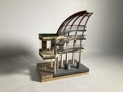
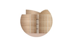
Modeling as a form of intimacy; communicating the perceptions and tactility of an internal space to convey scale comprehensively.
Posted 16 May 2022 17:15
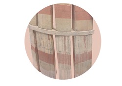
Investigating the envelope in terms of its relation to techincal details and the atmospheric qualities evoked by material choices.
Posted 16 May 2022 17:14
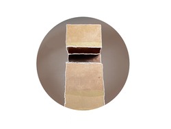
Exploring tactility through material qualities and their environmental properties as well as their use in details and technical interfaces
Posted 16 May 2022 17:13
The Considering permeability as a key creative driver for my design, the natural flow of people through the building is highly significant. The public is invited to enter the space through a vareity of entrances and, with scale in mind, are primarily drawn to and welcomed up the largest rammed earth mass; The Dome Gallery. This journey upwards attempts to entice users up a grand helical stair which appears to float centrally in the space - a climb of curiosity where the journey aims to be just as alluring as the arrival. At this point, people are engulfed by the sheer scale and proximity of the tactile forms and gain an impressive sense of arrival overlooking the historic buildings of Accrington. Just as the natural strata within the materiality, the public ascend the building in layers, mimicking the organic fabric.
Posted 16 May 2022 17:12
These sketches demonstrate development towards my initial final plans and how the spaces and massing embeds permeability as a core concept to my design.
Posted 16 May 2022 17:09
Developing adjacency diagrams to gather an understanding of the various apces and how they may relate to one another. This also gives an overarching sense of scale and proximity to the programme.
Posted 16 May 2022 17:07
To test interventions to the site, I edited various 3D masses onto an aerial view to capture how the space may change. This was done with my key creative driver of permeability in mind.
Posted 16 May 2022 17:05
The handshake refining tactile elements of the building at scale 1:5 using a model and scale drawings.
Posted 16 May 2022 17:02
The view out of a window of the existing strucuture on site helps gather an understanding of the site's historic surrounding context and the potential sights out of my design.
Posted 16 May 2022 17:02
Bringing the 2D into the 3D using a 1:50 scale model allowing me to have 1:1 contact with the build ability and materials intended.
Posted 16 May 2022 16:58
To initially break down the site, I recorded craft aspects that were tangible whislt journeying through the town. This helped me understand the stark contrasts of Accrington, in terms of its former industrial glory, compared to current austerity and a state of disrepair.
Posted 16 May 2022 16:58
Taking a deeper dive into the envelope and exploring the details which make up the building.
Posted 16 May 2022 16:57
Mapping out technical, environmental and regulatory strategies for the building, what do we value most and what factors will alter the design?
Posted 16 May 2022 16:55
The Big Pebble (or tasklet 06) explored the routes taken by users of the building to enter one of the main spaces.
Posted 16 May 2022 16:54
Finalising the programme and the plan of the building and how each space relates or links with each other. From this working GAs were created as a basis to work from and carry into atelier 3.2
Posted 16 May 2022 16:54
Beginning to nestle the scheme into the masterplan of the town, how will it connect to the high street and reintegrate the community? Who will the building be available to and why?
Posted 16 May 2022 16:53
Massing models were key to developing the form of the building after taking inspiration from elements of Accrington; it allowed me to begin visualising the form of the arts and crafts centre in scale form.
Posted 16 May 2022 16:52
The second tasklet involved drawing a theoretical scene from a window overlooking the site, I chose to depict an elderly member of the town relaxing in their living room with a picture of Accrington hung proudly on their wall. Serial visions were also created exploring a route to site as if a worker was travelling from their home to a calico mill in the centre of town.
Posted 16 May 2022 16:52
Tasklet 01 allowed us to explore Accrington and the site so we could get an idea for the context, environment and community that we were working with. The site visit and historical research concluded by the atelier group revealed hidden histories buried within the towns fabric.
Posted 16 May 2022 16:49
Exhibition render showing one of the workshop spaces within the project. The desired and imagined atmosphere is well captured by the layering of colors and textures in the image. The light and movement aim to entice the viewer and really transport them in that space at that time.
Posted 14 May 2022 22:03
Drawing up final GA's for the project. This is the plan at the largest scale assigned. It gives a great idea of the further surroundings, as it shows some greenery and waterways which otherwise could not be seen. Its simplicity further enhances the presence of the site and the nature around it.
Posted 14 May 2022 21:56
